## Heatmap & Algorithm Visualization: Factorial Calculation in Python
### Overview
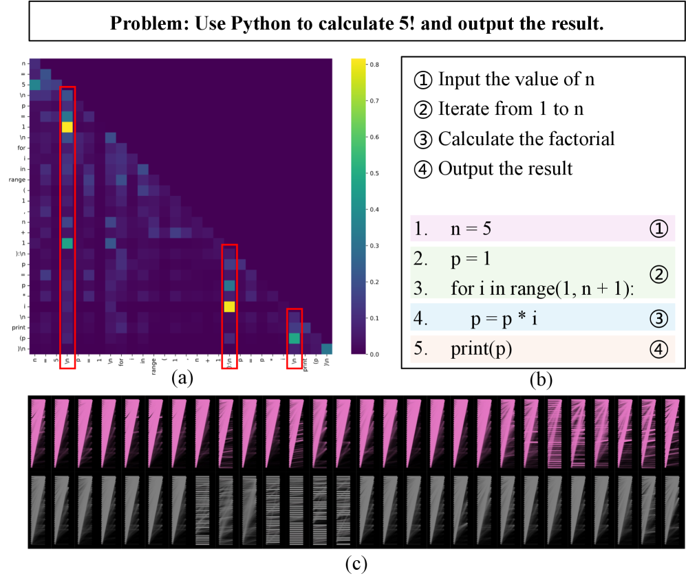
The image presents a combination of a heatmap, a textual algorithm description, and a visual representation of a process. The heatmap appears to visualize correlations between variables related to a Python program designed to calculate the factorial of 5. The algorithm is outlined in numbered steps, and a visual representation (c) shows a series of bars, potentially representing iterations or data transformations.
### Components/Axes
The image is divided into four main sections:
1. **Header:** "Problem: Use Python to calculate 5! and output the result."
2. **Heatmap (a):** A heatmap with labels along the y-axis (n, p, i, for, range, print, i/n) and x-axis (n, p, i, for, range, 1, print). A colorbar on the right indicates values ranging from 0.0 to 0.8.
3. **Algorithm (b):** A numbered list outlining the steps to calculate the factorial.
4. **Visual Representation (c):** A grid of bars, with a second, more detailed view on the right.
### Detailed Analysis or Content Details
**Heatmap (a):**
The heatmap displays correlation values between the variables listed on the axes. The color intensity represents the strength of the correlation, with darker blues indicating higher correlation and lighter colors indicating lower correlation.
* **Y-axis Labels:** n, p, i, for, range, print, i/n
* **X-axis Labels:** n, p, i, for, range, 1, print
* **Colorbar:** 0.0 to 0.8 (approximately).
* **Notable Values (approximate, based on color):**
* Correlation between 'n' and 'n' is approximately 0.8.
* Correlation between 'p' and 'p' is approximately 0.8.
* Correlation between 'i' and 'i' is approximately 0.7.
* Correlation between 'for' and 'for' is approximately 0.6.
* Correlation between 'range' and 'range' is approximately 0.6.
* Correlation between 'print' and 'print' is approximately 0.7.
* Correlation between 'i/n' and 'i/n' is approximately 0.7.
* The correlation between 'n' and 'p' is approximately 0.3.
* The correlation between 'n' and 'i' is approximately 0.2.
* The correlation between 'n' and 'for' is approximately 0.1.
* The correlation between 'n' and 'range' is approximately 0.1.
* The correlation between 'n' and '1' is approximately 0.1.
* The correlation between 'n' and 'print' is approximately 0.1.
* The correlation between 'p' and 'i' is approximately 0.4.
* The correlation between 'p' and 'for' is approximately 0.2.
* The correlation between 'p' and 'range' is approximately 0.2.
* The correlation between 'p' and '1' is approximately 0.2.
* The correlation between 'p' and 'print' is approximately 0.2.
**Algorithm (b):**
1. n = 5
2. p = 1
3. for i in range(1, n + 1):
4. p = p * i
5. print(p)
**Visual Representation (c):**
A grid of bars, with the right side showing a more detailed view. The bars appear to change in height, potentially representing the value of 'p' at each iteration of the loop. The bars are mostly gray, with some purple highlights on the right side.
### Key Observations
* The heatmap shows strong self-correlation for each variable (n, p, i, for, range, print, i/n).
* The correlation between 'n' and other variables is relatively low, suggesting 'n' is somewhat independent.
* The algorithm clearly outlines the steps for calculating the factorial of 5.
* The visual representation (c) seems to illustrate the iterative process of factorial calculation, with the bars representing the increasing value of the factorial.
### Interpretation
The image demonstrates the process of calculating the factorial of 5 using Python. The heatmap attempts to visualize the relationships between the variables involved in the calculation. The strong self-correlations indicate that each variable is strongly related to itself, which is expected. The low correlations between 'n' and other variables suggest that the initial value of 'n' doesn't strongly influence the other variables directly, but it sets the upper bound for the loop. The algorithm provides a clear, step-by-step guide to the calculation, and the visual representation (c) offers a graphical illustration of the iterative process. The purple highlights on the right side of (c) may indicate the final result or a significant point in the calculation. The heatmap is likely a conceptual visualization rather than a precise statistical analysis, as the correlations don't necessarily have a clear mathematical meaning in this context. The image serves as a pedagogical tool to explain the factorial calculation process and its underlying variables.