\n
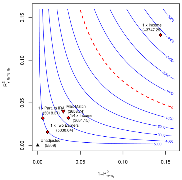
## Contour Plot: Statistical Model Performance Landscape
### Overview
This image is a contour plot visualizing a two-dimensional performance landscape, likely related to statistical or econometric model fitting. The plot displays iso-performance curves (contours) and several specific model configurations marked as points. The primary visual elements are blue contour lines representing a performance metric, a red dashed line indicating a zero-value threshold, and labeled data points representing different model specifications.
### Components/Axes
**Axes:**
- **X-axis (Horizontal):** Labeled `1 - R²_{α-α_s}`. The scale runs from 0.00 to 0.15, with major tick marks at 0.00, 0.05, 0.10, and 0.15. This represents a measure of unexplained variance or lack of fit for a parameter `α` relative to a baseline `α_s`.
- **Y-axis (Vertical):** Labeled `R²_{y-g_s-g-g_s}`. The scale runs from 0.00 to 0.15, with major tick marks at 0.00, 0.05, 0.10, and 0.15. This represents a coefficient of determination (R-squared) for a dependent variable `y` after accounting for several factors (`g_s`, `g`, `g_s`).
**Contour Lines (Legend):**
- A series of solid blue lines represent constant values of a performance metric (likely a log-likelihood, AIC, or similar loss function where lower is better, given the negative values).
- The contour values, labeled on the right side of the plot, are: `-5000`, `-4000`, `-3000`, `-2000`, `-1000`, `0`, `1000`, `2000`, `3000`, `4000`, `5000`.
- A single red dashed line represents the `0` contour, acting as a critical threshold separating negative and positive performance regions.
**Data Points (Labeled Models):**
Six specific model configurations are plotted as points, each with a label and a numerical value in parentheses (presumably the exact performance metric value). Their positions are approximate based on visual inspection.
1. **Black Triangle (Bottom-Left):** Label: `Unadjusted`. Value: `(5509)`. Position: Near (0.00, 0.00).
2. **Red Diamond (Lower-Left):** Label: `1 x Two Earners`. Value: `(5038.84)`. Position: Approx. (0.01, 0.02).
3. **Red Diamond (Lower-Left):** Label: `1 x Part. in IRA`. Value: `(5018.31)`. Position: Approx. (0.00, 0.03).
4. **Red Diamond (Lower-Left):** Label: `1/4 x Income`. Value: `(3684.15)`. Position: Approx. (0.04, 0.03).
5. **Red Triangle (Lower-Left):** Label: `Max Match`. Value: `(3658.74)`. Position: Approx. (0.03, 0.04).
6. **Red Diamond (Top-Right):** Label: `1 x Income`. Value: `(-3747.29)`. Position: Approx. (0.14, 0.13).
### Detailed Analysis
**Contour Trend:** The blue contour lines form a series of curves that slope downward from the top-left to the bottom-right of the plot. The values increase (become less negative/more positive) as one moves from the top-left corner towards the bottom-right corner. The gradient is steepest in the top-left region. The red dashed `0` contour runs diagonally from the top-center to the middle-right.
**Data Point Trends & Spatial Grounding:**
- **Cluster in Lower-Left Quadrant:** Five of the six points (`Unadjusted`, `1 x Two Earners`, `1 x Part. in IRA`, `1/4 x Income`, `Max Match`) are clustered in the region where both `1 - R²_{α-α_s}` and `R²_{y-g_s-g-g_s}` are low (< 0.05). This region corresponds to high positive contour values (between `3000` and `5000`), indicating relatively poor model fit (if the metric is a loss function).
- **Outlier Point:** The point `1 x Income` is isolated in the top-right quadrant, where both axis values are high (~0.14). This point lies near the `-4000` contour, indicating a much better model fit (a large negative value).
- **Performance Gradient:** Moving from the `Unadjusted` model (5509) towards the `1 x Income` model (-3747.29), the performance metric improves dramatically (decreases by ~9256 units). This path corresponds to increasing values on both axes.
- **Within-Cluster Variation:** Among the lower-left cluster, the `Max Match` (3658.74) and `1/4 x Income` (3684.15) models perform slightly better (lower values) than the `Unadjusted` (5509), `1 x Two Earners` (5038.84), and `1 x Part. in IRA` (5018.31) models.
### Key Observations
1. **Strong Inverse Relationship:** There is a clear inverse relationship between the two axis variables and the performance metric. Higher values of `1 - R²_{α-α_s}` and `R²_{y-g_s-g-g_s}` are associated with significantly better (lower) performance values.
2. **Critical Threshold:** The red dashed `0` contour acts as a major dividing line. All points in the lower-left cluster are on the "high-value" (positive) side of this threshold, while the `1 x Income` point is deep within the "low-value" (negative) side.
3. **Model Impact:** The model specification `1 x Income` has a transformative effect on the performance metric compared to all other adjustments shown, moving the result from a region of poor fit to one of good fit.
4. **Clustering of Adjustments:** Alternative model adjustments like `Two Earners`, `Part. in IRA`, `1/4 x Income`, and `Max Match` result in only marginal improvements over the `Unadjusted` baseline and remain in a fundamentally different region of the performance landscape compared to the `1 x Income` model.
### Interpretation
This plot visualizes the trade-off or relationship between two specific measures of model fit (`R²`-like statistics for different components) and an overall performance metric. The data suggests that the factor represented by `1 x Income` is the dominant driver of model performance in this analysis.
The **Peircean investigative reading** would be: The stark separation between the `1 x Income` point and all others indicates a **genuine anomaly or a fundamental shift in the underlying relationship**. It's not merely a quantitative improvement but a qualitative change in the model's behavior. The cluster of other adjustments suggests they are **perturbations within a local optimum** of poor fit, while incorporating income in this specific way (`1 x Income`) accesses a **completely different, superior region** of the parameter space.
The axes themselves are informative: `1 - R²_{α-α_s}` measures how poorly a parameter `α` is estimated relative to a baseline, while `R²_{y-g_s-g-g_s}` measures how well the outcome `y` is explained after certain adjustments. The plot shows that models which allow for greater deviation in `α` (higher x-value) and achieve higher explanatory power for `y` (higher y-value) perform vastly better on the overall metric. The `1 x Income` model achieves both, explaining why it is an outlier. This could imply that income is a key confounding variable or that its correct specification is crucial for the model's validity. The other adjustments fail to address this core issue, leaving the model in a suboptimal state.