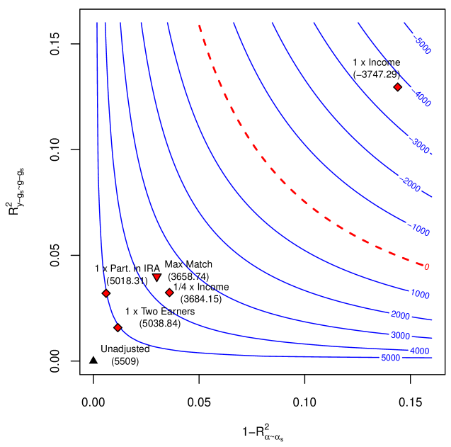
## Contour Plot: R-squared Values
### Overview
The image is a contour plot showing the relationship between two R-squared values, labeled as `R²y-gs~g-gs` on the y-axis and `1-R²α~αs` on the x-axis. The plot displays several blue contour lines representing different constant values, ranging from -5000 to 5000. A dashed red line is also present. Several data points, represented by red diamonds and a black triangle, are plotted on the graph, each labeled with a description and a numerical value.
### Components/Axes
* **X-axis:** `1-R²α~αs`, ranging from 0.00 to 0.15 in increments of 0.05.
* **Y-axis:** `R²y-gs~g-gs`, ranging from 0.00 to 0.15 in increments of 0.05.
* **Contour Lines:** Blue lines representing constant values. The values are labeled along the lines and range from -5000 to 5000.
* **Dashed Line:** A red dashed line that appears to separate regions of the plot.
* **Data Points:**
* Red diamonds:
* "1 x Part. in IRA (5018.31)" located at approximately (0.01, 0.03).
* "1/4 x Income (3684.15)" located at approximately (0.05, 0.03).
* "1 x Two Earners (5038.84)" located at approximately (0.02, 0.02).
* "1 x Income (-3747.29)" located at approximately (0.15, 0.14).
* Red triangle:
* "Max Match (3658.74)" located at approximately (0.04, 0.04).
* Black triangle:
* "Unadjusted (5509)" located at approximately (0.00, 0.00).
### Detailed Analysis
* **Contour Lines:** The blue contour lines are curved, generally increasing in value as they move towards the bottom-right corner of the plot.
* **Dashed Red Line:** The dashed red line starts near the top-left and curves towards the bottom-right.
* **Data Point Locations:**
* "Unadjusted (5509)" is located at the origin (0.00, 0.00).
* "1 x Two Earners (5038.84)" is located near the origin, slightly above and to the right.
* "1 x Part. in IRA (5018.31)" is located above "1 x Two Earners (5038.84)".
* "Max Match (3658.74)" is located to the right and slightly above "1 x Part. in IRA (5018.31)".
* "1/4 x Income (3684.15)" is located close to "Max Match (3658.74)".
* "1 x Income (-3747.29)" is located in the top-right corner of the plot.
### Key Observations
* The contour lines indicate a complex relationship between the two R-squared values.
* The data points are clustered in the lower-left corner, except for "1 x Income (-3747.29)", which is located in the top-right corner.
* The "Unadjusted (5509)" data point is at the origin.
### Interpretation
The contour plot visualizes how different factors (e.g., participation in IRA, income levels, two earners) affect the relationship between two R-squared values. The contour lines represent constant values, allowing for the comparison of different scenarios. The data points indicate the specific R-squared values for each scenario. The clustering of data points in the lower-left corner suggests that these scenarios have similar effects on the R-squared values. The "1 x Income (-3747.29)" data point, located in the top-right corner, represents an outlier, indicating a significantly different effect on the R-squared values compared to the other scenarios. The red dashed line might represent a threshold or boundary, separating regions with different characteristics or implications.