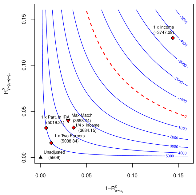
## Chart: R-squared vs. 1-R-squared Alpha-Omega
### Overview
The image presents a contour plot visualizing the relationship between R² (y-gs - gs) and 1-R² (alpha-omega). The plot features several contour lines representing different values, ranging from -5000 to 5000, with specific data points marked by symbols. A dashed red line is also present, and several data points are labeled with their corresponding values in parentheses.
### Components/Axes
* **X-axis:** Labeled "1-R² α-ωs", ranging from approximately 0.00 to 0.15.
* **Y-axis:** Labeled "R² y-gs - gs", ranging from approximately 0.00 to 0.15.
* **Contour Lines:** Curved lines representing values from -5000 to 5000, increasing in increments. The contour lines are blue, except for the dashed red line representing a value of 0.
* **Data Points:** Marked with different symbols (diamonds and triangles) and labeled with values in parentheses.
* **Legend:** The contour lines are labeled with their corresponding values on the right side of the chart.
### Detailed Analysis
The chart displays several contour lines that curve from the bottom-left to the top-right. The lines are densely packed on the left side and become more spaced out towards the right.
* **Contour Values:** The contour lines represent values of -5000, -4000, -3000, -2000, -1000, 0, 1000, 2000, 3000, 4000, and 5000.
* **Data Point 1 (Unadjusted):** Marked with a black triangle, located near the origin (approximately x=0.00, y=0.00), with a value of (5509).
* **Data Point 2 (1 x Part. in IRA):** Marked with a red diamond, located at approximately x=0.02, y=0.04, with a value of (5018.31).
* **Data Point 3 (Max Match):** Marked with a red diamond, located at approximately x=0.03, y=0.04, with a value of (3658.74).
* **Data Point 4 (1/4 x Income):** Marked with a red diamond, located at approximately x=0.04, y=0.04, with a value of (3684.15).
* **Data Point 5 (1 x Two Earners):** Marked with a red diamond, located at approximately x=0.05, y=0.03, with a value of (5038.84).
* **Data Point 6 (1 x Income):** Marked with a red diamond, located at approximately x=0.15, y=0.13, with a value of (-3747.29).
* **Dashed Red Line:** Represents the contour value of 0, curving from the bottom-left to the top-right.
### Key Observations
* The data points are clustered in the lower-left region of the chart, with the "Unadjusted" point closest to the origin.
* The "1 x Income" data point is an outlier, located in the upper-right region with a negative value.
* The contour lines indicate a non-linear relationship between R² and 1-R².
* The dashed red line (value 0) separates the regions of positive and negative contour values.
### Interpretation
The chart likely represents a model comparison or sensitivity analysis, where R² measures the goodness of fit and 1-R² represents the unexplained variance. The contour lines show how the model's performance (represented by the contour value) changes as the values of R² and 1-R² vary.
The clustering of data points in the lower-left region suggests that the model performs best when both R² and 1-R² are low. The outlier "1 x Income" indicates that this particular scenario results in a poor model fit (negative contour value). The dashed red line highlights the threshold where the model's performance transitions from positive to negative.
The different symbols (triangles and diamonds) likely represent different scenarios or groups being compared. The values in parentheses provide quantitative measures of the model's performance for each scenario. The chart allows for a visual assessment of the trade-offs between model fit and unexplained variance under different conditions.