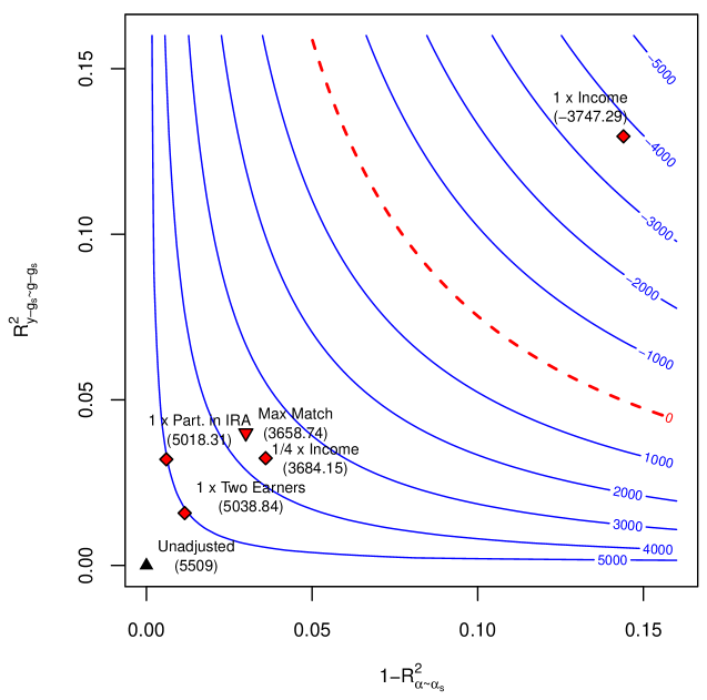
## Contour Plot: Relationship Between R²_y and 1-R²_x with Financial Metrics
### Overview
The image is a contour plot showing the relationship between two variables: **R²_y** (y-axis) and **1-R²_x** (x-axis). The plot includes contour lines labeled with numerical values (e.g., -5000, -4000, ..., 5000) and data points labeled with financial scenarios (e.g., "1 x Income," "Max Match"). A red dashed line labeled "0" divides the plot into positive and negative regions.
---
### Components/Axes
- **X-axis**: Labeled **1-R²_x**, ranging from **0.00** to **0.15**.
- **Y-axis**: Labeled **R²_y**, ranging from **0.00** to **0.15**.
- **Contour Lines**: Labeled with values from **-5000** to **5000** in increments of **1000**.
- **Red Dashed Line**: Labeled **"0"**, diagonally spanning from bottom-left to top-right.
- **Data Points**: Labeled with financial scenarios and coordinates (e.g., "1 x Income" at (0.12, 0.15)).
---
### Detailed Analysis
#### Contour Lines
- The contour lines represent levels of a function (likely a cost or benefit metric).
- Values increase from **-5000** (bottom-left) to **5000** (top-right).
- The **0** line (red dashed) acts as a threshold, separating positive and negative regions.
#### Data Points
1. **Unadjusted** (Triangle, black):
- Coordinates: (0.00, 0.00)
- Value: **5509** (highest value on the plot).
2. **1 x Part. in IRA** (Diamond, red):
- Coordinates: (0.03, 0.10)
- Value: **5018.31** (near the 5000 contour line).
3. **Max Match** (Triangle, red):
- Coordinates: (0.07, 0.12)
- Value: **3658.74** (between 3000 and 4000).
4. **1/4 x Income** (Diamond, red):
- Coordinates: (0.05, 0.11)
- Value: **3684.15** (between 3000 and 4000).
5. **1 x Income** (Diamond, red):
- Coordinates: (0.12, 0.15)
- Value: **-3747.29** (negative, below the 0 line).
---
### Key Observations
- The **Unadjusted** point (origin) has the highest value (**5509**), suggesting it represents a baseline or default scenario.
- **1 x Part. in IRA** and **1/4 x Income** are in the positive region, with values close to the 5000 contour line.
- **Max Match** and **1/4 x Income** are in the same positive region but slightly lower than **1 x Part. in IRA**.
- **1 x Income** is in the negative region, indicating a lower value (-3747.29).
- The red dashed line (**0**) separates the positive and negative regions, with most data points above it except **1 x Income**.
---
### Interpretation
The plot likely models the impact of different financial scenarios (e.g., income levels, IRA contributions) on a metric (e.g., cost, benefit, or risk). The **Unadjusted** scenario (origin) is the most favorable, while **1 x Income** is the least favorable. The **Max Match** and **1/4 x Income** scenarios show moderate positive outcomes, while **1 x Part. in IRA** is the most favorable among the labeled points. The red dashed line (**0**) may represent a critical threshold where outcomes shift from positive to negative. The data suggests that adjustments (e.g., IRA contributions) significantly influence the metric, with higher contributions (e.g., **1 x Part. in IRA**) yielding better results.