\n
## Line Chart with Scatter Points: Test Accuracy vs. Parameter `t`
### Overview
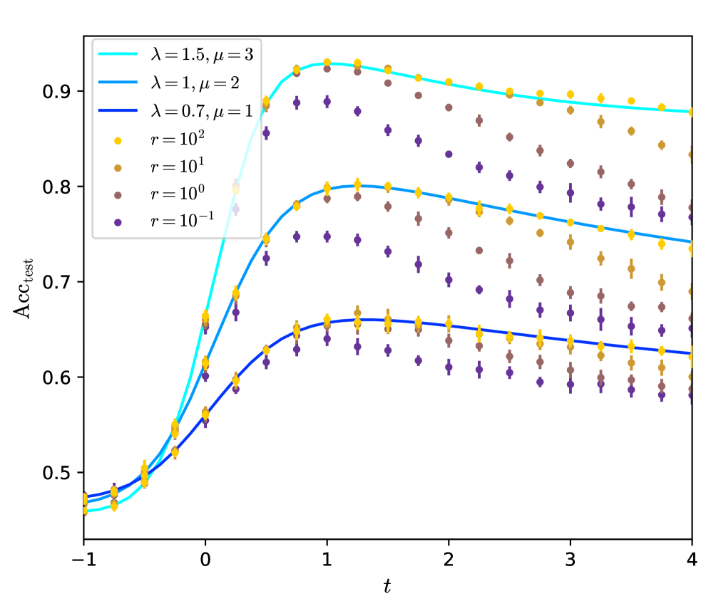
The image is a scientific line chart overlaid with scatter points, plotting test accuracy (`Acc_test`) against a parameter `t`. It compares three distinct model configurations (defined by parameters `λ` and `μ`) and shows the performance distribution across four different noise or regularization levels (parameter `r`). The chart demonstrates how accuracy evolves with `t`, peaking for all series before declining, and highlights the impact of both model configuration and the `r` parameter on performance and variance.
### Components/Axes
* **Y-Axis:** Labeled `Acc_test`. The scale is linear, ranging from approximately 0.45 to 0.95, with major tick marks at 0.5, 0.6, 0.7, 0.8, and 0.9.
* **X-Axis:** Labeled `t`. The scale is linear, ranging from -1 to 4, with major tick marks at -1, 0, 1, 2, 3, and 4.
* **Legend (Top-Left Corner):**
* **Lines (Model Configurations):**
* Cyan line: `λ = 1.5, μ = 3`
* Medium blue line: `λ = 1, μ = 2`
* Dark blue line: `λ = 0.7, μ = 1`
* **Scatter Points (Noise/Regularization Level `r`):**
* Yellow circle: `r = 10²`
* Light brown circle: `r = 10¹`
* Brown circle: `r = 10⁰`
* Purple circle: `r = 10⁻¹`
* **Data Series:** Three solid lines represent the mean or expected trend for each model configuration. Overlaid on these lines are clusters of scatter points (with vertical error bars) at discrete `t` values, showing the distribution of results for different `r` values.
### Detailed Analysis
**Trend Verification per Line:**
1. **Cyan Line (`λ=1.5, μ=3`):** Starts at ~0.46 at `t=-1`. Slopes upward steeply, crossing 0.8 around `t=0.2`. Reaches a peak of ~0.93 at `t=1`. After the peak, it slopes gently downward to ~0.88 at `t=4`.
2. **Medium Blue Line (`λ=1, μ=2`):** Starts at ~0.47 at `t=-1`. Slopes upward, crossing 0.7 around `t=0.2`. Reaches a peak of ~0.80 at `t=1`. After the peak, slopes downward to ~0.74 at `t=4`.
3. **Dark Blue Line (`λ=0.7, μ=1`):** Starts at ~0.48 at `t=-1`. Slopes upward more gradually, crossing 0.6 around `t=0.2`. Reaches a peak of ~0.66 at `t=1`. After the peak, slopes downward to ~0.62 at `t=4`.
**Scatter Point Distribution (Cross-referenced with Legend):**
At each sampled `t` value (e.g., t = -0.8, -0.5, -0.2, 0, 0.2, 0.5, 0.8, 1.0, 1.2, etc.), four colored points are plotted, corresponding to the four `r` values.
* **General Pattern:** For a given `t` and model line, the yellow points (`r=10²`) are consistently the highest, followed by light brown (`r=10¹`), then brown (`r=10⁰`), with purple (`r=10⁻¹`) being the lowest. This indicates that higher `r` values correlate with higher test accuracy.
* **Variance:** The vertical spread (error bars) between the purple and yellow points at any given `t` is significant, often spanning 0.1 to 0.15 in accuracy. This spread appears largest around the peak (`t=1`) and narrows slightly at the extremes of `t`.
* **Alignment with Lines:** The solid lines pass through the central tendency of the scatter point clusters. The cyan line aligns with the uppermost clusters, the medium blue with the middle clusters, and the dark blue with the lowest clusters.
### Key Observations
1. **Universal Peak at `t=1`:** All three model configurations achieve their maximum test accuracy at approximately `t=1`.
2. **Performance Hierarchy:** The model with `λ=1.5, μ=3` (cyan) consistently outperforms the others across the entire `t` range, followed by `λ=1, μ=2` (medium blue), and then `λ=0.7, μ=1` (dark blue).
3. **Impact of `r`:** There is a strong, monotonic relationship between the parameter `r` and accuracy. Higher `r` (e.g., 10²) yields higher accuracy and appears to have slightly lower variance (smaller error bars) compared to lower `r` (e.g., 10⁻¹).
4. **Symmetrical Decline:** The decline in accuracy after `t=1` is more gradual than the initial ascent for all series.
5. **Initial Convergence:** At very low `t` values (`t=-1`), the performance difference between the three model configurations is minimal (all ~0.46-0.48), but they diverge significantly as `t` increases.
### Interpretation
This chart likely illustrates the results of a machine learning experiment studying the dynamics of model training or generalization. The parameter `t` could represent a training step, a temperature, or an interpolation coefficient between two model states. The parameters `λ` and `μ` define different model architectures or hyperparameter settings, with higher values leading to better peak performance.
The parameter `r` is critical. Its inverse relationship with accuracy (lower `r` = worse performance) suggests it might represent a **noise level** (where lower `r` means more noise) or the **inverse of a regularization strength** (where lower `r` means weaker regularization). The large spread in scatter points for low `r` indicates that high noise/weak regularization leads to unstable and poor generalization.
The consistent peak at `t=1` for all configurations is a key finding. It suggests an **optimal operating point** in the `t`-parameter space that is robust to changes in model architecture (`λ, μ`) and noise level (`r`). The fact that all models degrade after this point could indicate overfitting, over-smoothing, or a transition into a less optimal regime as `t` increases further. The chart effectively communicates that while model choice (`λ, μ`) sets the performance ceiling, the `r` parameter heavily influences where within that ceiling a specific run will land, and `t` must be carefully tuned to hit the universal peak.