## Pie Chart: Percentage Distribution
### Overview
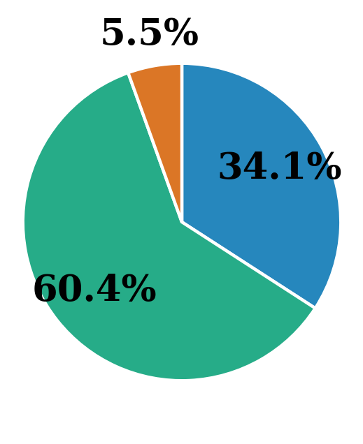
The image displays a simple pie chart divided into three segments, each labeled with a percentage value. The chart has no title, legend, or axis labels. The segments are distinguished by color and are separated by thin white borders.
### Components/Axes
* **Chart Type:** Pie Chart.
* **Segments:** Three colored segments.
* **Labels:** Each segment contains a percentage value directly on it.
* **Legend:** None present.
* **Title/Axis Labels:** None present.
### Detailed Analysis
The chart is composed of three segments with the following properties, listed clockwise from the top:
1. **Orange Segment:**
* **Color:** Orange.
* **Label/Value:** "5.5%".
* **Spatial Position:** A small slice located at the top of the chart, slightly left of the vertical center.
* **Visual Trend:** This is the smallest segment by a significant margin.
2. **Blue Segment:**
* **Color:** Medium blue.
* **Label/Value:** "34.1%".
* **Spatial Position:** Occupies the right side of the chart, from the top-right to the bottom-right.
* **Visual Trend:** This is the second-largest segment.
3. **Green Segment:**
* **Color:** Teal or sea-green.
* **Label/Value:** "60.4%".
* **Spatial Position:** Occupies the entire left side and bottom of the chart, making it the dominant visual element.
* **Visual Trend:** This is the largest segment, representing a clear majority.
**Data Verification:** The sum of the percentages (5.5% + 34.1% + 60.4%) equals 100.0%, confirming the data is consistent for a whole-part relationship.
### Key Observations
* **Dominant Majority:** The green segment (60.4%) constitutes more than half of the total, indicating a clear majority share for its associated category.
* **Significant Minority:** The blue segment (34.1%) represents a substantial portion, roughly one-third of the whole.
* **Minor Component:** The orange segment (5.5%) is a very small fraction, suggesting it represents a minor or niche category.
* **Missing Context:** The chart lacks a title, legend, or any descriptive text to explain what the percentages or colors represent. This is the most critical missing information for full interpretation.
### Interpretation
This pie chart visually communicates a proportional distribution among three categories. The data suggests a scenario where one category (green) holds a dominant position, another (blue) holds a strong secondary position, and a third (orange) is marginal.
**What the data suggests:** The distribution is highly unequal. The relationship between the parts is not balanced; it's a hierarchy with a clear leader, a challenger, and a distant third.
**Why it matters (with missing context):** Without labels, the real-world significance is unknown. However, the structure is common in analyses such as:
* **Market Share:** Company A (green) dominates the market, Company B (blue) is a major competitor, and others (orange) have minimal share.
* **Survey Results:** A majority opinion (green), a significant opposing view (blue), and a small undecided or alternative group (orange).
* **Resource Allocation:** One department or project consumes the majority of resources (green), another a significant portion (blue), and a third very little (orange).
**Notable Anomalies:** The primary anomaly is the complete lack of descriptive metadata (title, legend). This renders the chart informative only in the abstract sense of showing proportions, but useless for conveying specific, actionable information. The small size of the orange segment could be an outlier depending on the context, representing a negligible factor or a new, emerging category.
**Conclusion:** The chart effectively shows a 60/35/5 split between three unnamed entities. To derive any meaningful insight, the categories corresponding to the green, blue, and orange segments must be identified.