## Chart Type: Pie Chart
### Overview
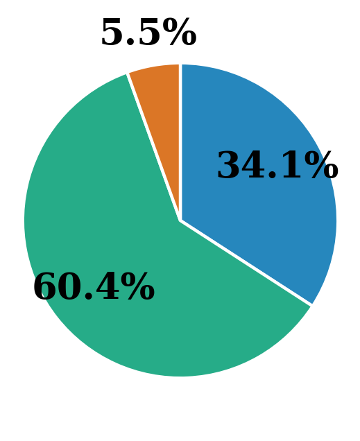
The image is a pie chart displaying three categories with their respective percentages. The categories are represented by different colors: blue, green, and orange. The green category occupies the largest portion of the pie, followed by blue, and then orange.
### Components/Axes
* **Categories:** The pie chart represents three distinct categories, each identified by a unique color.
* **Percentages:** Each category is labeled with a percentage value, indicating its proportion of the whole.
### Detailed Analysis
* **Blue Category:** The blue section occupies approximately 34.1% of the pie chart. It is located in the top-right quadrant.
* **Green Category:** The green section occupies approximately 60.4% of the pie chart. It is located in the bottom-left quadrant.
* **Orange Category:** The orange section occupies approximately 5.5% of the pie chart. It is located in the top-left quadrant.
### Key Observations
* The green category represents the majority (60.4%) of the data.
* The orange category represents a small fraction (5.5%) of the data.
* The blue category represents a significant portion (34.1%) of the data, but less than the green category.
### Interpretation
The pie chart visually represents the distribution of data across three categories. The green category dominates, suggesting it is the most prevalent or significant component. The orange category is the least prevalent. The chart provides a clear and concise overview of the relative proportions of each category within the whole. Without further context, it's difficult to determine the specific meaning of these categories, but the chart effectively communicates their relative sizes.