\n
## Pie Chart: Percentage Distribution
### Overview
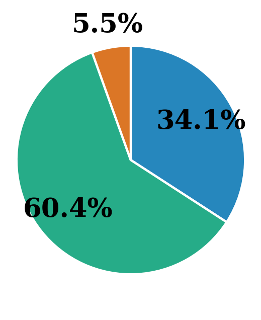
The image is a pie chart illustrating the percentage distribution of three categories. The chart is visually divided into three segments, each representing a different proportion of the whole. The percentages are directly labeled on the chart.
### Components/Axes
The chart consists of three segments, each with a distinct color:
* **Blue:** Represents 34.1%
* **Green:** Represents 60.4%
* **Orange:** Represents 5.5%
There are no explicit axes or a legend beyond the color-coding and percentage labels. The chart is a simple representation of proportions.
### Detailed Analysis
The pie chart displays the following data:
* **Category 1 (Blue):** 34.1%
* **Category 2 (Green):** 60.4%
* **Category 3 (Orange):** 5.5%
The largest segment is green, occupying the majority of the pie chart. The blue segment is significantly smaller, and the orange segment is the smallest.
### Key Observations
* The green category dominates the distribution, representing over 60% of the total.
* The orange category is a minor component, contributing less than 6% to the total.
* The sum of the percentages is 34.1% + 60.4% + 5.5% = 100%, confirming that the chart represents a complete distribution.
### Interpretation
The data suggests a highly skewed distribution, where one category (green) is substantially more prevalent than the others. This could represent a variety of scenarios, such as market share, demographic breakdown, or resource allocation. The small percentage represented by the orange category indicates it is a relatively insignificant factor in the overall context. Without further context, it is difficult to determine the specific meaning of these percentages, but the chart clearly highlights the dominance of the green category. The chart is a simple visual aid to demonstrate the relative proportions of three different categories.