## Scatter Plot with Reference Lines: Test Accuracy vs. K for Different c Values
### Overview
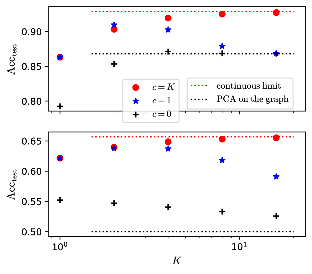
The image displays two vertically stacked scatter plots sharing a common logarithmic x-axis labeled "K". Both plots have a y-axis labeled "Acc_test" (Test Accuracy), but with different scales. The plots compare the performance of three different conditions (c=K, c=1, c=0) against two reference baselines ("continuous limit" and "PCA on the graph") as the parameter K increases.
### Components/Axes
* **X-Axis (Shared):** Labeled "K". It uses a logarithmic scale with major tick marks at `10^0` (1) and `10^1` (10). Data points are plotted at approximate K values of 1, 2, 4, 8, and 16.
* **Y-Axis (Top Plot):** Labeled "Acc_test". Linear scale ranging from approximately 0.80 to 0.93.
* **Y-Axis (Bottom Plot):** Labeled "Acc_test". Linear scale ranging from approximately 0.50 to 0.66.
* **Legend:** Positioned in the center, between the two subplots.
* **Data Series:**
* Red Circle (●): `c = K`
* Blue Star (★): `c = 1`
* Black Plus (+): `c = 0`
* **Reference Lines:**
* Red Dotted Line (····): `continuous limit`
* Black Dotted Line (····): `PCA on the graph`
### Detailed Analysis
**Top Subplot (Acc_test range ~0.80-0.93):**
* **c=K (Red Circles):** Shows a clear upward trend. Values are approximately: (K=1, Acc≈0.86), (K=2, Acc≈0.90), (K=4, Acc≈0.92), (K=8, Acc≈0.93), (K=16, Acc≈0.93). It approaches and nearly meets the "continuous limit" line.
* **c=1 (Blue Stars):** Shows an initial increase followed by a plateau/slight decline. Values are approximately: (K=1, Acc≈0.86), (K=2, Acc≈0.91), (K=4, Acc≈0.90), (K=8, Acc≈0.88), (K=16, Acc≈0.87). It peaks near K=2.
* **c=0 (Black Plus Signs):** Shows a relatively flat, slightly increasing trend. Values are approximately: (K=1, Acc≈0.79), (K=2, Acc≈0.85), (K=4, Acc≈0.87), (K=8, Acc≈0.87), (K=16, Acc≈0.87). It converges to the "PCA on the graph" line.
* **Reference Lines:**
* "continuous limit" (Red Dotted): Horizontal line at Acc_test ≈ 0.93.
* "PCA on the graph" (Black Dotted): Horizontal line at Acc_test ≈ 0.87.
**Bottom Subplot (Acc_test range ~0.50-0.66):**
* **c=K (Red Circles):** Shows a slight upward trend. Values are approximately: (K=1, Acc≈0.62), (K=2, Acc≈0.64), (K=4, Acc≈0.65), (K=8, Acc≈0.655), (K=16, Acc≈0.66). It approaches the "continuous limit" line.
* **c=1 (Blue Stars):** Shows a distinct downward trend after an initial point. Values are approximately: (K=1, Acc≈0.62), (K=2, Acc≈0.64), (K=4, Acc≈0.64), (K=8, Acc≈0.62), (K=16, Acc≈0.59).
* **c=0 (Black Plus Signs):** Shows a clear downward trend. Values are approximately: (K=1, Acc≈0.55), (K=2, Acc≈0.545), (K=4, Acc≈0.54), (K=8, Acc≈0.53), (K=16, Acc≈0.525). It trends away from the "PCA on the graph" line.
* **Reference Lines:**
* "continuous limit" (Red Dotted): Horizontal line at Acc_test ≈ 0.66.
* "PCA on the graph" (Black Dotted): Horizontal line at Acc_test ≈ 0.50.
### Key Observations
1. **Performance Hierarchy:** In both plots, the `c=K` condition consistently achieves the highest test accuracy, followed by `c=1`, with `c=0` performing the worst.
2. **Trend Divergence with K:** The behavior of `c=1` and `c=0` diverges significantly between the two plots. In the top plot, they stabilize or slightly increase with K. In the bottom plot, both show a marked decrease in accuracy as K increases.
3. **Convergence to Limits:** The `c=K` series converges toward the "continuous limit" baseline in both scenarios. The `c=0` series converges to the "PCA on the graph" baseline in the top plot but diverges from it in the bottom plot.
4. **Scale Sensitivity:** The absolute accuracy values are much higher in the top plot (~0.8-0.93) compared to the bottom plot (~0.5-0.66), suggesting the two plots represent different datasets, tasks, or model configurations.
### Interpretation
This chart likely evaluates the performance of a graph-based or kernel-based machine learning model where `K` is a key hyperparameter (e.g., number of neighbors, kernel width) and `c` controls a specific model component or regularization.
* **`c=K` is the Optimal Strategy:** Setting the parameter `c` to scale with `K` yields the best and most robust performance, approaching a theoretical "continuous limit." This suggests an adaptive strategy is superior.
* **Fixed `c` Values are Suboptimal and Brittle:** Using fixed values for `c` (`c=1` or `c=0`) leads to lower performance. More critically, their effectiveness is highly sensitive to the problem context (as seen by the differing trends between the top and bottom plots). The declining accuracy for `c=1` and `c=0` with increasing K in the bottom plot indicates over-smoothing, over-regularization, or a mismatch between the fixed parameter and the growing model complexity/scope represented by K.
* **Baselines as Performance Ceilings/Floors:** The "continuous limit" acts as an upper-bound benchmark that the adaptive `c=K` method can reach. The "PCA on the graph" serves as a lower-bound or alternative baseline; the fact that `c=0` matches it in one scenario but not the other provides insight into the conditions under which that simple baseline is competitive.
* **Underlying Message:** The data argues for using an adaptive parameter (`c=K`) that scales with the model's operational scale (`K`) to achieve optimal and stable generalization performance, rather than relying on fixed heuristic values. The two subplots demonstrate that this conclusion holds across different problem settings (high-accuracy vs. lower-accuracy regimes).