## Scatter Plot: Accuracy vs. K
### Overview
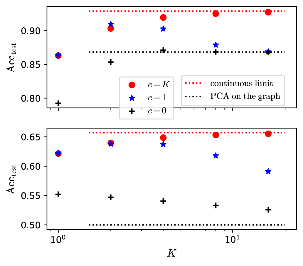
The image contains two scatter plots, one above the other, displaying the relationship between accuracy (Acc_test) and a parameter K, for different values of 'c'. The top plot shows higher accuracy values compared to the bottom plot. The x-axis (K) is on a logarithmic scale.
### Components/Axes
**Top Plot:**
* **Y-axis Label:** Acc_test (Accuracy)
* Scale ranges from approximately 0.80 to 0.95.
* Tick marks are present at 0.80, 0.85, 0.90, and 0.95.
* **X-axis Label:** K
* Values shown are 10^0 and 10^1.
* **Legend:** Located in the center-right of the top plot.
* `c = K`: Represented by red circles.
* `c = 1`: Represented by blue stars.
* `c = 0`: Represented by black plus signs (+).
* `continuous limit`: Represented by a red dotted horizontal line.
* `PCA on the graph`: Represented by a black dotted horizontal line.
**Bottom Plot:**
* **Y-axis Label:** Acc_test (Accuracy)
* Scale ranges from approximately 0.50 to 0.70.
* Tick marks are present at 0.50, 0.55, 0.60, 0.65, and 0.70.
* **X-axis Label:** K
* Values shown are 10^0 and 10^1.
* **Legend:** (Same as top plot)
* `c = K`: Represented by red circles.
* `c = 1`: Represented by blue stars.
* `c = 0`: Represented by black plus signs (+).
* `continuous limit`: Represented by a red dotted horizontal line.
* `PCA on the graph`: Represented by a black dotted horizontal line.
### Detailed Analysis
**Top Plot:**
* **c = K (Red Circles):** The accuracy starts at approximately 0.86 at K=1, increases to approximately 0.91 at K=2, then reaches approximately 0.93 at K=5, and remains around 0.93-0.94 for K=10 and K=20.
* **c = 1 (Blue Stars):** The accuracy starts at approximately 0.90 at K=1, decreases to approximately 0.87 at K=5, and remains around 0.87 for K=10 and K=20.
* **c = 0 (Black Plus Signs):** The accuracy starts at approximately 0.79 at K=1, increases to approximately 0.86 at K=2, and remains around 0.87 for K=5, K=10, and K=20.
* **Continuous Limit (Red Dotted Line):** A horizontal line at approximately 0.94.
* **PCA on the graph (Black Dotted Line):** A horizontal line at approximately 0.87.
**Bottom Plot:**
* **c = K (Red Circles):** The accuracy starts at approximately 0.62 at K=1, increases to approximately 0.64 at K=2, then reaches approximately 0.65 at K=5, and remains around 0.65 for K=10 and K=20.
* **c = 1 (Blue Stars):** The accuracy starts at approximately 0.62 at K=1, increases to approximately 0.64 at K=2, decreases to approximately 0.62 at K=10, and decreases further to approximately 0.59 at K=20.
* **c = 0 (Black Plus Signs):** The accuracy starts at approximately 0.55 at K=1, remains around 0.55 at K=2, decreases to approximately 0.54 at K=5, and remains around 0.53 for K=10 and K=20.
* **Continuous Limit (Red Dotted Line):** A horizontal line at approximately 0.66.
* **PCA on the graph (Black Dotted Line):** A horizontal line at approximately 0.50.
### Key Observations
* In the top plot, the accuracy for `c = K` is consistently higher than `c = 1` and `c = 0`.
* In the bottom plot, the accuracy for `c = K` is consistently higher than `c = 1` and `c = 0`.
* The accuracy for `c = 0` is the lowest in both plots.
* The "continuous limit" line represents an upper bound on the accuracy.
* The "PCA on the graph" line represents a lower bound on the accuracy for the bottom plot, and a mid-range accuracy for the top plot.
* The x-axis is logarithmic, meaning the differences between K values are not linear.
### Interpretation
The plots illustrate the impact of the parameter K on the accuracy of a model, under different conditions represented by 'c'. The top plot likely represents a scenario where the model performs better overall, as indicated by the higher accuracy values. The bottom plot shows a scenario with lower overall accuracy.
The 'c = K' condition consistently yields the highest accuracy in both scenarios, suggesting it's the most favorable setting. The 'continuous limit' likely represents the theoretical maximum accuracy achievable, while 'PCA on the graph' provides a baseline accuracy.
The trend of 'c = 1' decreasing in accuracy as K increases in the bottom plot suggests that higher values of K might negatively impact the model's performance under that specific condition. The 'c = 0' condition consistently results in the lowest accuracy, indicating it's the least effective setting.