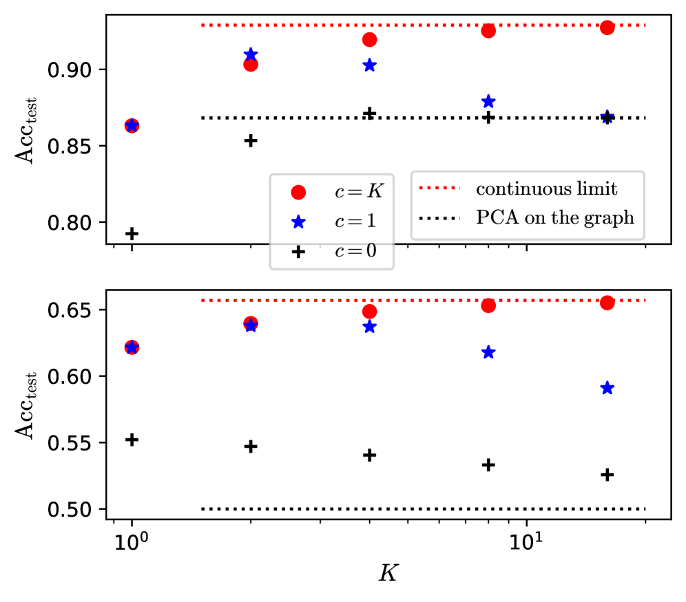
## Chart: Test Accuracy vs. K
### Overview
The image presents two line charts displaying the relationship between 'K' (likely the number of clusters or components) and 'ACCtest' (test accuracy). The top chart shows accuracy values generally above 0.85, while the bottom chart shows values between 0.5 and 0.65. Each chart includes three data series, distinguished by color and marker shape, representing different values of 'c' (likely a parameter influencing the model). Horizontal dotted lines indicate 'continuous limit' and 'PCA on the graph' thresholds.
### Components/Axes
* **X-axis:** 'K', ranging from approximately 10⁰ to 10¹. The scale is logarithmic.
* **Y-axis:** 'ACCtest', ranging from approximately 0.5 to 0.95.
* **Legend (Top-Right of each chart):**
* Red circles: 'c = K'
* Blue stars: 'c = 1'
* Black plus signs: 'c = 0'
* Red dotted line: 'continuous limit'
* Black dotted line: 'PCA on the graph'
* **Horizontal Dotted Lines:**
* Top Chart: 'continuous limit' at approximately 0.92, 'PCA on the graph' at approximately 0.87.
* Bottom Chart: 'continuous limit' at approximately 0.65, 'PCA on the graph' at approximately 0.52.
### Detailed Analysis or Content Details
**Top Chart:**
* **c = K (Red Circles):** The line starts at approximately (10⁰, 0.87), rises to a peak of approximately (3, 0.92), then declines slightly to approximately (10¹, 0.90).
* **c = 1 (Blue Stars):** The line starts at approximately (10⁰, 0.85), rises to approximately (3, 0.91), then declines to approximately (10¹, 0.88).
* **c = 0 (Black Plus Signs):** The line remains relatively flat, starting at approximately (10⁰, 0.83) and ending at approximately (10¹, 0.85).
**Bottom Chart:**
* **c = K (Red Circles):** The line starts at approximately (10⁰, 0.62), rises to approximately (3, 0.65), then declines to approximately (10¹, 0.63).
* **c = 1 (Blue Stars):** The line starts at approximately (10⁰, 0.63), rises to approximately (3, 0.65), then declines to approximately (10¹, 0.57).
* **c = 0 (Black Plus Signs):** The line remains relatively flat, starting at approximately (10⁰, 0.54) and ending at approximately (10¹, 0.53).
### Key Observations
* In both charts, the 'c = 0' data series exhibits the lowest accuracy values and remains relatively stable across the range of 'K'.
* The 'c = K' and 'c = 1' data series show similar trends, with accuracy increasing initially and then decreasing as 'K' increases.
* The top chart consistently shows higher accuracy values than the bottom chart.
* The 'continuous limit' line appears to represent an upper bound on achievable accuracy.
* The 'PCA on the graph' line represents a lower bound on achievable accuracy.
### Interpretation
The charts likely represent the performance of a model (or multiple models with different parameter settings) as the number of components ('K') is varied. The parameter 'c' likely controls some aspect of the model's regularization or complexity.
The top chart suggests that for higher accuracy, the model performs best with a moderate value of 'K' (around 3) and either 'c = K' or 'c = 1'. The 'continuous limit' and 'PCA on the graph' lines indicate the theoretical maximum and minimum achievable accuracy, respectively.
The bottom chart shows significantly lower accuracy values, suggesting that the model configuration represented by this chart is less effective. The relatively flat 'c = 0' line indicates that this configuration is not sensitive to changes in 'K'.
The difference between the two charts could be due to different datasets, different model architectures, or different hyperparameter settings. The charts demonstrate a trade-off between model complexity ('K') and accuracy, and the optimal value of 'K' depends on the specific model configuration ('c'). The consistent performance of 'c=0' suggests it may be a baseline or a highly regularized configuration that prevents overfitting but also limits the model's ability to capture complex patterns in the data.