## Scatter Plot with Fitted Curve: Mean Pass Rate vs. Mean Number of Tokens Generated
### Overview
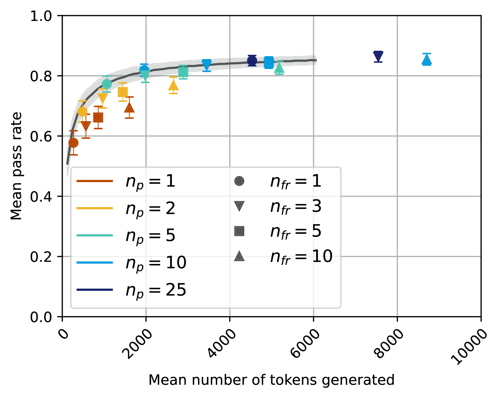
The image is a technical scatter plot displaying the relationship between the "Mean number of tokens generated" (x-axis) and the "Mean pass rate" (y-axis). It includes multiple data series differentiated by color and marker shape, each with vertical error bars. A dark gray fitted curve with a light gray shaded confidence interval is overlaid on the data, suggesting a modeled trend. The plot is contained within a grid.
### Components/Axes
* **X-Axis:** Labeled "Mean number of tokens generated". The scale is linear, ranging from 0 to 10000, with major tick marks and labels at 0, 2000, 4000, 6000, 8000, and 10000. The labels are rotated approximately 45 degrees.
* **Y-Axis:** Labeled "Mean pass rate". The scale is linear, ranging from 0.0 to 1.0, with major tick marks and labels at 0.0, 0.2, 0.4, 0.6, 0.8, and 1.0.
* **Legend:** Positioned in the bottom-left quadrant of the plot area. It is divided into two columns:
* **Left Column (Color Key):** Defines the parameter `n_p` by line color.
* Brown line: `n_p = 1`
* Gold/Yellow line: `n_p = 2`
* Teal line: `n_p = 5`
* Light Blue line: `n_p = 10`
* Dark Blue line: `n_p = 25`
* **Right Column (Marker Key):** Defines the parameter `n_fr` by marker shape.
* Circle: `n_fr = 1`
* Inverted Triangle: `n_fr = 3`
* Square: `n_fr = 5`
* Triangle: `n_fr = 10`
* **Data Series:** Each data point is a combination of a color (from `n_p`) and a marker shape (from `n_fr`). All points have vertical error bars indicating variability.
* **Fitted Curve:** A dark gray line that follows the general trend of the data, rising steeply from the origin and plateauing. It is surrounded by a light gray shaded region representing the confidence interval.
### Detailed Analysis
Data points are identified by their approximate coordinates (x, y), color (`n_p`), and marker shape (`n_fr`). Values are approximate due to visual estimation.
**Data Points (Approximate):**
* **Brown (`n_p=1`):**
* Circle (`n_fr=1`): (~100, 0.58)
* Inverted Triangle (`n_fr=3`): (~300, 0.63)
* Square (`n_fr=5`): (~600, 0.66)
* Triangle (`n_fr=10`): (~1200, 0.70)
* **Gold (`n_p=2`):**
* Circle (`n_fr=1`): (~200, 0.68)
* Inverted Triangle (`n_fr=3`): (~800, 0.74)
* Square (`n_fr=5`): (~1000, 0.75)
* Triangle (`n_fr=10`): (~2500, 0.76)
* **Teal (`n_p=5`):**
* Circle (`n_fr=1`): (~500, 0.77)
* Inverted Triangle (`n_fr=3`): (~1800, 0.81)
* Square (`n_fr=5`): (~2800, 0.81)
* Triangle (`n_fr=10`): (~5200, 0.82)
* **Light Blue (`n_p=10`):**
* Circle (`n_fr=1`): (~1000, 0.81)
* Inverted Triangle (`n_fr=3`): (~3500, 0.83)
* Square (`n_fr=5`): (~4800, 0.84)
* Triangle (`n_fr=10`): (~8800, 0.85)
* **Dark Blue (`n_p=25`):**
* Circle (`n_fr=1`): (~4500, 0.84)
* Inverted Triangle (`n_fr=3`): (~7500, 0.86)
**Fitted Curve Trend:** The curve starts near (0, 0.5), rises sharply until approximately x=2000 (y≈0.8), and then gradually flattens, approaching a horizontal asymptote near y=0.85 as x increases towards 6000 and beyond.
### Key Observations
1. **Primary Trend:** There is a strong, positive, non-linear relationship between the mean number of tokens generated and the mean pass rate. Performance improves rapidly with initial increases in token count and then experiences diminishing returns.
2. **Effect of `n_p` (Color):** For a given `n_fr` (marker shape), series with higher `n_p` values (cooler colors: teal, light blue, dark blue) consistently achieve higher mean pass rates at similar or higher token counts compared to lower `n_p` values (warmer colors: brown, gold).
3. **Effect of `n_fr` (Marker):** Within a single color series (`n_p`), increasing `n_fr` (moving from circle to triangle) generally corresponds to both a higher mean number of tokens generated and a slightly higher mean pass rate.
4. **Convergence:** All data series appear to converge towards a similar maximum pass rate (approximately 0.85-0.87) as the mean number of tokens generated becomes very large (>6000).
5. **Error Bars:** The vertical error bars indicate variability in the pass rate for each condition. The size of the error bars appears relatively consistent across the plot, without a clear trend of increasing or decreasing with x or y.
### Interpretation
This chart likely evaluates the performance (pass rate) of a generative model or system as a function of the average length of its output (tokens generated). The parameters `n_p` and `n_fr` represent different experimental conditions, possibly related to prompting strategies, number of attempts, or refinement steps.
The data suggests a fundamental trade-off: generating more tokens is associated with a higher probability of success (pass rate), but the benefit saturates. The initial steep climb indicates that a modest increase in output length yields significant reliability gains. The plateau implies that beyond a certain point (~2000-4000 tokens), simply making the output longer provides minimal additional benefit to the pass rate.
The separation by `n_p` indicates that this parameter is a key driver of efficiency. Higher `n_p` conditions achieve better pass rates with fewer tokens (are more efficient) and also reach a higher ultimate performance ceiling. The `n_fr` parameter seems to control a secondary axis of effort; increasing it consumes more tokens for a marginal gain in pass rate within a given `n_p` strategy.
The fitted curve models the underlying law of diminishing returns. The shaded confidence interval suggests the model's certainty is highest in the middle range of the data (1000-5000 tokens) and slightly less certain at the extremes. The convergence of all strategies at high token counts implies that with enough computational budget (tokens), most approaches can achieve near-peak performance, but smarter strategies (`n_p`) get there much faster.