## Scatter Plot: Mean Pass Rate vs. Mean Number of Tokens Generated
### Overview
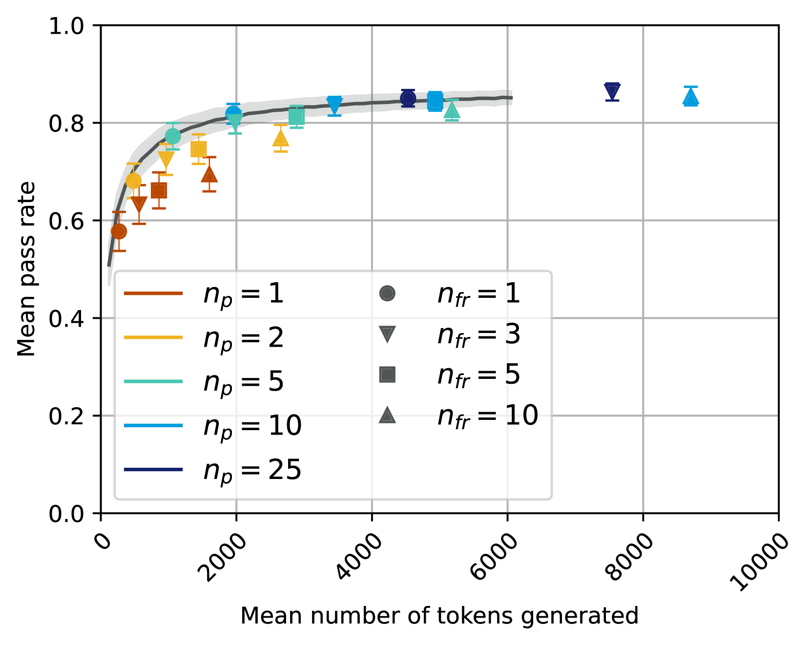
The image depicts a scatter plot analyzing the relationship between the mean number of tokens generated and the mean pass rate. Multiple data series are represented using distinct symbols and colors, with a trend line and shaded confidence interval. The plot suggests a positive correlation between token count and pass rate, with diminishing returns at higher token counts.
### Components/Axes
- **X-axis**: "Mean number of tokens generated" (0 to 10,000, linear scale)
- **Y-axis**: "Mean pass rate" (0.0 to 1.0, linear scale)
- **Legend**: Located in the bottom-left corner, mapping:
- **Colors/Symbols**:
- Red circles: `n_p = 1`, `n_fr = 1`
- Orange triangles: `n_p = 2`, `n_fr = 3`
- Teal squares: `n_p = 5`, `n_fr = 5`
- Blue triangles: `n_p = 10`, `n_fr = 10`
- Dark blue circles: `n_p = 25`, `n_fr = 1`
- **Trend Line**: Black curve with shaded gray confidence interval
### Detailed Analysis
1. **Trend Line**:
- Starts near (0, 0.5) and rises steeply, plateauing near (6,000, 0.85).
- Shaded area (confidence interval) widens slightly between 2,000–4,000 tokens, then narrows.
2. **Data Series**:
- **`n_p = 25` (dark blue circles)**: Highest pass rates (0.8–0.9) at 4,000–6,000 tokens.
- **`n_p = 10` (blue triangles)**: Pass rates ~0.7–0.85, peaking at 6,000 tokens.
- **`n_p = 5` (teal squares)**: Pass rates ~0.6–0.8, plateauing earlier (~4,000 tokens).
- **`n_p = 2` (orange triangles)**: Pass rates ~0.5–0.7, with lower variability.
- **`n_p = 1` (red circles)**: Pass rates ~0.4–0.6, clustered at lower token counts.
3. **Key Data Points**:
- At 2,000 tokens: Pass rates range from 0.55 (n_p=1) to 0.75 (n_p=25).
- At 6,000 tokens: All series converge near 0.8–0.85 pass rate.
- Beyond 8,000 tokens: Minimal improvement (pass rates stabilize ~0.85–0.9).
### Key Observations
- **Diminishing Returns**: Pass rate improvements plateau after ~6,000 tokens, regardless of `n_p`.
- **Efficiency Tradeoff**: Higher `n_p` values achieve better pass rates with fewer tokens (e.g., `n_p=25` reaches 0.85 at 4,000 tokens vs. `n_p=1` at 6,000 tokens).
- **Symbol Consistency**: All legend mappings align with plotted data (e.g., `n_p=10` = blue triangles).
### Interpretation
The data demonstrates that increasing the mean number of tokens generated (`n_p`) improves the mean pass rate, but with diminishing returns beyond ~6,000 tokens. The shaded confidence interval suggests the trend is statistically robust, though variability exists at lower token counts. The legend’s `n_fr` values (e.g., `n_fr=3` for `n_p=2`) may represent experimental conditions or subgroups, but their impact on pass rate is less clear without additional context. The plot implies optimizing `n_p` to balance token efficiency and performance, with `n_p=25` offering the best tradeoff in this dataset.