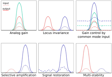
## Chart Type: Comparative Response Curves
### Overview
The image presents six separate plots, each illustrating the relationship between an "input" signal and the resulting "output" signal under different conditions or system configurations. Each plot shows response curves, with the x-axis representing the input signal strength or frequency (unspecified, but assumed to be consistent across plots), and the y-axis representing the output signal strength. The plots are arranged in a 2x3 grid.
### Components/Axes
* **X-axis:** Implicitly represents the input signal characteristic (e.g., strength, frequency). No explicit scale is provided.
* **Y-axis:** Represents the output signal strength. No explicit scale is provided.
* **Legend (Top-Left of the first plot):**
* `input`: Represented by dotted lines, typically in red or blue.
* `output`: Represented by solid lines, typically in red, blue, or green.
* **Plot Titles (Below each plot):**
* Analog gain
* Locus invariance
* Gain control by common mode input
* Selective amplification
* Signal restoration
* Multi-stability
### Detailed Analysis
**1. Analog Gain (Top-Left)**
* **Input:** Several dotted red lines, each representing a different input level. The peaks of these curves increase from left to right.
* **Output:** A solid green line, showing a single peak. The peak is significantly higher than any of the input peaks.
* **Trend:** The analog gain plot shows that the output signal is amplified relative to the input signal. The amplification factor appears to be non-linear, as the output peak is much larger than the largest input peak.
**2. Locus Invariance (Top-Middle)**
* **Input:** Not explicitly shown, but implied.
* **Output:** Two solid red lines, each showing a single peak. The peaks are separated along the x-axis.
* **Trend:** The locus invariance plot suggests that the system responds to two distinct input locations or frequencies, producing two separate output peaks.
**3. Gain Control by Common Mode Input (Top-Right)**
* **Input:** A dotted red line with a single peak and a dashed blue line that is relatively flat.
* **Output:** A solid blue line with a single peak, and a solid green line with a single peak. The green peak is slightly lower than the blue peak. A dashed green line is also present, with a single peak.
* **Trend:** This plot shows how a common mode input (represented by the dashed blue line) can influence the gain of the system. The output signal varies depending on the presence and characteristics of the common mode input.
**4. Selective Amplification (Bottom-Left)**
* **Input:** A dotted red line with two small peaks.
* **Output:** A solid blue line with a single, large peak.
* **Trend:** The selective amplification plot indicates that the system amplifies only one of the input signals, suppressing the other.
**5. Signal Restoration (Bottom-Middle)**
* **Input:** A dashed blue line with multiple small oscillations.
* **Output:** A solid blue line with a single, large peak.
* **Trend:** The signal restoration plot demonstrates the system's ability to reconstruct a clean signal from a noisy or distorted input.
**6. Multi-Stability (Bottom-Right)**
* **Input:** A dotted red line with two small peaks.
* **Output:** A solid red line with a single, large peak.
* **Trend:** The multi-stability plot suggests that the system can maintain a stable output state even with multiple potential input signals.
### Key Observations
* Each plot demonstrates a different type of signal processing or system behavior.
* The "input" and "output" signals are represented by different line styles (dotted vs. solid) and colors.
* The plots lack explicit scales on the x and y axes, making it difficult to quantify the relationships between input and output signals.
### Interpretation
The image illustrates various signal processing concepts, such as amplification, filtering, and signal restoration. Each plot demonstrates a specific functionality or characteristic of a system in response to different input signals. The absence of explicit scales limits the quantitative analysis, but the qualitative relationships between input and output signals are clearly depicted. The plots suggest that the system can perform a variety of signal processing tasks, including amplifying specific signals, suppressing noise, and maintaining stable output states. The "Gain control by common mode input" plot highlights the importance of considering common mode signals in system design.