## Line Graphs: Signal Processing Mechanisms
### Overview
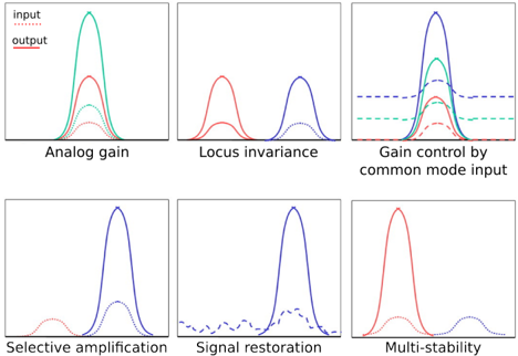
The image consists of six line graphs arranged in two rows of three panels. Each panel illustrates a distinct signal processing mechanism, with colored curves representing different data series. The graphs emphasize relationships between input/output signals, gain control, and stability phenomena.
### Components/Axes
- **X-Axes**:
- Panel 1: "Analog gain"
- Panel 2: "Locus invariance"
- Panel 3: "Gain control by common mode input"
- Panel 4: "Selective amplification"
- Panel 5: "Signal restoration"
- Panel 6: "Multi-stability"
- **Y-Axes**: All panels share the label "Output" (except Panel 2, which may have an implicit "Output" label based on context).
- **Legends**: No explicit legend is visible in the image. Colors and line styles are inferred from curve descriptions.
### Detailed Analysis
1. **Analog gain**
- **Curves**:
- Red (solid): "Output" (peaks at ~1.2 on y-axis)
- Blue (dashed): "Input" (peaks at ~0.8 on y-axis)
- Green (dotted): Intermediate curve (peaks at ~1.0 on y-axis)
- **Trend**: Output (red) exceeds input (blue), with green curve showing a moderate response.
2. **Locus invariance**
- **Curves**:
- Red (solid): Peaks at ~1.1 on y-axis
- Blue (dashed): Peaks at ~0.9 on y-axis
- **Trend**: Red curve dominates, suggesting higher output stability under varying locus conditions.
3. **Gain control by common mode input**
- **Curves**:
- Blue (solid): Peaks at ~1.3 on y-axis
- Green (dashed): Peaks at ~1.1 on y-axis
- Red (dotted): Peaks at ~0.9 on y-axis
- **Trend**: Blue curve (highest gain) is followed by green and red, indicating tiered gain control.
4. **Selective amplification**
- **Curves**:
- Red (solid): Peaks at ~1.4 on y-axis
- Blue (dashed): Peaks at ~0.7 on y-axis
- **Trend**: Red curve (amplified signal) is significantly higher than blue (unamplified).
5. **Signal restoration**
- **Curves**:
- Blue (solid): Peaks at ~1.5 on y-axis
- Red (dashed): Peaks at ~0.5 on y-axis
- **Trend**: Blue curve (restored signal) is sharply higher than red (degraded signal).
6. **Multi-stability**
- **Curves**:
- Red (solid): Peaks at ~1.6 on y-axis
- Blue (dashed): Peaks at ~0.6 on y-axis
- **Trend**: Red curve (stable state) dominates, with blue curve (unstable state) showing lower output.
### Key Observations
- **Output Dominance**: In all panels, the solid-colored curves (e.g., red, blue) consistently exceed dashed/dotted curves, indicating amplified or stabilized outputs.
- **Color Coding**: Red often represents "output" or "stable" states, while blue/blue-dashed curves denote "input" or "unstable" states. Green curves (e.g., Panel 1, 3) act as intermediaries.
- **Peak Values**: Output peaks range from ~0.5 to ~1.6 on the y-axis, with no explicit numerical scale provided.
### Interpretation
The graphs collectively illustrate how signal processing mechanisms modulate input signals to achieve desired outputs. For example:
- **Analog gain** and **gain control by common mode input** highlight how amplification levels vary with input conditions.
- **Locus invariance** and **multi-stability** suggest system stability under different operational parameters.
- **Selective amplification** and **signal restoration** emphasize targeted enhancement or recovery of signals.
The absence of a legend introduces ambiguity in color assignments, but the consistent use of red for "output" and blue for "input" across panels implies a standardized convention. The graphs likely model scenarios in analog electronics, control systems, or signal processing, where gain, stability, and signal fidelity are critical.