## Trajectory Plots: Varying 'n' Values
### Overview
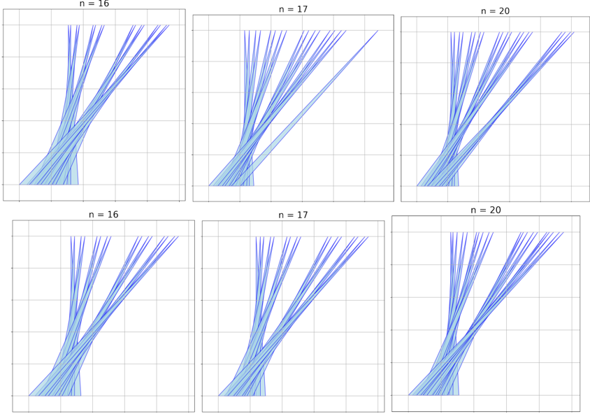
The image presents six trajectory plots arranged in a 2x3 grid. Each plot displays multiple blue lines originating from a common point at the bottom and diverging upwards. The plots are distinguished by the value of 'n' indicated at the top of each subplot. The values of 'n' are 16, 17, and 20, with each value appearing twice.
### Components/Axes
* **Axes:** Each plot has a horizontal and vertical axis, but they are not labeled with specific values. The axes are marked with a grid.
* **Trajectories:** Multiple blue lines represent trajectories, starting from a common origin at the bottom and diverging upwards. The lines are of varying shades of blue, with a lighter blue shaded region around the lines, indicating a possible confidence interval or spread.
* **Titles:** Each subplot is titled with "n = [value]", where [value] is either 16, 17, or 20.
### Detailed Analysis
The plots are arranged as follows:
* **Top Row:**
* Left: n = 16
* Center: n = 17
* Right: n = 20
* **Bottom Row:**
* Left: n = 16
* Center: n = 17
* Right: n = 20
Each plot shows a set of trajectories that start from approximately the same point at the bottom of the graph and then spread out as they move upwards. The spread of the trajectories appears to increase as 'n' increases. The shaded region around the trajectories also seems to widen with increasing 'n'.
**Specific Observations:**
* **n = 16 (Top-Left):** The trajectories are relatively close together, with a narrow shaded region.
* **n = 17 (Top-Center):** The trajectories show a slightly wider spread compared to n = 16, and the shaded region is also wider.
* **n = 20 (Top-Right):** The trajectories have the widest spread among the three values, and the shaded region is also the broadest.
* **n = 16 (Bottom-Left):** Similar to the top-left plot, the trajectories are relatively close together.
* **n = 17 (Bottom-Center):** Similar to the top-center plot, the trajectories show a slightly wider spread compared to n = 16.
* **n = 20 (Bottom-Right):** Similar to the top-right plot, the trajectories have the widest spread.
### Key Observations
* The spread of the trajectories increases as the value of 'n' increases.
* The shaded region around the trajectories also widens with increasing 'n'.
* The plots with the same 'n' value appear visually similar.
### Interpretation
The plots likely represent simulations or experimental data where 'n' is a parameter that influences the variability or uncertainty of the trajectories. As 'n' increases, the trajectories become more dispersed, suggesting that the system becomes more unpredictable or sensitive to initial conditions. The shaded region likely represents a confidence interval or the range of possible outcomes, which also increases with 'n', further supporting the idea of increased uncertainty. The data suggests a positive correlation between 'n' and the spread of the trajectories.