\n
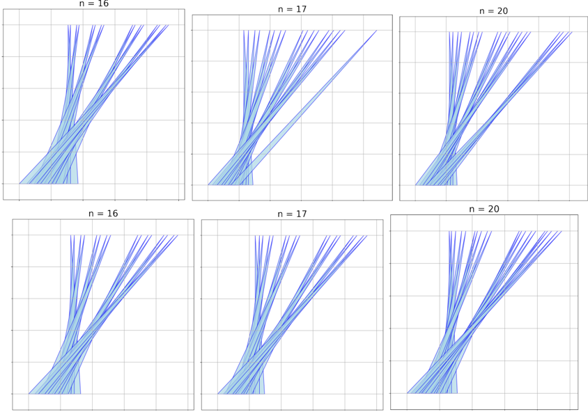
## Line Chart Grid: Trajectory Plots for Varying n
### Overview
The image displays a 2x3 grid of six line charts. Each chart shows multiple blue lines (trajectories) originating from a common point in the bottom-left corner and spreading upward and to the right. The charts are organized by a parameter `n`, with values 16, 17, and 20. The top row and bottom row appear to be duplicates or very similar visualizations for the same `n` values. There are no axis labels, numerical markers, or legends present.
### Components/Axes
* **Titles:** Each chart has a title centered above it: `n = 16`, `n = 17`, `n = 20`. These titles are repeated in the second row.
* **Axes:** The charts have a visible grid but no labeled axes or numerical tick marks. The grid suggests a Cartesian coordinate system.
* **Data Series:** Each chart contains multiple (approximately 10-20) solid blue lines. All lines within a chart are the same color and style.
* **Legend:** No legend is present.
### Detailed Analysis
* **Spatial Layout:** The six charts are arranged in two rows and three columns. The column headers (titles) are `n = 16` (left), `n = 17` (center), and `n = 20` (right).
* **Trend Verification (Per Chart):**
* **General Trend:** In every chart, all lines exhibit a positive, roughly linear or slightly curved trend, moving from the bottom-left quadrant toward the top-right quadrant.
* **Spread/Variability:** The key difference between charts is the spread or dispersion of the lines.
* **n = 16:** Lines are relatively tightly clustered. They form a narrow fan shape.
* **n = 17:** The spread of lines is slightly wider than for n=16.
* **n = 20:** The lines show the greatest dispersion, forming a broad fan. The rightmost lines reach further to the right edge of the plot area compared to the n=16 and n=17 charts.
* **Component Isolation (Per Plot Region):**
* **Origin Point (Bottom-Left):** All lines in all charts converge at or very near the bottom-left corner of the grid.
* **Termination Area (Top/Right):** Lines terminate at various points along the top and right edges of the grid. The termination points are more scattered for higher `n`.
* **Grid:** A light gray grid is visible in the background of each plot, dividing the area into roughly 5x5 or 6x6 major cells.
### Key Observations
1. **Parameter `n` Correlates with Dispersion:** The primary visual variable is the parameter `n`. As `n` increases from 16 to 20, the fan of trajectories becomes noticeably wider, indicating greater variability in the final positions of the lines.
2. **Common Origin:** All trajectories share an identical starting point, suggesting a controlled initial condition.
3. **Lack of Quantitative Data:** The absence of axis labels and scales prevents the extraction of specific numerical coordinates, slopes, or rates of change. The analysis is purely qualitative and comparative.
4. **Duplicate Rows:** The bottom row of charts appears to be a visual duplicate of the top row for the corresponding `n` values. No discernible difference in line patterns is evident between the two rows.
### Interpretation
This visualization likely demonstrates the effect of a parameter `n` on the outcome of a stochastic (random) process or a system with sensitive dependence on initial conditions.
* **What the Data Suggests:** The plots show that increasing `n` increases the variance or entropy of the system's final state. If each line represents a single simulation run or sample, a higher `n` leads to a wider range of possible outcomes.
* **Relationship Between Elements:** The parameter `n` is the independent variable, and the dispersion of the trajectory endpoints is the dependent variable. The common origin is a controlled constant.
* **Potential Context:** This could represent:
* The paths of particles in a diffusion process where `n` is related to time or number of steps.
* The results of a random walk or Monte Carlo simulation where `n` is the number of iterations or dimensions.
* The behavior of a numerical algorithm where `n` is a precision or complexity parameter, with higher `n` allowing for more divergent solutions.
* **Anomalies:** The main "anomaly" is the systematic increase in spread with `n`, which is the central finding the visualization communicates. The lack of axis labels is a significant limitation for technical interpretation, suggesting this image may be from a context where the axes are understood (e.g., a research paper with a detailed caption) or is meant to show a qualitative pattern only.
**Language Declaration:** All text in the image is in English.