## Scatter Plot: Method Performance Comparison (Accuracy vs. Computational Steps)
### Overview
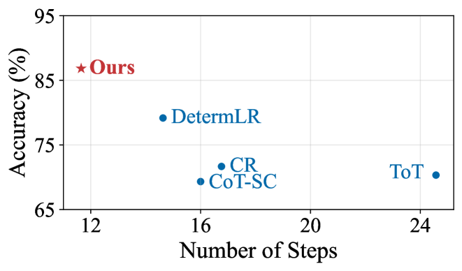
The image is a 2D scatter plot comparing the performance of five different methods or algorithms. The plot visualizes the trade-off between computational cost (measured in "Number of Steps") and performance (measured as "Accuracy (%)"). One method, labeled "Ours," is highlighted with a distinct red star, suggesting it is the proposed or primary method of the study from which this figure originates.
### Components/Axes
* **Chart Type:** Scatter Plot
* **X-Axis:**
* **Label:** "Number of Steps"
* **Scale:** Linear, ranging from approximately 11 to 25.
* **Major Ticks:** 12, 16, 20, 24.
* **Y-Axis:**
* **Label:** "Accuracy (%)"
* **Scale:** Linear, ranging from 65 to 95.
* **Major Ticks:** 65, 75, 85, 95.
* **Data Series & Legend:** The legend is embedded directly in the plot area, with labels placed adjacent to their corresponding data points.
* **"Ours":** Represented by a **red star (★)**. Positioned in the top-left quadrant.
* **"DetermLR":** Represented by a **blue circle (●)**. Positioned in the upper-middle area.
* **"CR":** Represented by a **blue circle (●)**. Positioned near the center, slightly below "DetermLR".
* **"CoT-SC":** Represented by a **blue circle (●)**. Positioned just below and slightly left of "CR".
* **"ToT":** Represented by a **blue circle (●)**. Positioned in the bottom-right quadrant.
### Detailed Analysis
The plot contains five distinct data points. Below is an analysis of each, including approximate coordinate extraction and trend description.
1. **"Ours" (Red Star)**
* **Spatial Position:** Top-left corner of the data cluster.
* **Approximate Coordinates:** (X ≈ 12, Y ≈ 88).
* **Trend Description:** This point represents the highest accuracy and the lowest number of steps among all plotted methods.
2. **"DetermLR" (Blue Circle)**
* **Spatial Position:** Upper-middle region, to the right and below "Ours".
* **Approximate Coordinates:** (X ≈ 15, Y ≈ 79).
* **Trend Description:** Shows a significant drop in accuracy (~9 percentage points) compared to "Ours" for a moderate increase in steps (~3 more steps).
3. **"CR" (Blue Circle)**
* **Spatial Position:** Near the center of the plot.
* **Approximate Coordinates:** (X ≈ 17, Y ≈ 72).
* **Trend Description:** Positioned below "DetermLR", indicating lower accuracy for a slightly higher step count.
4. **"CoT-SC" (Blue Circle)**
* **Spatial Position:** Just below and slightly left of "CR".
* **Approximate Coordinates:** (X ≈ 16, Y ≈ 69).
* **Trend Description:** Has the second-lowest accuracy and a step count similar to "CR".
5. **"ToT" (Blue Circle)**
* **Spatial Position:** Far right, bottom quadrant.
* **Approximate Coordinates:** (X ≈ 24.5, Y ≈ 70).
* **Trend Description:** This method requires the highest number of steps by a large margin but achieves an accuracy only marginally better than "CoT-SC" and worse than "CR".
### Key Observations
* **Dominant Performance:** The method labeled "Ours" is a clear outlier, achieving the highest accuracy (~88%) with the fewest computational steps (~12). This represents a Pareto-optimal point on the chart.
* **Inverse General Trend:** Among the four blue-circle methods, there is no clear positive correlation between steps and accuracy. In fact, the method with the most steps ("ToT") has one of the lowest accuracies.
* **Clustering:** "CR" and "CoT-SC" form a cluster with similar step counts (16-17) and relatively low accuracy (69-72%).
* **Efficiency Gap:** There is a substantial performance gap between the proposed method ("Ours") and all other compared methods in this visualization.
### Interpretation
This chart is designed to demonstrate the superior efficiency and effectiveness of the "Ours" method. The data suggests that "Ours" achieves a breakthrough in the accuracy-efficiency trade-off, delivering top-tier performance while being significantly less computationally expensive (requiring fewer steps) than alternatives like "DetermLR", "CR", "CoT-SC", and especially "ToT".
The poor performance of "ToT" (high steps, low accuracy) is particularly notable, indicating it may be an inefficient approach for the task measured here. The clustering of "CR" and "CoT-SC" suggests these methods may share similar underlying mechanisms or limitations.
The visual rhetoric—using a distinct red star for "Ours" placed in the coveted "high accuracy, low cost" top-left corner—is a powerful and intentional choice to highlight the proposed method's advantage. The chart effectively argues that "Ours" is not just incrementally better but represents a different class of performance compared to the other plotted techniques.