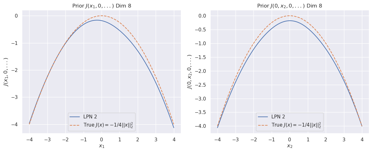
## Line Charts: Prior J(x1, 0, ...) and Prior J(0, x2, 0, ...)
### Overview
The image contains two line charts side-by-side, comparing the performance of "LPN 2" against a "True J(x)" function. Both charts depict a similar downward-sloping curve, with the x-axis representing either x1 or x2, and the y-axis representing the function J(x1, 0, ...) or J(0, x2, 0, ...). The "True J(x)" curve is slightly above the "LPN 2" curve in both charts. Both charts are titled "Prior J(...) Dim 8".
### Components/Axes
**Left Chart:**
* **Title:** Prior J(x1, 0,...) Dim 8
* **X-axis:** x1, ranging from -4 to 4 in increments of 1.
* **Y-axis:** J(x1, 0,...), ranging from -4 to 0 in increments of 1.
* **Legend (bottom-left):**
* Blue line: LPN 2
* Dashed orange line: True J(x) = -1/4||x||²
**Right Chart:**
* **Title:** Prior J(0, x2, 0,...) Dim 8
* **X-axis:** x2, ranging from -4 to 4 in increments of 1.
* **Y-axis:** J(0, x2, 0,...), ranging from -4.0 to 0.0 in increments of 0.5.
* **Legend (bottom-left):**
* Blue line: LPN 2
* Dashed orange line: True J(x) = -1/4||x||²
### Detailed Analysis
**Left Chart (Prior J(x1, 0,...)):**
* **LPN 2 (Blue):** The curve starts at approximately -4 when x1 is -4, rises to a peak of approximately 0 when x1 is 0, and then decreases back to approximately -4 when x1 is 4.
* x1 = -4, J(x1, 0, ...) ≈ -4
* x1 = -2, J(x1, 0, ...) ≈ -1
* x1 = 0, J(x1, 0, ...) ≈ 0
* x1 = 2, J(x1, 0, ...) ≈ -1
* x1 = 4, J(x1, 0, ...) ≈ -4
* **True J(x) = -1/4||x||² (Dashed Orange):** The curve starts at approximately -4 when x1 is -4, rises to a peak of approximately 0 when x1 is 0, and then decreases back to approximately -4 when x1 is 4. The orange line is consistently slightly above the blue line.
* x1 = -4, J(x1, 0, ...) ≈ -4
* x1 = -2, J(x1, 0, ...) ≈ -1
* x1 = 0, J(x1, 0, ...) ≈ 0
* x1 = 2, J(x1, 0, ...) ≈ -1
* x1 = 4, J(x1, 0, ...) ≈ -4
**Right Chart (Prior J(0, x2, 0,...)):**
* **LPN 2 (Blue):** The curve starts at approximately -4 when x2 is -4, rises to a peak of approximately 0 when x2 is 0, and then decreases back to approximately -4 when x2 is 4.
* x2 = -4, J(0, x2, 0, ...) ≈ -4
* x2 = -2, J(0, x2, 0, ...) ≈ -1
* x2 = 0, J(0, x2, 0, ...) ≈ 0
* x2 = 2, J(0, x2, 0, ...) ≈ -1
* x2 = 4, J(0, x2, 0, ...) ≈ -4
* **True J(x) = -1/4||x||² (Dashed Orange):** The curve starts at approximately -4 when x2 is -4, rises to a peak of approximately 0 when x2 is 0, and then decreases back to approximately -4 when x2 is 4. The orange line is consistently slightly above the blue line.
* x2 = -4, J(0, x2, 0, ...) ≈ -4
* x2 = -2, J(0, x2, 0, ...) ≈ -1
* x2 = 0, J(0, x2, 0, ...) ≈ -0.2
* x2 = 2, J(0, x2, 0, ...) ≈ -1
* x2 = 4, J(0, x2, 0, ...) ≈ -4
### Key Observations
* Both charts show a symmetrical, downward-sloping curve, indicating a similar relationship between x1/x2 and the function J.
* The "True J(x)" curve consistently outperforms "LPN 2", as it has slightly higher values across the range of x1 and x2.
* The minimum value for both curves in both charts is approximately -4, occurring at x1/x2 = -4 and x1/x2 = 4.
* The maximum value for both curves in both charts is approximately 0, occurring at x1/x2 = 0.
### Interpretation
The charts compare the performance of "LPN 2" to a "True J(x)" function, which is defined as -1/4||x||². The charts suggest that "LPN 2" approximates the "True J(x)" function, but with a slight underestimation. The fact that both charts are titled "Prior J(...) Dim 8" suggests that these are prior distributions in an 8-dimensional space, with the charts showing the marginal distributions along the x1 and x2 axes, while holding the other dimensions at 0. The similarity between the two charts indicates that the function behaves similarly with respect to both x1 and x2. The difference between the "LPN 2" and "True J(x)" curves could be due to approximations or simplifications made in the "LPN 2" model.