\n
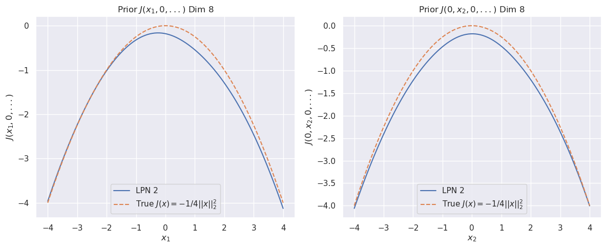
## Charts: Prior Distributions in 8 Dimensions
### Overview
The image presents two separate charts, both depicting prior distributions in an 8-dimensional space. Each chart visualizes a function of two variables (x1, 0, ...) and (0, x2, 0, ...), respectively, comparing the approximation provided by an LPN 2 model to the "true" function. Both charts share a similar structure and scale.
### Components/Axes
Both charts have the following components:
* **Title:** "Prior J(x1, 0, ...)" Dim 8" (left chart) and "Prior J(0, x2, 0, ...)" Dim 8" (right chart).
* **X-axis:** Labeled "x1" (left chart) and "x2" (right chart), ranging from approximately -4 to 4.
* **Y-axis:** Labeled "J(x1, 0, ...)" (left chart) and "J(0, x2, 0, ...)" (right chart), ranging from approximately -4 to 0.
* **Legend:** Located in the bottom-left corner of each chart.
* "LPN 2" - represented by a solid blue line.
* "True J(x) = -1/4||x||₂" - represented by a dashed orange line.
### Detailed Analysis or Content Details
**Left Chart (x1):**
* **LPN 2 (Blue Line):** The line starts at approximately -4 with a value of -3.8, increases to a peak around x1 = 0 with a value of approximately 0, and then decreases symmetrically to approximately -3.8 at x1 = 4. The curve appears parabolic.
* **True J(x) (Orange Dashed Line):** The dashed line starts at approximately -4 with a value of -4, increases to a peak around x1 = 0 with a value of approximately 0, and then decreases symmetrically to approximately -4 at x1 = 4. This curve also appears parabolic, and closely follows the LPN 2 line.
**Right Chart (x2):**
* **LPN 2 (Blue Line):** The line starts at approximately -4 with a value of -3.5, increases to a peak around x2 = 0 with a value of approximately -0.5, and then decreases symmetrically to approximately -3.5 at x2 = 4. The curve appears parabolic.
* **True J(x) (Orange Dashed Line):** The dashed line starts at approximately -4 with a value of -4, increases to a peak around x2 = 0 with a value of approximately -0.5, and then decreases symmetrically to approximately -4 at x2 = 4. This curve also appears parabolic, and closely follows the LPN 2 line.
### Key Observations
* Both charts show a similar parabolic shape for both the LPN 2 approximation and the true function.
* The LPN 2 approximation consistently underestimates the true function's value, particularly at the extremes of the x-axis.
* The difference between the LPN 2 approximation and the true function appears to be relatively small, suggesting a good approximation.
* The y-axis scales are slightly different between the two charts.
### Interpretation
These charts demonstrate the behavior of a Locally Private Neural Network (LPN) 2 model when approximating a prior distribution in an 8-dimensional space. The "true" function, J(x) = -1/4||x||₂, represents the actual prior distribution. The LPN 2 model provides an approximation of this distribution.
The fact that both curves are parabolic suggests that the LPN 2 model is capturing the general shape of the prior distribution. However, the consistent underestimation of the true function indicates that the LPN 2 model is introducing some bias. This bias is likely a consequence of the privacy mechanism employed by the LPN, which adds noise to the data to protect individual privacy.
The slight differences in the y-axis scales between the two charts might indicate that the sensitivity of the function to changes in x1 and x2 is different. The charts provide a visual comparison of the approximation quality of the LPN 2 model, highlighting the trade-off between privacy and accuracy. The closeness of the lines suggests a reasonable balance between these two factors.