## Line Plot: Normalized Log-Probability vs. Number of Layers at Different Temperatures
### Overview
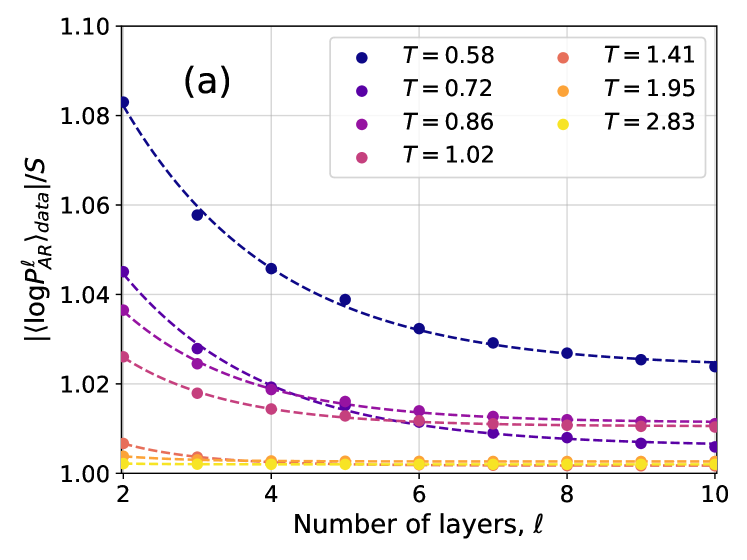
This image is a scientific line plot, labeled "(a)" in the top-left corner, showing the relationship between a normalized log-probability metric and the number of layers in a system, for seven different temperature values. The plot demonstrates how the metric changes with depth (layers) and how this relationship is strongly modulated by temperature.
### Components/Axes
* **Chart Label:** "(a)" located in the top-left quadrant of the plot area.
* **X-Axis:**
* **Title:** "Number of layers, ℓ"
* **Scale:** Linear, ranging from 2 to 10.
* **Major Ticks:** 2, 4, 6, 8, 10.
* **Y-Axis:**
* **Title:** `|(log P_AR^ℓ)_data| / S` (Absolute value of the log of P_AR to the power of ℓ, for the data, divided by S).
* **Scale:** Linear, ranging from 1.00 to 1.10.
* **Major Ticks:** 1.00, 1.02, 1.04, 1.06, 1.08, 1.10.
* **Legend:** Positioned in the top-right quadrant of the plot area. It contains seven entries, each associating a color with a temperature value `T`.
* **Entry 1:** Dark blue circle, `T = 0.58`
* **Entry 2:** Purple circle, `T = 0.72`
* **Entry 3:** Magenta circle, `T = 0.86`
* **Entry 4:** Pink circle, `T = 1.02`
* **Entry 5:** Salmon/Orange circle, `T = 1.41`
* **Entry 6:** Orange circle, `T = 1.95`
* **Entry 7:** Yellow circle, `T = 2.83`
* **Data Series:** Seven dashed lines, each with circular markers at integer layer values (ℓ = 2, 3, 4, 5, 6, 7, 8, 9, 10). The color of each line and its markers corresponds exactly to an entry in the legend.
### Detailed Analysis
**Trend Verification & Data Points (Approximate):**
The general trend is that the y-value decreases as the number of layers (ℓ) increases. The rate of decrease is highly dependent on temperature (T). Lower temperatures show a steep initial decline that flattens out, while higher temperatures show almost no change.
1. **Series T = 0.58 (Dark Blue):**
* **Trend:** Steepest downward slope, starting highest and decreasing rapidly before leveling off.
* **Approximate Points:** (2, 1.083), (3, 1.058), (4, 1.046), (5, 1.039), (6, 1.033), (7, 1.029), (8, 1.027), (9, 1.026), (10, 1.025).
2. **Series T = 0.72 (Purple):**
* **Trend:** Steep downward slope, starting second highest.
* **Approximate Points:** (2, 1.045), (3, 1.028), (4, 1.019), (5, 1.015), (6, 1.012), (7, 1.010), (8, 1.009), (9, 1.008), (10, 1.007).
3. **Series T = 0.86 (Magenta):**
* **Trend:** Moderate downward slope.
* **Approximate Points:** (2, 1.037), (3, 1.024), (4, 1.018), (5, 1.014), (6, 1.012), (7, 1.011), (8, 1.010), (9, 1.009), (10, 1.008).
4. **Series T = 1.02 (Pink):**
* **Trend:** Gentle downward slope.
* **Approximate Points:** (2, 1.026), (3, 1.018), (4, 1.014), (5, 1.012), (6, 1.011), (7, 1.010), (8, 1.009), (9, 1.008), (10, 1.007).
5. **Series T = 1.41 (Salmon/Orange):**
* **Trend:** Very slight downward slope, nearly flat.
* **Approximate Points:** (2, 1.007), (3, 1.005), (4, 1.004), (5, 1.003), (6, 1.003), (7, 1.002), (8, 1.002), (9, 1.002), (10, 1.002).
6. **Series T = 1.95 (Orange) & T = 2.83 (Yellow):**
* **Trend:** Essentially flat, horizontal lines.
* **Approximate Points (Both):** Hovering just above 1.000 across all layers, from ℓ=2 to ℓ=10. The yellow line (T=2.83) appears marginally lower than the orange line (T=1.95), but both are within ~0.002 of 1.000.
### Key Observations
1. **Temperature-Dependent Convergence:** All series converge toward a lower y-value as the number of layers increases, but the convergence point and rate are dictated by temperature.
2. **Low-Temperature Sensitivity:** At low temperatures (T ≤ 1.02), the metric is highly sensitive to the number of layers, especially for shallow networks (low ℓ).
3. **High-Temperature Insensitivity:** At high temperatures (T ≥ 1.41), the metric becomes largely invariant to the number of layers, remaining close to 1.00.
4. **Monotonic Ordering:** For any given layer number ℓ, the y-value is strictly ordered by temperature: lower T yields a higher y-value. This ordering is preserved across the entire x-axis range.
5. **Diminishing Returns:** For the low-temperature series, the most significant change occurs between ℓ=2 and ℓ=4. Adding layers beyond ℓ=6 results in very small incremental changes.
### Interpretation
This chart likely illustrates a phenomenon in statistical physics, machine learning (e.g., neural network theory), or information theory. The y-axis metric `|(log P_AR^ℓ)_data| / S` appears to be a normalized measure of a system's "surprise," "energy," or "deviation from a baseline" (S), possibly related to autoregressive probability (P_AR) over ℓ layers.
The data suggests a **phase transition-like behavior controlled by temperature**:
* **Low-Temperature Regime (T < ~1.4):** The system is in an "ordered" or "constrained" state. Here, the measured property is strongly dependent on system depth (layers). Shallow systems exhibit high deviation, which is progressively reduced as depth increases, suggesting that depth helps the system settle into a more stable or predictable configuration.
* **High-Temperature Regime (T > ~1.4):** The system is in a "disordered" or "entropic" state. Thermal noise dominates, rendering the system's property essentially independent of its structural depth. The metric saturates near its minimum value (1.00), indicating a baseline level of disorder or randomness that cannot be reduced by adding more layers.
The critical temperature appears to be around T ≈ 1.4, where the behavior shifts from depth-sensitive to depth-invariant. This type of analysis is crucial for understanding the capacity, stability, or learning dynamics of layered systems, indicating that there is an optimal temperature range where depth meaningfully influences the system's properties.