## Scatter Chart: Log Probability vs. Number of Layers
### Overview
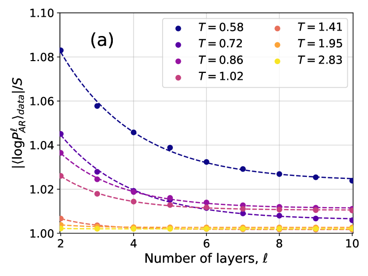
The image is a scatter plot showing the relationship between the absolute value of the log probability of something labeled 'AR' and the number of layers, for different temperatures (T). The plot includes data points for six different temperatures, each represented by a different color, and dashed lines that appear to be fitted to the data.
### Components/Axes
* **X-axis:** Number of layers, labeled as "Number of layers, l". The axis ranges from 2 to 10, with integer markings at each value.
* **Y-axis:** Absolute value of the log probability, labeled as "|<logP<sub>AR</sub><sup>l</sup>><sub>data</sub>|/S". The axis ranges from 1.00 to 1.10, with markings at intervals of 0.02.
* **Legend:** Located in the top-right corner, the legend indicates the temperature (T) associated with each color:
* Blue: T = 0.58
* Purple: T = 0.72
* Dark Purple: T = 0.86
* Pink: T = 1.02
* Orange: T = 1.41
* Yellow: T = 1.95
* Light Yellow: T = 2.83
* **Title:** There is a label "(a)" in the top-center of the chart.
### Detailed Analysis
* **T = 0.58 (Blue):** The blue data series shows a decreasing trend as the number of layers increases.
* At l = 2, the value is approximately 1.083.
* At l = 10, the value is approximately 1.024.
* **T = 0.72 (Purple):** The purple data series shows a decreasing trend as the number of layers increases.
* At l = 2, the value is approximately 1.045.
* At l = 10, the value is approximately 1.015.
* **T = 0.86 (Dark Purple):** The dark purple data series shows a decreasing trend as the number of layers increases.
* At l = 2, the value is approximately 1.035.
* At l = 10, the value is approximately 1.010.
* **T = 1.02 (Pink):** The pink data series shows a decreasing trend as the number of layers increases.
* At l = 2, the value is approximately 1.025.
* At l = 10, the value is approximately 1.007.
* **T = 1.41 (Orange):** The orange data series shows a slight decreasing trend as the number of layers increases.
* At l = 2, the value is approximately 1.007.
* At l = 10, the value is approximately 1.004.
* **T = 1.95 (Yellow):** The yellow data series shows a slight decreasing trend as the number of layers increases.
* At l = 2, the value is approximately 1.004.
* At l = 10, the value is approximately 1.002.
* **T = 2.83 (Light Yellow):** The light yellow data series shows a slight decreasing trend as the number of layers increases.
* At l = 2, the value is approximately 1.002.
* At l = 10, the value is approximately 1.001.
### Key Observations
* As the temperature (T) increases, the absolute value of the log probability generally decreases.
* For all temperatures, the absolute value of the log probability decreases as the number of layers increases. The rate of decrease is more pronounced at lower temperatures.
* The data points appear to be fitted with dashed lines, suggesting a functional relationship between the number of layers and the log probability for each temperature.
### Interpretation
The plot illustrates how the absolute value of the log probability changes with the number of layers at different temperatures. The decreasing trend observed for all temperatures suggests that as the number of layers increases, the log probability converges towards a certain value. The fact that the curves for higher temperatures are lower and flatter indicates that higher temperatures lead to a lower and more stable log probability value, less sensitive to the number of layers. This could imply that at higher temperatures, the system is less influenced by the number of layers, possibly due to increased thermal fluctuations.