\n
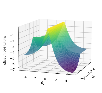
## 3D Surface Plot: Minimized Energy Landscape
### Overview
The image depicts a 3D surface plot representing a minimized energy landscape. The plot visualizes the relationship between two parameters, θ₁ and θ₂, and their corresponding minimized energy value. The surface is colored to indicate energy levels, with warmer colors (yellow/orange) representing lower energy and cooler colors (green/purple) representing higher energy.
### Components/Axes
* **X-axis:** θ₂ - ranges approximately from -4 to 4.
* **Y-axis:** θ₁ - ranges approximately from -4 to 4.
* **Z-axis:** Minimized Energy - ranges approximately from -7 to 1.
* **Surface:** Represents the minimized energy value for different combinations of θ₁ and θ₂.
* **Color Gradient:** Indicates energy levels. Yellow/orange represents lower energy, transitioning through green to purple for higher energy.
### Detailed Analysis
The surface exhibits a complex shape with multiple local minima and a prominent central peak.
* **Central Peak:** Located around θ₁ = 0 and θ₂ = 0, the surface rises to a local maximum with an energy value of approximately 1.
* **Left Minimum:** A broad minimum extends from approximately θ₁ = -4 to θ₁ = 0 and θ₂ = -4, with energy values ranging from approximately -3 to -7. The minimum appears to be shallowest at θ₂ = -4.
* **Right Minimum:** A similar broad minimum extends from approximately θ₁ = 0 to θ₁ = 4 and θ₂ = 4, with energy values ranging from approximately -3 to -7. The minimum appears to be shallowest at θ₂ = 4.
* **Saddle Points:** There are saddle points visible where the surface changes curvature, indicating transitions between different energy minima. These are located around θ₁ = -2, θ₂ = 2 and θ₁ = 2, θ₂ = -2.
* **Trend:** The surface generally decreases in energy as θ₁ and θ₂ move away from the central peak towards the minima on the left and right.
### Key Observations
* The energy landscape is not symmetrical. The minima on the left and right sides of the plot are not identical in shape or depth.
* The presence of multiple local minima suggests the possibility of multiple stable states or configurations.
* The central peak represents an unstable state, as any small perturbation would likely cause the system to move towards one of the minima.
### Interpretation
This plot likely represents the energy landscape of a system with two degrees of freedom, parameterized by θ₁ and θ₂. The minimized energy indicates the stability of different configurations of the system. The multiple minima suggest that the system can exist in several stable states, and the energy barrier between these states (represented by the height of the saddle points) determines the ease with which the system can transition between them. The shape of the landscape suggests a complex interplay between the two parameters, and the asymmetry indicates that the system is not invariant under certain transformations. This type of plot is common in fields like physics, chemistry, and machine learning, where it is used to visualize the energy landscape of a system and understand its behavior. The data suggests that the system will tend to settle into one of the two minima, and the specific minimum it settles into will depend on its initial conditions.