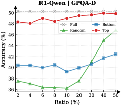
## Line Chart: R1-Qwen-7B on GPQA-D
### Overview
This is a line chart comparing the performance (accuracy) of four different methods or data selection strategies ("Full", "Random", "Bottom", "Top") on the R1-Qwen-7B model, evaluated on the GPQA-D dataset. The chart plots accuracy against an increasing ratio (percentage), likely representing the proportion of data used for training or evaluation.
### Components/Axes
* **Chart Title:** "R1-Qwen-7B on GPQA-D" (centered at the top).
* **Y-Axis:** Labeled "Accuracy (%)". The scale runs from 36 to 50, with major tick marks at 36, 38, 40, 42, 44, 46, 48, and 50.
* **X-Axis:** Labeled "Ratio (%)". The scale is non-linear, with marked points at 2, 4, 6, 8, 10, 20, 30, 40, and 50.
* **Legend:** Located in the top-left corner of the plot area. It defines four data series:
* **Full:** Represented by a gray line with 'x' markers.
* **Random:** Represented by a green line with upward-pointing triangle markers.
* **Bottom:** Represented by a blue line with square markers.
* **Top:** Represented by a red line with circle markers.
### Detailed Analysis
**1. "Full" Series (Gray line, 'x' markers):**
* **Trend:** This line is perfectly horizontal, indicating constant performance.
* **Data Points:** The accuracy remains fixed at **50%** across all ratio values from 2% to 50%. This likely represents a baseline or upper-bound performance using the full dataset.
**2. "Top" Series (Red line, circle markers):**
* **Trend:** This line shows a generally increasing trend with some fluctuation. It starts high, dips slightly, then rises to converge with the "Full" baseline.
* **Data Points (Approximate):**
* Ratio 2%: ~48.5%
* Ratio 4%: ~48.2%
* Ratio 6%: ~48.8%
* Ratio 8%: ~48.5%
* Ratio 10%: ~49.2%
* Ratio 20%: ~49.0%
* Ratio 30%: ~49.5%
* Ratio 40%: ~49.8%
* Ratio 50%: ~50.0% (matches "Full")
**3. "Bottom" Series (Blue line, square markers):**
* **Trend:** This line shows a gradual, steady upward trend after an initial plateau.
* **Data Points (Approximate):**
* Ratio 2%: ~40.2%
* Ratio 4%: ~40.0%
* Ratio 6%: ~39.8%
* Ratio 8%: ~40.2%
* Ratio 10%: ~39.2%
* Ratio 20%: ~40.0%
* Ratio 30%: ~40.8%
* Ratio 40%: ~41.8%
* Ratio 50%: ~42.5%
**4. "Random" Series (Green line, triangle markers):**
* **Trend:** This line shows a distinct "hockey stick" or exponential growth pattern. It remains low and flat for small ratios, then increases sharply after the 20% mark.
* **Data Points (Approximate):**
* Ratio 2%: ~37.0%
* Ratio 4%: ~36.8%
* Ratio 6%: ~36.2%
* Ratio 8%: ~36.5%
* Ratio 10%: ~36.2%
* Ratio 20%: ~38.0%
* Ratio 30%: ~41.0%
* Ratio 40%: ~44.5%
* Ratio 50%: ~47.0%
### Key Observations
1. **Performance Hierarchy:** At low data ratios (2-10%), there is a clear and significant performance gap: "Top" (~48-49%) >> "Bottom" (~40%) > "Random" (~36-37%).
2. **Convergence at High Ratios:** As the ratio increases to 50%, the performance of all methods improves, and the gaps narrow considerably. "Top" reaches the "Full" baseline, "Random" shows dramatic improvement, and "Bottom" improves steadily.
3. **Critical Threshold for Random Sampling:** The "Random" method exhibits a phase shift or critical threshold around the 20% ratio mark, after which its accuracy improves rapidly.
4. **Stability vs. Growth:** The "Top" method provides high and relatively stable performance even with very little data. The "Random" method is highly sensitive to the amount of data, performing poorly with small samples but becoming competitive with large samples.
5. **"Bottom" Method Underperformance:** The "Bottom" method consistently underperforms the "Top" method across all ratios, suggesting that selecting data based on whatever criterion "Bottom" represents is less effective than the "Top" criterion.
### Interpretation
This chart demonstrates the impact of data selection strategies on model performance when working with limited data (low ratios). The key insight is that **intelligent data selection ("Top") is vastly superior to random selection when data is scarce.** Using just 2% of the data selected by the "Top" method yields accuracy (~48.5%) that is nearly equal to using 50% of the data selected randomly (~47.0%).
The "Top" strategy likely selects the most informative or high-quality examples, allowing the model to learn efficiently. The "Bottom" strategy may select the least informative or most difficult examples, leading to slower learning. The "Random" strategy's performance curve is characteristic of learning curves in machine learning, where performance improves with more data, but the rate of improvement accelerates after a sufficient data volume is reached.
The flat "Full" line at 50% serves as the performance ceiling for this specific task and model setup. The fact that "Top" reaches this ceiling at a 50% ratio suggests that the other 50% of the data (presumably the "Bottom" half) contributes little to no additional performance gain for this model on this task. This has significant implications for efficient data curation and cost reduction in training or evaluation pipelines.