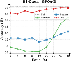
## Line Chart: R1-Qwen | GPQA-D Accuracy vs. Ratio
### Overview
The chart compares the accuracy performance of four different configurations (Full, Bottom, Random, Top) across varying ratios (2% to 50%). Accuracy is measured on a y-axis (36%–50%), while the x-axis represents the ratio percentage. A gray dashed reference line at 50% accuracy is included for benchmarking.
### Components/Axes
- **X-axis**: Ratio (%) – Increments from 2% to 50% in 2% steps.
- **Y-axis**: Accuracy (%) – Scale from 36% to 50%.
- **Legend**: Located in the top-right corner, with four entries:
- **Full**: Gray dashed line (flat performance).
- **Bottom**: Blue line (lowest initial accuracy).
- **Random**: Green line (most volatile trend).
- **Top**: Red line (highest final accuracy).
- **Reference Line**: Gray dashed line at 50% accuracy.
### Detailed Analysis
1. **Full (Gray Dashed Line)**:
- Remains flat at ~48–50% accuracy across all ratios.
- No significant variation observed.
2. **Bottom (Blue Line)**:
- Starts at ~40% accuracy at 2% ratio.
- Dips to ~39% at 10% ratio.
- Gradually rises to ~42% at 50% ratio.
- Trend: Slight upward trajectory with minor fluctuations.
3. **Random (Green Line)**:
- Begins at ~38% accuracy at 2% ratio.
- Drops to ~36% at 10% ratio.
- Sharp upward spike to ~45% at 40% ratio.
- Continues rising to ~48% at 50% ratio.
- Trend: Highly volatile, with a dramatic increase in later ratios.
4. **Top (Red Line)**:
- Starts at ~48% accuracy at 2% ratio.
- Peaks at ~50% accuracy by 40% ratio.
- Slight dip to ~49.5% at 50% ratio.
- Trend: Steady upward climb with minor stabilization at higher ratios.
### Key Observations
- **Top** and **Full** configurations consistently outperform others, with **Top** reaching the 50% benchmark.
- **Random** shows the most significant improvement, surpassing **Bottom** and **Full** at higher ratios (40%+).
- **Bottom** remains the lowest-performing configuration throughout.
- The **Random** configuration’s sharp rise at 40% ratio suggests a potential threshold effect or optimization at mid-to-high ratios.
### Interpretation
The data suggests that **Top** and **Full** configurations are optimized for high accuracy, with **Top** achieving near-perfect performance. The **Random** configuration’s volatility indicates inconsistent behavior, though it outperforms others at higher ratios. The **Bottom** configuration’s flat trajectory implies limited adaptability. The 50% reference line highlights a performance ceiling, with only **Top** and **Full** approaching it. The sharp rise in **Random** at 40% ratio warrants further investigation into whether specific ratio thresholds unlock hidden efficiencies.