## Heatmap: Spatio-temporal Data Visualization
### Overview
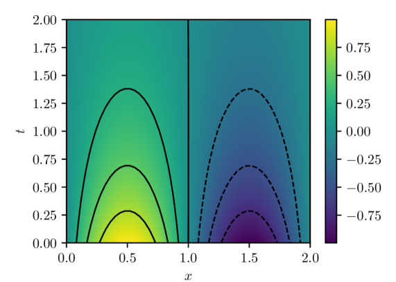
The image is a heatmap visualizing data across two dimensions, x and t, with a color gradient representing the data values. The heatmap is divided into two regions by a vertical line at x=1.0. The left region shows positive values, while the right region shows negative values. Contour lines are overlaid on the heatmap to highlight specific value levels.
### Components/Axes
* **X-axis:** Horizontal axis labeled "x", ranging from 0.0 to 2.0 in increments of 0.5.
* **Y-axis:** Vertical axis labeled "t", ranging from 0.0 to 2.0 in increments of 0.25.
* **Colorbar:** Located on the right side of the image, representing the data values. The colorbar ranges from -0.75 (dark purple) to 0.75 (yellow). Intermediate values are represented by shades of green and blue.
* **Contour Lines:** Solid black lines on the left side and dashed black lines on the right side, indicating specific data value levels.
### Detailed Analysis
* **Left Region (x: 0.0 to 1.0):**
* The heatmap shows a region of positive values, with the highest values (yellow) concentrated around x=0.5 and t=0.0.
* The values decrease as t increases, forming a bell-shaped distribution.
* Three solid black contour lines are present, indicating specific value levels. The innermost contour line is closest to the yellow region, and the outermost contour line is furthest.
* The approximate t values for the peaks of the three solid contour lines are 0.2, 0.7, and 1.3.
* **Right Region (x: 1.0 to 2.0):**
* The heatmap shows a region of negative values, with the lowest values (dark purple) concentrated around x=1.5 and t=0.0.
* The values increase (become less negative) as t increases, forming an inverted bell-shaped distribution.
* Three dashed black contour lines are present, indicating specific value levels. The innermost contour line is closest to the dark purple region, and the outermost contour line is furthest.
* The approximate t values for the peaks of the three dashed contour lines are 0.2, 0.7, and 1.3.
### Key Observations
* The data is symmetrical around x=1.0, with the left region showing positive values and the right region showing negative values.
* The magnitude of the values decreases as t increases in both regions.
* The contour lines provide a visual representation of the data distribution, highlighting the regions of highest and lowest values.
### Interpretation
The heatmap visualizes a spatio-temporal dataset where the values are positive on one side of a boundary (x=1.0) and negative on the other side. The data exhibits a symmetrical distribution, with the magnitude of the values decreasing over time (t). The contour lines help to identify the regions where the data values are most concentrated. The data could represent a physical phenomenon, such as the diffusion of a substance from two sources with opposite concentrations, or a mathematical function with similar properties.