\n
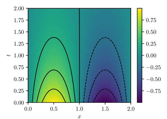
## Contour Plot: Variable Distribution
### Overview
The image presents a contour plot visualizing the distribution of a variable across a two-dimensional space defined by 'x' and 't'. The plot uses a color gradient to represent the value of the variable, with yellow indicating higher values and purple indicating lower values. A vertical black line divides the plot into two regions. Dashed lines are overlaid on the contour plot.
### Components/Axes
* **X-axis:** Labeled 'x', ranging from approximately 0.0 to 2.0.
* **Y-axis:** Labeled 't', ranging from approximately 0.0 to 2.0.
* **Colorbar:** Located on the right side of the plot. The colorbar represents the variable's value, with the following approximate mapping:
* Yellow: 0.75
* Light Yellow-Green: 0.50
* Green: 0.25
* Light Blue-Green: 0.00
* Blue: -0.25
* Dark Blue: -0.50
* Purple: -0.75
* **Vertical Line:** A solid black vertical line positioned at approximately x = 1.0, dividing the plot into two sections.
* **Dashed Lines:** A series of dashed black lines are overlaid on the contour plot, forming curves.
### Detailed Analysis
The contour plot shows a gradient of colors representing the variable's value.
* **Left Side (x < 1.0):** The variable values are generally positive, ranging from approximately 0.0 to 0.75. The contours are relatively close together, indicating a steeper gradient. The highest values (yellow) are concentrated around x = 0.5 and t = 0.0. As 't' increases, the values decrease, forming a series of curved contours.
* **Right Side (x > 1.0):** The variable values are generally negative, ranging from approximately -0.25 to -0.75. The contours are also relatively close together, indicating a steep gradient. The lowest values (purple) are concentrated around x = 1.5 and t = 0.0. As 't' increases, the values decrease, forming a series of curved contours.
* **Dashed Lines:** The dashed lines appear to follow the contours of the variable, but with a slight offset. They seem to represent a specific value or threshold of the variable. The dashed lines are more closely spaced on the right side of the plot, suggesting a more rapid change in the variable's value in that region.
### Key Observations
* There is a clear discontinuity in the variable's value at x = 1.0, as indicated by the sharp change in color and the vertical black line.
* The variable's value is positive for x < 1.0 and negative for x > 1.0.
* The contours are more closely spaced near x = 1.0, indicating a steeper gradient in that region.
* The dashed lines appear to be related to the contours, but their exact relationship is unclear.
### Interpretation
The contour plot likely represents a solution to a differential equation or a physical system with a boundary condition at x = 1.0. The discontinuity at x = 1.0 suggests a change in the system's properties or a forcing function at that point. The dashed lines could represent a specific level set of the variable, or a trajectory of the system. The plot demonstrates a clear separation in the behavior of the variable based on the value of 'x', with positive values on one side and negative values on the other. The steep gradients near x = 1.0 indicate a rapid transition between these two states. Without further context, it is difficult to determine the exact physical meaning of the variable and the system being represented.