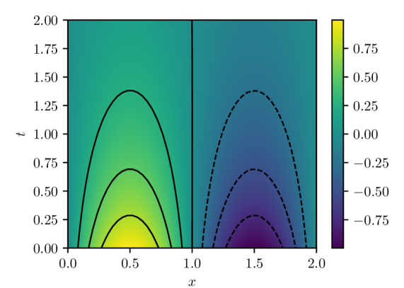
## Contour Plot: Symmetric Positive and Negative Regions
### Overview
The image is a 2D contour plot (or heatmap) displaying a scalar field over a domain defined by variables `x` and `t`. The plot is divided into two distinct, symmetric regions by a vertical line at `x = 1.0`. The left region (`x < 1.0`) shows positive values (warm colors), while the right region (`x > 1.0`) shows negative values (cool colors). The data is represented by both a continuous color gradient and discrete contour lines.
### Components/Axes
* **X-Axis:** Labeled `x`. Linear scale ranging from `0.0` to `2.0`, with major tick marks at `0.0`, `0.5`, `1.0`, `1.5`, and `2.0`.
* **Y-Axis:** Labeled `t`. Linear scale ranging from `0.00` to `2.00`, with major tick marks at intervals of `0.25` (`0.00`, `0.25`, `0.50`, `0.75`, `1.00`, `1.25`, `1.50`, `1.75`, `2.00`).
* **Color Bar (Legend):** Positioned vertically on the right side of the plot. It maps color to numerical values, ranging from approximately `-0.75` (dark purple) to `+0.75` (bright yellow). Key labeled ticks are at `-0.75`, `-0.50`, `-0.25`, `0.00`, `0.25`, `0.50`, and `0.75`.
* **Contour Lines:**
* **Left Region (`x < 1.0`):** Solid black lines. These are upward-opening parabolas (concave down) centered around `x = 0.5`. Three distinct contours are visible.
* **Right Region (`x > 1.0`):** Dashed black lines. These are downward-opening parabolas (concave up) centered around `x = 1.5`. Three distinct contours are visible.
* **Dividing Line:** A solid vertical black line at `x = 1.0`, separating the positive and negative domains.
### Detailed Analysis
* **Color Gradient & Value Distribution:**
* The highest positive values (bright yellow, ~`+0.75`) are concentrated in a small region near the bottom center of the left domain, around `(x=0.5, t=0.0)`.
* Values decrease (transitioning through green to teal) as one moves away from this peak, both in the `+x` and `+t` directions within the left region.
* The lowest negative values (dark purple, ~`-0.75`) are concentrated in a small region near the bottom center of the right domain, around `(x=1.5, t=0.0)`.
* Values increase (transitioning through blue to teal) as one moves away from this trough, both in the `+x` and `+t` directions within the right region.
* The value is approximately `0.00` (teal color) along the vertical line `x=1.0` and in the upper portions of the plot (`t > ~1.5`).
* **Contour Line Analysis (Trend Verification):**
* **Left Region (Solid Lines):** The contours represent lines of constant positive value. The innermost (lowest) solid contour peaks at approximately `t ≈ 0.25`. The middle solid contour peaks at approximately `t ≈ 0.70`. The outermost (highest) solid contour peaks at approximately `t ≈ 1.35`. The trend is that for a given positive value, the `t` coordinate is highest at `x=0.5` and decreases symmetrically as `x` moves towards `0.0` or `1.0`.
* **Right Region (Dashed Lines):** The contours represent lines of constant negative value. The innermost (lowest) dashed contour dips to a minimum at approximately `t ≈ 0.25`. The middle dashed contour dips to a minimum at approximately `t ≈ 0.70`. The outermost (highest) dashed contour dips to a minimum at approximately `t ≈ 1.35`. The trend is that for a given negative value, the `t` coordinate is lowest at `x=1.5` and increases symmetrically as `x` moves towards `1.0` or `2.0`.
### Key Observations
1. **Perfect Symmetry:** The plot exhibits reflectional symmetry about the vertical line `x = 1.0`. The pattern of contours on the left is a mirror image of the pattern on the right, with the sign of the value inverted.
2. **Bounded Influence:** The regions of significant positive or negative magnitude (strong yellow/purple) are confined to the lower half of the plot (`t < ~1.0`). The field decays towards zero as `t` increases.
3. **Zero-Line:** The line `x = 1.0` acts as a zero-isoline, separating the positive and negative domains.
4. **Contour Correspondence:** Each solid contour in the left region has a corresponding dashed contour in the right region at the same `t`-level (e.g., the solid contour peaking at `t≈1.35` corresponds to the dashed contour dipping at `t≈1.35`), indicating they represent values of equal magnitude but opposite sign.
### Interpretation
This plot likely visualizes the solution to a partial differential equation (PDE) or a mathematical function with an antisymmetric property about `x=1.0`. The structure suggests a system where a disturbance or source term centered at `x=0.5` generates a positive response that decays with distance (`x`) and time (`t`), while an equal and opposite disturbance centered at `x=1.5` generates a negative response.
The confinement of strong values to low `t` could indicate a transient phenomenon that dissipates over time, or a spatially localized effect that weakens with distance from its source. The perfect symmetry implies the underlying physics or mathematics is invariant under the transformation `(x, value) -> (2.0 - x, -value)`. This type of pattern is common in wave interference, potential theory, or reaction-diffusion systems with symmetric initial conditions. The vertical line at `x=1.0` is a nodal line where the field is zero.