## Heatmap with Overlaid Curves: Spatial-Temporal Value Distribution
### Overview
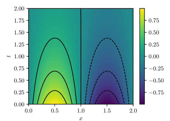
The image depicts a 2D heatmap with axes labeled **x** (horizontal, 0.0–2.0) and **t** (vertical, 0.0–2.0). A color gradient (purple to yellow) represents values ranging from **-0.75 to 0.75**, as indicated by the legend on the right. Two sets of curves are overlaid: solid black lines (left side) and dashed black lines (right side), suggesting distinct data trends or boundaries.
---
### Components/Axes
- **X-axis**: Labeled "x", scaled from 0.0 to 2.0 in increments of 0.5.
- **Y-axis**: Labeled "t", scaled from 0.0 to 2.0 in increments of 0.5.
- **Color Legend**: Vertical bar on the right, transitioning from purple (-0.75) to yellow (0.75), with intermediate markers at -0.5, 0.0, 0.25, 0.5, 0.75.
- **Curves**:
- **Solid black lines**: Left side (x ≈ 0.0–1.0), forming parabolic peaks.
- **Dashed black lines**: Right side (x ≈ 1.0–2.0), forming inverted parabolic troughs.
---
### Detailed Analysis
1. **Color Gradient**:
- Left half (x < 1.0): Green-to-yellow gradient, indicating **positive values** (0.0–0.75).
- Right half (x > 1.0): Blue-to-purple gradient, indicating **negative values** (-0.75–0.0).
- Central boundary at x = 1.0 shows a sharp transition from green to blue.
2. **Solid Curves (Left Side)**:
- Three parabolic peaks centered at:
- (x = 0.5, t = 0.25) with maximum value ~0.75 (yellow).
- (x = 0.5, t = 0.75) with moderate value ~0.5 (green).
- (x = 0.5, t = 1.25) with lower value ~0.25 (light green).
- Symmetric about x = 0.5, suggesting periodic or resonant behavior.
3. **Dashed Curves (Right Side)**:
- Two inverted parabolic troughs centered at:
- (x = 1.5, t = 0.5) with minimum value ~-0.75 (purple).
- (x = 1.5, t = 1.25) with moderate value ~-0.5 (dark blue).
- Symmetric about x = 1.5, mirroring the left-side peaks but inverted.
4. **Spatial Relationships**:
- The solid and dashed curves are separated by x = 1.0, with no overlap.
- The left-side peaks (positive values) align vertically with the right-side troughs (negative values) at t = 0.5 and t = 1.25, suggesting a phase relationship.
---
### Key Observations
- **Symmetry**: Both curve sets exhibit mirror symmetry about their respective x-centers (0.5 and 1.5).
- **Phase Shift**: The right-side troughs occur at t = 0.5 and t = 1.25, offset by ~0.25 and ~0.75 relative to the left-side peaks.
- **Color-Value Correlation**: The heatmap’s color transitions align precisely with the legend, confirming value ranges.
- **Boundary at x = 1.0**: Sharp color and curve discontinuity suggests a system boundary or parameter change.
---
### Interpretation
The image likely represents a **spatiotemporal phenomenon** with opposing behaviors in two regions:
1. **Left Region (x < 1.0)**: Positive values (green/yellow) with periodic peaks at t = 0.25, 0.75, 1.25. This could model wave propagation, resonance, or constructive interference.
2. **Right Region (x > 1.0)**: Negative values (blue/purple) with inverted troughs at t = 0.5, 1.25. This may represent destructive interference, damping, or a phase-shifted response.
3. **Boundary Dynamics**: The abrupt transition at x = 1.0 implies a discontinuity (e.g., a wall, interface, or parameter change) causing reflection or phase inversion.
The curves’ symmetry and phase alignment suggest a **wave-like system** (e.g., acoustics, optics, or quantum mechanics) with standing waves or interference patterns. The dashed curves might represent boundary conditions or external influences altering the system’s behavior.