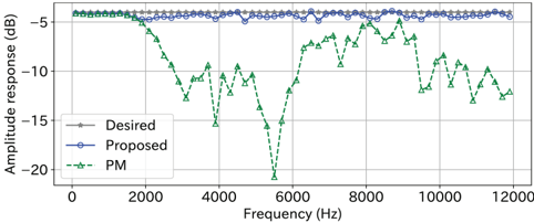
## Chart: Amplitude Response vs. Frequency
### Overview
The image presents a line chart comparing the amplitude response (in dB) of three different systems or designs – "Desired", "Proposed", and "PM" – across a frequency range from 0 Hz to 12000 Hz. The chart aims to visually assess how well the "Proposed" and "PM" designs match the "Desired" response.
### Components/Axes
* **X-axis:** Frequency (Hz), ranging from 0 to 12000 Hz. The axis is labeled "Frequency (Hz)".
* **Y-axis:** Amplitude response (dB), ranging from approximately -22 dB to -4 dB. The axis is labeled "Amplitude response (dB)".
* **Legend:** Located in the top-left corner of the chart.
* "Desired" – Represented by a gray dashed line with gray markers.
* "Proposed" – Represented by a blue solid line with blue circular markers.
* "PM" – Represented by a green dashed line with green triangular markers.
* **Gridlines:** Horizontal and vertical gridlines are present to aid in reading values.
### Detailed Analysis
**Desired Response (Gray):**
The "Desired" line is relatively flat, fluctuating around -5 dB across the entire frequency range. It exhibits minor variations, but generally remains within the -6 dB to -4 dB range.
**Proposed Response (Blue):**
The "Proposed" line also remains relatively flat, closely tracking the "Desired" response. It fluctuates around -5 dB, with a slight downward trend from approximately 10000 Hz to 12000 Hz. The line generally stays between -5.5 dB and -4.5 dB.
**PM Response (Green):**
The "PM" line exhibits a significantly different behavior.
* From 0 Hz to approximately 2000 Hz, it closely follows the "Desired" and "Proposed" lines, around -5 dB.
* From 2000 Hz to approximately 5000 Hz, the amplitude response drops sharply, reaching a minimum of approximately -21 dB at 4000 Hz.
* From 5000 Hz to approximately 8000 Hz, the amplitude response rises rapidly, returning to around -5 dB.
* From 8000 Hz to 12000 Hz, the amplitude response fluctuates, generally decreasing from -5 dB to approximately -15 dB.
**Specific Data Points (Approximate):**
| Frequency (Hz) | Desired (dB) | Proposed (dB) | PM (dB) |
|---|---|---|---|
| 0 | -5 | -5 | -5 |
| 2000 | -5 | -5 | -14 |
| 4000 | -5 | -5 | -21 |
| 6000 | -5 | -5 | -21 |
| 8000 | -5 | -5 | -7 |
| 10000 | -5 | -5.5 | -14 |
| 12000 | -5 | -6 | -15 |
### Key Observations
* The "PM" response deviates significantly from the "Desired" response, particularly in the 2000 Hz to 8000 Hz range.
* The "Proposed" response closely matches the "Desired" response across the entire frequency range.
* The "PM" response exhibits a pronounced dip in amplitude between 2000 Hz and 5000 Hz, followed by a rapid increase.
* The "PM" response shows a decreasing trend at higher frequencies (above 8000 Hz).
### Interpretation
The chart demonstrates a comparison of three amplitude response curves. The "Desired" curve represents a target performance characteristic. The "Proposed" curve shows a design that effectively achieves the desired response, maintaining a relatively flat amplitude profile across the tested frequency range. The "PM" curve, however, exhibits significant deviations from the desired response, indicating potential issues with the design. The large dip in the "PM" response between 2000 Hz and 5000 Hz suggests a resonance or filtering effect that attenuates signals within that frequency band. The fluctuations at higher frequencies may indicate instability or unwanted amplification. The close alignment of the "Proposed" and "Desired" curves suggests that the "Proposed" design is a viable solution for achieving the target amplitude response. The "PM" design would likely require further modification to align with the desired performance characteristics. The chart is a valuable tool for evaluating and comparing different system designs based on their frequency response.