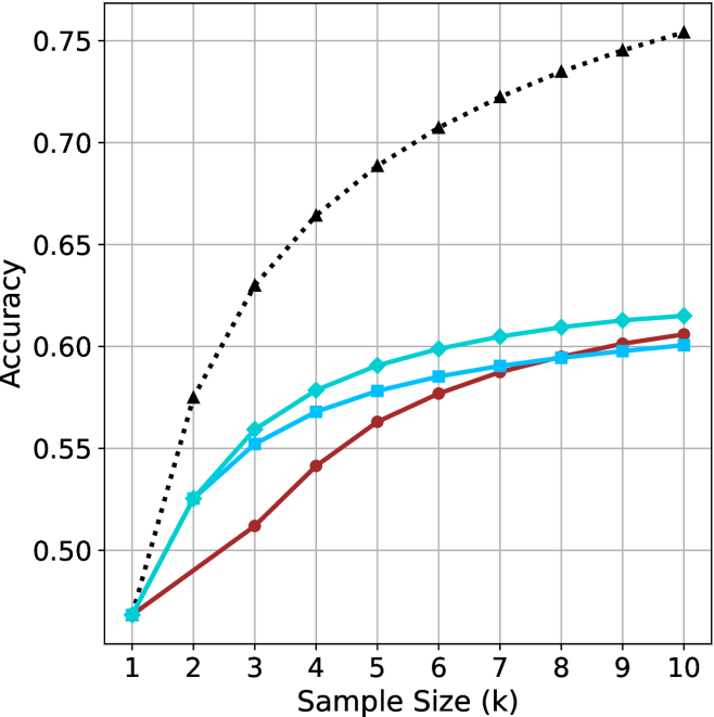
## Line Chart: Accuracy vs. Sample Size
### Overview
The image presents a line chart illustrating the relationship between accuracy and sample size. Three distinct lines represent different models or conditions, showing how accuracy changes as the sample size increases from 1k to 10k. The chart is set against a white background with a grid for easier readability.
### Components/Axes
* **X-axis:** Labeled "Sample Size (k)", ranging from 1 to 10, with increments of 1.
* **Y-axis:** Labeled "Accuracy", ranging from 0.50 to 0.75, with increments of 0.05.
* **Lines:** Three lines are plotted, each with a distinct color and style:
* Black dotted line
* Cyan solid line
* Red solid line
### Detailed Analysis
Let's analyze each line individually, noting trends and approximate data points.
* **Black Dotted Line:** This line exhibits the steepest upward trend. It starts at approximately 0.57 at a sample size of 1k and rapidly increases to approximately 0.74 at a sample size of 10k.
* (1k, 0.57)
* (2k, 0.63)
* (3k, 0.67)
* (4k, 0.69)
* (5k, 0.70)
* (6k, 0.71)
* (7k, 0.72)
* (8k, 0.73)
* (9k, 0.74)
* (10k, 0.74)
* **Cyan Solid Line:** This line shows a moderate upward trend, but plateaus towards the higher sample sizes. It begins at approximately 0.45 at 1k and reaches approximately 0.61 at 10k.
* (1k, 0.45)
* (2k, 0.52)
* (3k, 0.56)
* (4k, 0.58)
* (5k, 0.59)
* (6k, 0.60)
* (7k, 0.60)
* (8k, 0.61)
* (9k, 0.61)
* (10k, 0.61)
* **Red Solid Line:** This line demonstrates the slowest upward trend and appears to converge with the cyan line at higher sample sizes. It starts at approximately 0.43 at 1k and reaches approximately 0.59 at 10k.
* (1k, 0.43)
* (2k, 0.48)
* (3k, 0.52)
* (4k, 0.55)
* (5k, 0.57)
* (6k, 0.58)
* (7k, 0.59)
* (8k, 0.59)
* (9k, 0.60)
* (10k, 0.60)
### Key Observations
* The black dotted line consistently outperforms the other two lines across all sample sizes.
* The cyan and red lines converge as the sample size increases, suggesting diminishing returns in accuracy beyond a certain point.
* The initial increase in accuracy is most pronounced for the black dotted line, indicating a rapid improvement with even small sample sizes.
### Interpretation
The chart suggests that increasing the sample size generally improves accuracy, but the rate of improvement varies significantly depending on the model or condition being evaluated. The black dotted line represents a model that benefits substantially from larger sample sizes, while the cyan and red lines show a more limited improvement. The convergence of the cyan and red lines at higher sample sizes indicates that, for these models, the benefit of additional data diminishes as the sample size grows. This could be due to factors such as reaching a saturation point in the data or the inherent limitations of the models themselves. The chart highlights the importance of considering sample size when evaluating model performance and suggests that the optimal sample size may depend on the specific model and the desired level of accuracy.