\n
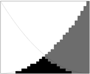
## Heatmap: Gradient Representation
### Overview
The image presents a grayscale heatmap, visually representing a gradient from dark to light. The gradient is structured as a series of stepped blocks, transitioning from black in the bottom-left corner to white in the top-right corner. A dashed line extends diagonally across the image, seemingly defining the transition point of the gradient. There are no explicit labels, axes, or legends.
### Components/Axes
There are no explicit axes or labels. The image's structure implies two dimensions, but their specific meanings are not defined. The gradient itself acts as the primary visual element, representing a continuous change in value. The dashed line serves as a visual marker, potentially indicating a threshold or boundary.
### Detailed Analysis or Content Details
The heatmap consists of a series of rectangular blocks arranged in a stepped pattern. The blocks transition in grayscale value as they move from the bottom-left to the top-right.
* **Bottom-Left:** The initial blocks are solid black. Approximately 6 blocks are visible in this darkest region.
* **Transition Zone:** As the blocks move upwards and to the right, they gradually lighten in shade. The transition is not smooth but occurs in discrete steps. The dashed line appears to bisect this transition zone.
* **Top-Right:** The final blocks are nearly white, with a very light gray shade. Approximately 10 blocks are visible in this lightest region.
The dashed line starts at the bottom-left corner and extends diagonally towards the top-right corner. It does not intersect any specific blocks but runs through the transition zone.
### Key Observations
The most notable observation is the clear gradient from black to white. The stepped nature of the gradient suggests a discrete representation of a continuous variable. The dashed line may indicate a point of interest or a threshold within the gradient. The absence of labels or axes makes it difficult to interpret the meaning of the gradient.
### Interpretation
The image likely represents a visualization of a data distribution or a function. The gradient could represent the frequency or intensity of a particular value. The dashed line might indicate a cutoff point or a significant value within the data. Without further context, it is difficult to determine the specific meaning of the heatmap. It could represent anything from a probability density function to a signal strength map. The stepped nature suggests that the underlying data is quantized or discretized. The image is a visual representation of a continuous variable being approximated by discrete steps. It is a demonstration of a gradient, and the dashed line is a visual aid to understand the transition.