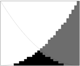
## Diagram: Grayscale Area Chart with Diagonal Boundary
### Overview
The image is a monochromatic (grayscale) diagram depicting two filled areas (one black, one gray) against a white background, bisected by a dotted diagonal line. It appears to be a conceptual or abstract chart, possibly representing a distribution, a boundary condition, or a comparative relationship between two quantities. There are no visible textual labels, axis titles, legends, or numerical markers.
### Components/Axes
* **Primary Visual Elements:**
1. **Dotted Diagonal Line:** A thin, dotted line runs from the top-left corner to the bottom-right corner of the image frame, creating a clear diagonal boundary.
2. **Black Area:** A solid black, stepped shape occupies the lower portion of the image. Its upper boundary is a jagged, staircase-like line that generally follows but stays below the dotted diagonal line. It peaks near the horizontal center of the image.
3. **Gray Area:** A solid gray, stepped shape occupies the right portion of the image. Its left boundary is also a jagged, staircase-like line. This area starts from the bottom-right corner and expands upward and leftward, intersecting and overlapping with the black area in the lower-center region.
* **Spatial Layout:** The dotted line acts as a primary axis or limit. The black area is anchored to the bottom edge, while the gray area is anchored to the right edge. Their intersection creates a complex, layered region in the lower-center of the frame.
### Detailed Analysis
* **Trend Verification:**
* **Black Area Trend:** The black area's upper boundary shows an overall upward trend from left to right, reaching its maximum height approximately 60-70% of the way across the horizontal axis. After this peak, it slopes downward toward the right edge.
* **Gray Area Trend:** The gray area's left boundary shows a consistent upward trend from the bottom-right corner toward the top-left, though its progression is stepped rather than smooth.
* **Component Isolation:**
* **Header/Top Region:** Dominated by white space, bisected only by the upper segment of the dotted diagonal line.
* **Main Chart Region:** Contains the interplay of the black and gray stepped areas and the dotted line. The most complex interaction occurs in the lower-center quadrant.
* **Footer/Bottom Region:** The base of the black area and the lower portion of the gray area rest along the bottom edge of the frame.
### Key Observations
1. **Absence of Quantitative Data:** The chart contains no numbers, scales, units, or labels. It is purely a qualitative or conceptual visualization.
2. **Stepped Geometry:** Both filled areas use a "staircase" or pixelated boundary rather than smooth curves, suggesting discrete data points, bins, or a digital/quantized representation.
3. **Boundary Relationship:** The dotted line appears to represent a theoretical maximum, ideal, or boundary condition. The black area approaches but does not exceed this line. The gray area crosses this line significantly in the upper-right quadrant.
4. **Overlap Zone:** The black and gray areas overlap in a specific region, creating a darker composite shape (though rendered as flat black and gray here). This suggests an area of intersection, competition, or combined effect between the two represented quantities.
### Interpretation
This diagram is likely a conceptual model rather than a presentation of empirical data. Its meaning must be inferred from its visual structure:
* **Possible Meanings:** It could represent:
* A **resource allocation or capacity chart**, where the dotted line is total capacity, the black area is one type of usage, and the gray area is another. The overlap indicates contention.
* A **performance or efficiency boundary**, where the dotted line is the theoretical limit (e.g., a Pareto frontier). The black area shows actual performance of one system, and the gray area shows another. The system represented by the gray area appears to exceed the theoretical limit in one region, which would be an anomaly or indicate the limit is not absolute.
* A **phase diagram or state transition map**, where the areas represent different states or phases, and the dotted line is a transition boundary.
* **Underlying Message:** The visual narrative suggests a comparison between two entities (black vs. gray) against a common reference (dotted line). The black entity is more centrally focused and bounded, while the gray entity is expansive and ultimately transcends the reference boundary. The stepped nature implies the underlying phenomena are discrete or measured in fixed increments.
* **Notable Anomaly:** The most striking feature is the gray area's breach of the dotted diagonal line in the upper-right section. If the line represents a strict limit, this is a critical outlier. If it represents a trend or average, the gray area demonstrates significant positive deviation in that region.
**Conclusion:** While devoid of explicit text or numbers, the image conveys a clear relational story through geometry and contrast. To extract specific facts or data, the accompanying context (e.g., a figure caption, surrounding document text) is essential. The diagram itself serves as a visual metaphor for comparison, boundary conditions, and discrete distribution.