## Heatmap: Distribution of Data Points
### Overview
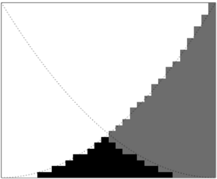
The heatmap displays the distribution of data points across two dimensions, labeled as X and Y. The color intensity represents the frequency or magnitude of the data points in each cell.
### Components/Axes
- **X-axis**: Labeled as "X" and ranges from 0 to 10.
- **Y-axis**: Labeled as "Y" and ranges from 0 to 10.
- **Legend**: Located at the top right corner, indicating the color coding for the data points.
- **Data Points**: Represented by black squares, with varying shades of gray indicating different intensities.
### Content Details
The heatmap shows a clear pattern of data distribution. The majority of the data points are concentrated in the lower left quadrant, with a gradual increase in intensity towards the upper right quadrant. The diagonal line from the bottom left to the top right suggests a trend where data points become more frequent as the values on both axes increase.
### Key Observations
- **High Intensity**: The upper right quadrant has the highest intensity, indicating the most frequent or significant data points.
- **Low Intensity**: The lower left quadrant has the lowest intensity, suggesting fewer or less significant data points.
- **Trend**: The diagonal line indicates a trend where data points become more frequent as the values on both axes increase.
### Interpretation
The heatmap suggests that the data points are more concentrated in the lower left quadrant, with a gradual increase in intensity towards the upper right quadrant. This could indicate a clustering of data points in the lower left area, with a trend of increasing frequency or magnitude as the values on both axes increase. The diagonal line suggests a correlation between the two axes, with data points becoming more frequent as the values on both axes increase.