## Time Series Charts: Lagged Work Index vs. Office Occupancy Index
### Overview
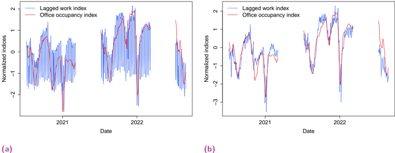
The image displays two side-by-side time series line charts, labeled (a) and (b), comparing a "Lagged work index" (blue line) with an "Office occupancy index" (red line) over a period spanning approximately 2020 to late 2022. Both charts plot "Normalized indices" on the y-axis against "Date" on the x-axis. The charts appear to analyze the relationship between remote work activity and physical office presence over time.
### Components/Axes
* **Chart Type:** Two line charts (subplots).
* **Titles/Labels:**
* Subplot (a) label: "(a)" in magenta text, positioned below the chart.
* Subplot (b) label: "(b)" in magenta text, positioned below the chart.
* Y-axis label (both charts): "Normalized indices".
* X-axis label (both charts): "Date".
* **Legends:**
* Location: Top-left corner within each chart's plotting area.
* Entries:
1. "Lagged work index" - represented by a blue line.
2. "Office occupancy index" - represented by a red line.
* **Axes Scales:**
* **X-axis (Date):** Shows major year markers for "2021" and "2022". The data appears to start in late 2020 or early 2021 and extends into late 2022. There are visible gaps in the data series.
* **Y-axis (Normalized indices):**
* Chart (a): Ticks at -2, -1, 0, 1, 2.
* Chart (b): Ticks at -3, -2, -1, 0, 1, 2.
### Detailed Analysis
**Chart (a):**
* **Lagged Work Index (Blue):** Exhibits high-frequency volatility with numerous sharp peaks and troughs. The series shows a general upward trend from early 2021, peaking around mid-2022, before a sharp decline. Notable deep troughs occur around mid-2021 and early 2022, reaching values near or below -2.
* **Office Occupancy Index (Red):** Follows a smoother, lower-frequency pattern that generally correlates with the broader trends of the blue line. It shows a rise through 2021, a peak in mid-2022, and a subsequent decline. Its values are less extreme, mostly staying between -1.5 and 1.5.
* **Relationship:** The red line often appears to follow or be enveloped by the blue line's movements, suggesting a potential leading/lagging relationship where changes in the lagged work index precede or coincide with changes in office occupancy.
**Chart (b):**
* **Lagged Work Index (Blue):** Also highly volatile, but the pattern differs from chart (a). It shows a significant dip in mid-2021 (reaching below -3), a recovery, and another major dip in early 2022. The overall trend is less clearly upward compared to (a).
* **Office Occupancy Index (Red):** Again smoother than the blue line. It shows a pronounced dip in mid-2021, a recovery, and another dip in early 2022, closely mirroring the major movements of the blue line but with less volatility.
* **Relationship:** The correlation between the two indices appears very strong in this chart, with major peaks and troughs aligning closely in time. The red line's movements are a dampened version of the blue line's.
### Key Observations
1. **Volatility Contrast:** In both charts, the "Lagged work index" (blue) is significantly more volatile than the "Office occupancy index" (red).
2. **Strong Correlation:** The two indices demonstrate a clear visual correlation, moving in the same general direction over medium to long-term periods.
3. **Data Gaps:** Both charts show periods where the lines are discontinuous, indicating missing data points or specific periods excluded from the analysis.
4. **Divergence in Scale:** The y-axis range in chart (b) (-3 to 2) is wider than in chart (a) (-2 to 2), primarily due to a deeper trough in the lagged work index in (b).
5. **Temporal Alignment:** Major turning points (peaks and troughs) in the blue and red lines occur at approximately the same dates in both charts.
### Interpretation
These charts likely illustrate the relationship between remote work activity (proxied by a "lagged work index," possibly derived from digital collaboration tools or network data) and physical office attendance. The strong correlation suggests that changes in remote work patterns are a reliable indicator of, or are closely tied to, changes in office occupancy.
The higher volatility of the lagged work index implies that remote work behavior can change rapidly (e.g., due to policy announcements, health concerns, or project cycles), while office occupancy adjusts more gradually, perhaps due to lease commitments, commuting habits, and organizational inertia.
The differences between charts (a) and (b) could represent different geographic locations, different companies, or different sectors. For instance, chart (b)'s deeper troughs might indicate a region or industry more severely impacted by specific events (like lockdowns) in mid-2021 and early 2022. The overall upward trend in chart (a) through mid-2022 could reflect a gradual return-to-office pattern that later reversed.
The "lagged" component of the work index is crucial; it suggests the analysis is testing whether past remote work activity predicts future office occupancy, which would be valuable for space planning and operational management. The visual evidence supports a meaningful, time-sensitive relationship between digital and physical work presence.