## Chart/Diagram Type: Behavioral Trial Analysis & State Space Visualization
### Overview
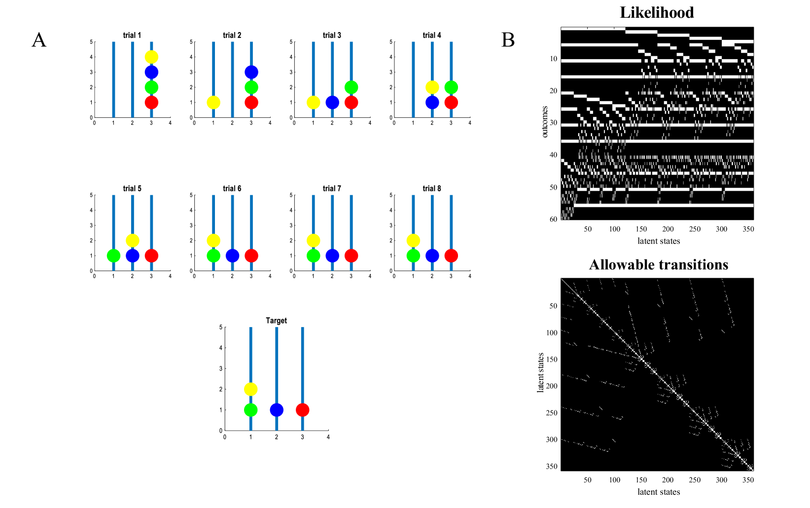
The image presents a combination of bar charts illustrating behavioral trials and a state-space visualization consisting of a heatmap and a transition diagram. The bar charts (labeled 'A') show the distribution of choices across four options in eight trials, plus a 'Target' trial. The state-space visualization (labeled 'B') displays a likelihood heatmap and allowable transitions between latent states.
### Components/Axes
**Section A (Bar Charts):**
* **Title:** A
* **Subtitles:** trial 1, trial 2, trial 3, trial 4, trial 5, trial 6, trial 7, trial 8, Target
* **X-axis:** 0, 1, 2, 3, 4 (representing choice options)
* **Y-axis:** 0 to 5 (representing frequency or probability)
* **Colors:** Red, Green, Blue, Yellow (representing different choice options)
**Section B (State Space Visualization):**
* **Title:** B
* **Heatmap Title:** Likelihood
* **Heatmap X-axis:** 50 to 350 (latent states)
* **Heatmap Y-axis:** 10 to 60 (outcomes)
* **Transition Diagram Title:** Allowable transitions
* **Transition Diagram X-axis:** 50 to 350 (latent states)
* **Transition Diagram Y-axis:** 50 to 350 (latent states)
### Detailed Analysis or Content Details
**Section A (Bar Charts):**
* **Trial 1:** Red bar at approximately 0.8, Green bar at approximately 1.5, Blue bar at approximately 2.5, Yellow bar at approximately 1.
* **Trial 2:** Red bar at approximately 1.2, Green bar at approximately 2.2, Blue bar at approximately 3.5, Yellow bar at approximately 0.5.
* **Trial 3:** Red bar at approximately 2.5, Green bar at approximately 1.5, Blue bar at approximately 0.8, Yellow bar at approximately 2.
* **Trial 4:** Red bar at approximately 1.8, Green bar at approximately 3.2, Blue bar at approximately 1.2, Yellow bar at approximately 0.5.
* **Trial 5:** Red bar at approximately 3.5, Green bar at approximately 0.8, Blue bar at approximately 2.2, Yellow bar at approximately 1.
* **Trial 6:** Red bar at approximately 1.5, Green bar at approximately 2.8, Blue bar at approximately 1.8, Yellow bar at approximately 0.7.
* **Trial 7:** Red bar at approximately 2.2, Green bar at approximately 1.2, Blue bar at approximately 3.5, Yellow bar at approximately 0.5.
* **Trial 8:** Red bar at approximately 0.7, Green bar at approximately 1.8, Blue bar at approximately 2.8, Yellow bar at approximately 2.
* **Target:** Red bar at approximately 0.5, Green bar at approximately 4.5, Blue bar at approximately 1.5, Yellow bar at approximately 0.5.
**Section B (State Space Visualization):**
* **Likelihood Heatmap:** The heatmap shows varying levels of likelihood (represented by grayscale intensity) across different latent states and outcomes. The intensity is highest (white) in the lower-left corner and gradually decreases towards the upper-right. There are several dark bands running diagonally across the heatmap.
* **Allowable Transitions:** The transition diagram shows lines connecting latent states. The density of lines is high, indicating many possible transitions. The lines are mostly white, indicating allowable transitions. The diagram appears to be fully connected, with transitions possible between almost any two states.
### Key Observations
* The bar charts show a shift in choice distributions across trials. The 'Target' trial exhibits a strong preference for the Green option.
* The likelihood heatmap suggests that certain combinations of latent states and outcomes are more probable than others.
* The transition diagram indicates a highly interconnected state space, allowing for a wide range of possible state transitions.
### Interpretation
The data suggests an agent (or system) learning to navigate a state space and make choices based on observed outcomes. The bar charts represent the agent's behavior in different trials, with the 'Target' trial indicating a learned preference. The state-space visualization provides a broader view of the agent's internal representation of the environment and its possible actions.
The likelihood heatmap reveals the agent's beliefs about the relationship between states and outcomes. The dark bands suggest that certain state-outcome combinations are less likely, potentially representing constraints or penalties. The fully connected transition diagram indicates that the agent has the capacity to explore a wide range of possibilities.
The combination of behavioral data and state-space visualization provides a powerful tool for understanding the agent's learning process and decision-making strategies. The data suggests that the agent is actively learning to optimize its behavior based on feedback from the environment. The high degree of connectivity in the state space suggests a flexible and adaptable system.