## Line Chart: Accuracy vs. Highest Reported Accuracy
### Overview
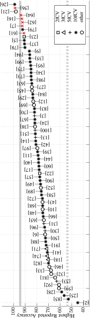
The image is a line chart comparing the "Highest Reported Accuracy" (x-axis) against "Accuracy" (y-axis). Multiple data series are represented by distinct symbols and colors, with a legend in the top-right corner. The chart includes a vertical line at x=90 and a dashed horizontal line at y=50. Data points are plotted along the y-axis, with numerical labels in brackets.
### Components/Axes
- **X-axis (Highest Reported Accuracy)**: Ranges from 100 (left) to 40 (right), with a vertical line at 90.
- **Y-axis (Accuracy)**: Discrete numerical values (e.g., 26, 56, 21, etc.) labeled in brackets.
- **Legend**: Located in the top-right corner, with the following mappings:
- **2fcV**: Square (□)
- **3fcV**: Triangle (△)
- **5fcV**: Plus (+)
- **10fcV**: Asterisk (*)
- **Other**: Circle (○)
### Detailed Analysis
- **Data Series Trends**:
- **10fcV (asterisks)**: Highest accuracy values, clustered near the top of the y-axis (e.g., 100, 99, 95).
- **5fcV (pluses)**: Slightly lower than 10fcV, with values like 97, 94, 93.
- **3fcV (triangles)**: Lower than 5fcV, with values such as 92, 89, 88.
- **2fcV (squares)**: Lower still, with values like 85, 83, 81.
- **Other (circles)**: Lowest accuracy, with values like 79, 77, 75.
- **Key Data Points**:
- Highest reported accuracy: **100** (y=100, x=100).
- Lowest reported accuracy: **40** (y=40, x=40).
- Vertical line at x=90 separates higher (left) and lower (right) accuracy ranges.
- Dashed horizontal line at y=50 may indicate a threshold for acceptable accuracy.
### Key Observations
- **Clustering**: Data points are densely packed between y=50 and y=100, with fewer points below y=50.
- **Outliers**: A few data points (e.g., y=26, y=21) fall below y=50, suggesting lower accuracy for specific cases.
- **Legend Consistency**: Symbols match their corresponding data series (e.g., asterisks for 10fcV).
### Interpretation
The chart demonstrates a clear trend where higher fcV values (e.g., 10fcV) correlate with higher reported accuracy. The vertical line at x=90 may represent a benchmark or target for accuracy, while the dashed line at y=50 could signify a minimum acceptable threshold. The "other" category (circles) consistently shows lower accuracy compared to the fcV series, indicating potential differences in performance or methodology. The data suggests that increasing fcV values improves accuracy, though exceptions exist (e.g., lower accuracy for some 2fcV or 3fcV cases). This could imply that fcV is a critical factor in determining accuracy, but further analysis is needed to confirm causality.