\n
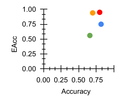
## Scatter Plot: EACC vs. Accuracy
### Overview
This image presents a scatter plot visualizing the relationship between Accuracy (on the x-axis) and EACC (on the y-axis). The plot contains four data points, each represented by a different colored circle. The plot lacks a title, but the axes labels suggest a performance evaluation context.
### Components/Axes
* **X-axis:** Labeled "Accuracy", ranging from 0.00 to 0.75 with tick marks at 0.00, 0.25, 0.50, and 0.75.
* **Y-axis:** Labeled "EACC", ranging from 0.00 to 1.00 with tick marks at 0.00, 0.25, 0.50, 0.75, and 1.00.
* **Data Points:** Four distinct data points, each represented by a colored circle.
* **Legend:** Located in the top-right corner, consisting of four colored circles. The colors are (from left to right): orange, red, blue, and green. No labels are associated with the colors in the legend.
### Detailed Analysis
The scatter plot displays the following data points:
* **Orange Point:** Approximately (0.75, 1.00).
* **Red Point:** Approximately (0.75, 0.95).
* **Blue Point:** Approximately (0.75, 0.75).
* **Green Point:** Approximately (0.50, 0.50).
There is no apparent trend in the data. The points are scattered, with three points clustered around an Accuracy of 0.75 and varying EACC values, and one point at (0.50, 0.50).
### Key Observations
* The three data points with an Accuracy of approximately 0.75 exhibit different EACC values, suggesting variability in performance for models achieving similar accuracy.
* The green data point at (0.50, 0.50) represents a lower performance level compared to the other three points.
* The lack of a clear trend makes it difficult to establish a strong correlation between Accuracy and EACC based on this limited dataset.
### Interpretation
The plot likely represents the performance of different models or configurations on a specific task. Accuracy measures the proportion of correct predictions, while EACC (Equal Error Rate Characteristic) is a metric often used in biometric or classification systems to represent the point where false acceptance and false rejection rates are equal.
The data suggests that achieving a certain level of accuracy (around 0.75) does not guarantee a specific EACC value. The variability in EACC for the three points with similar accuracy could be due to differences in the types of errors made by the models (e.g., some models might have higher false positive rates, while others have higher false negative rates). The lower performance of the green point indicates that it may require further optimization or a different approach.
Without additional context, it is difficult to draw definitive conclusions. However, the plot highlights the importance of considering multiple performance metrics beyond just accuracy when evaluating models. The absence of labels on the legend makes it impossible to determine what each color represents, limiting the interpretability of the data.