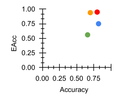
## Scatter Plot: Accuracy vs. EAcc
### Overview
The image is a scatter plot comparing two metrics: "Accuracy" (x-axis) and "EAcc" (y-axis). Four data points are plotted, each represented by a distinct color (green, blue, orange, red). The points are positioned in the upper-right quadrant, indicating higher values for both metrics.
### Components/Axes
- **X-axis (Accuracy)**: Labeled "Accuracy," scaled from 0.00 to 1.00 in increments of 0.25.
- **Y-axis (EAcc)**: Labeled "EAcc," scaled from 0.00 to 1.00 in increments of 0.25.
- **Legend**: Located on the right side of the plot, associating colors with labels:
- Green (G)
- Blue (B)
- Orange (O)
- Red (R)
### Detailed Analysis
1. **Data Points**:
- **Green (G)**: Positioned at approximately (0.5, 0.5).
- **Blue (B)**: Positioned at approximately (0.7, 0.7).
- **Orange (O)**: Positioned at approximately (0.8, 0.9).
- **Red (R)**: Positioned at approximately (0.9, 1.0).
2. **Trends**:
- All data points exhibit a positive correlation: as Accuracy increases, EAcc also increases.
- The points form a diagonal line from the lower-left (green) to the upper-right (red), suggesting a proportional relationship between the two metrics.
### Key Observations
- The red data point (R) achieves the highest values for both Accuracy (0.9) and EAcc (1.0), indicating optimal performance.
- The green data point (G) is the lowest in both metrics, positioned at the midpoint of the axes.
- The orange (O) and blue (B) points show intermediate performance, with orange slightly outperforming blue in both metrics.
### Interpretation
The scatter plot demonstrates a strong positive relationship between Accuracy and EAcc. The red point (R) represents the highest-performing category, achieving near-perfect scores in both metrics. This suggests that improvements in Accuracy directly correlate with enhancements in EAcc. The green point (G) may represent a baseline or underperforming category, while the orange and blue points indicate moderate performance. The legend’s placement on the right ensures clarity in distinguishing categories, and the uniform scaling of axes allows for precise comparison. No outliers or anomalies are present, as all points align with the observed trend.