## Bar Chart: Category Counts
### Overview
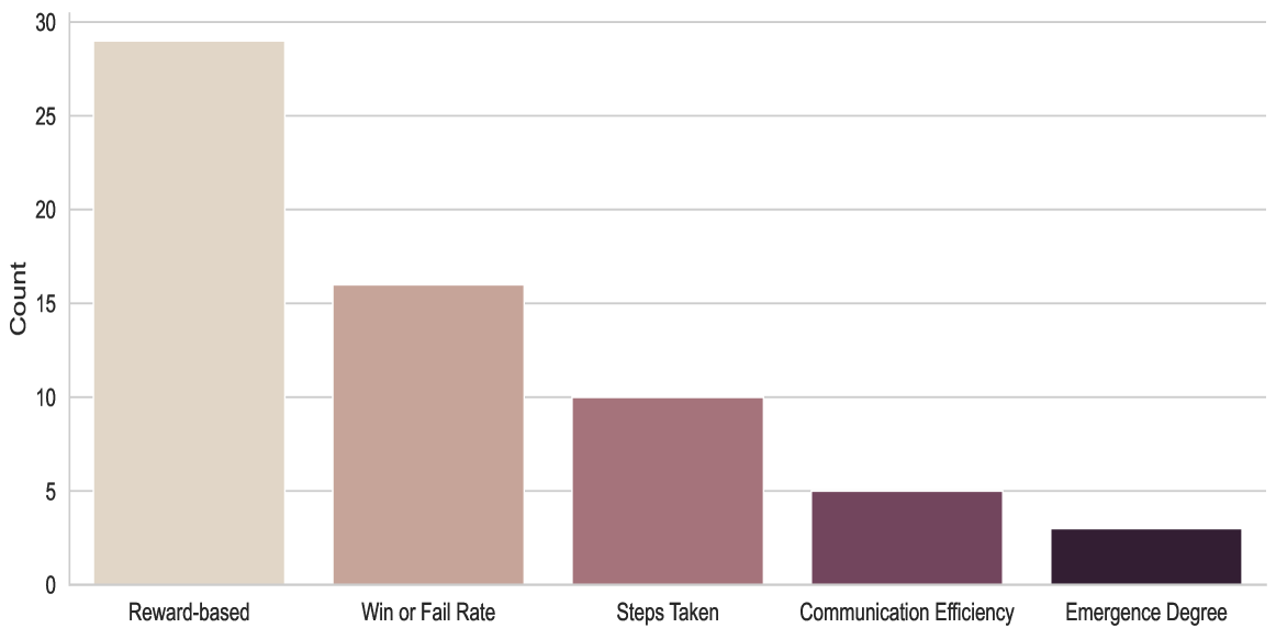
The image is a bar chart displaying the count of different categories. The categories are "Reward-based", "Win or Fail Rate", "Steps Taken", "Communication Efficiency", and "Emergence Degree". The chart shows the relative frequency or count of each category.
### Components/Axes
* **X-axis:** Categories: "Reward-based", "Win or Fail Rate", "Steps Taken", "Communication Efficiency", "Emergence Degree".
* **Y-axis:** Count, ranging from 0 to 30, with increments of 5 (0, 5, 10, 15, 20, 25, 30).
* The bars are colored in shades of brown, with "Reward-based" being the lightest and "Emergence Degree" being the darkest.
### Detailed Analysis
* **Reward-based:** The count is approximately 29.
* **Win or Fail Rate:** The count is approximately 16.
* **Steps Taken:** The count is approximately 10.
* **Communication Efficiency:** The count is approximately 5.
* **Emergence Degree:** The count is approximately 3.
### Key Observations
* "Reward-based" has the highest count, significantly higher than the other categories.
* The counts decrease from left to right, with "Emergence Degree" having the lowest count.
* There is a substantial drop in count from "Reward-based" to "Win or Fail Rate".
### Interpretation
The bar chart indicates the relative frequency or importance of different factors. "Reward-based" appears to be the most prevalent or significant factor, while "Emergence Degree" is the least. The data suggests a hierarchy or distribution of these factors, with a clear dominance of "Reward-based". The steep decline in counts from "Reward-based" to the other categories suggests that it may be a primary driver or characteristic, while the others are secondary or less frequent.