## 3D Surface Plot: Evolution of a Function Over Space and Time
### Overview
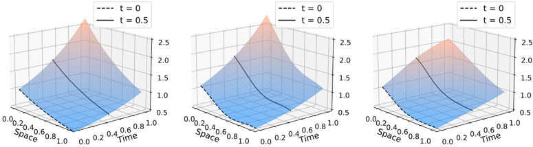
The image displays three horizontally arranged 3D surface plots. Each plot visualizes the same type of mathematical function or data distribution, showing its value (vertical axis) as a function of two independent variables: "Space" and "Time." The plots appear to compare the state of this function at two distinct time points, `t=0` and `t=0.5`, represented by different line styles on the same surface.
### Components/Axes
* **Chart Type:** 3D Surface Plot (three instances).
* **Axes (Identical for all three plots):**
* **X-axis (Front-Left):** Labeled "Space". Scale ranges from 0.0 to 1.0, with major tick marks at 0.0, 0.2, 0.4, 0.6, 0.8, and 1.0.
* **Y-axis (Front-Right):** Labeled "Time". Scale ranges from 0.0 to 1.0, with major tick marks at 0.0, 0.2, 0.4, 0.6, 0.8, and 1.0.
* **Z-axis (Vertical):** Unlabeled, but represents the function's value. Scale ranges from 0.5 to 2.5, with major tick marks at 0.5, 1.0, 1.5, 2.0, and 2.5.
* **Legend:** Positioned in the top-left corner of each plot's bounding box.
* `--- t = 0` (Dashed black line)
* `— t = 0.5` (Solid black line)
* **Visual Elements:** Each plot shows a single, continuous 3D surface. The surface is colored with a gradient, transitioning from blue at lower Z-values to a reddish-orange at higher Z-values. The dashed (`t=0`) and solid (`t=0.5`) lines are contours or specific slices drawn onto this surface.
### Detailed Analysis
* **Surface Shape & Trend:** All three plots depict a surface that peaks at the origin (Space=0, Time=0) and decays as both Space and Time increase. The general trend is a downward slope from the back corner (0,0) towards the front edges (Space=1 and Time=1).
* **Data Series & Values:**
* **At (Space=0, Time=0):** The surface reaches its maximum value, approximately **Z ≈ 2.5**.
* **Along the Space axis (Time=0):** Following the dashed line (`t=0`) from (0,0) to (1,0), the value decreases from ~2.5 to approximately **Z ≈ 0.5**.
* **Along the Time axis (Space=0):** Following the dashed line (`t=0`) from (0,0) to (0,1), the value decreases from ~2.5 to approximately **Z ≈ 0.5**.
* **At (Space=1, Time=1):** The surface reaches its minimum visible value, approximately **Z ≈ 0.5**.
* **Comparison of t=0 vs. t=0.5:** The solid line (`t=0.5`) is consistently positioned *below* the dashed line (`t=0`) for the same (Space, Time) coordinates. This indicates that the function's value at a given point in space has decreased after a time interval of 0.5 units. The decay appears smooth and monotonic.
* **Comparison Across the Three Plots:** The three plots are visually very similar, suggesting they may represent the same phenomenon under slightly different conditions, parameters, or viewing angles. Subtle differences in the curvature of the surface, particularly in the central region, might exist but are difficult to quantify without raw data. The leftmost plot's peak appears slightly sharper, while the rightmost plot's surface seems marginally flatter.
### Key Observations
1. **Consistent Decay Pattern:** The primary observation is a consistent, smooth decay of the function's value from a maximum at the spatio-temporal origin (0,0) towards a minimum at the far edges (1,1).
2. **Temporal Evolution:** The function at `t=0.5` (solid line) represents a "decayed" or "evolved" state compared to the initial condition at `t=0` (dashed line) for any fixed spatial location.
3. **Symmetry:** The decay appears roughly symmetric with respect to the Space and Time axes; the slope along the Space direction is similar to the slope along the Time direction.
4. **Color Mapping:** The color gradient (blue to red-orange) effectively reinforces the Z-axis values, with "hotter" colors at the peak and "cooler" colors at the base.
### Interpretation
This visualization likely demonstrates the solution to a partial differential equation (PDE) modeling a diffusion or decay process. The surface represents a quantity (e.g., concentration, temperature, probability density) that is initially concentrated at a point in space (Space=0) and spreads out or dissipates over time.
* **What the data suggests:** The plots show the fundamental behavior of a diffusive system: an initial sharp peak (high concentration) smooths out and lowers in amplitude as time progresses, spreading its influence across the spatial domain. The `t=0.5` line being below the `t=0` line is the direct visual evidence of this dissipation.
* **How elements relate:** The "Space" and "Time" axes are the independent variables controlling the system's state. The Z-axis is the dependent variable—the system's response. The legend is crucial for distinguishing the initial state (`t=0`) from a later snapshot (`t=0.5`).
* **Notable patterns/anomalies:** The high degree of similarity between the three plots is notable. It suggests they might be showing convergence of a numerical method, results from slightly different model parameters, or simply the same result from different camera angles to aid 3D perception. The lack of significant anomalies indicates a stable, well-behaved process. The symmetry implies isotropic diffusion (the same rate in all directions).