## 3D Surface Plots: Heat Diffusion at Different Times
### Overview
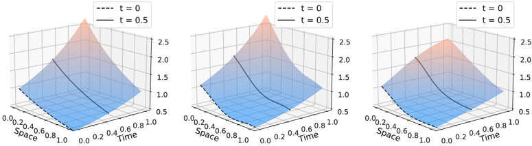
The image presents three 3D surface plots illustrating the heat distribution over space and time. Each plot represents a different scenario or parameter setting, showing how the heat profile evolves from time t=0 to t=0.5. The plots share the same axes and legend, allowing for direct comparison of the heat distribution patterns.
### Components/Axes
* **Axes:**
* X-axis: "Space", ranging from 0.0 to 1.0 in increments of 0.2.
* Y-axis: "Time", ranging from 0.0 to 1.0 in increments of 0.2.
* Z-axis: Represents the heat value, ranging from 0.5 to 2.5 in increments of 0.5.
* **Legend (located at the top-left of each plot):**
* Dashed black line: "t = 0"
* Solid black line: "t = 0.5"
* **Surface:** The blue-to-red gradient surface represents the heat distribution across space and time. Blue indicates lower heat values, while red indicates higher heat values.
### Detailed Analysis
**Plot 1 (Left):**
* **t = 0 (Dashed Black Line):** The heat distribution at t=0 is linear, increasing steadily from approximately 0.5 at Space=0 to approximately 1.0 at Space=1.
* **t = 0.5 (Solid Black Line):** The heat distribution at t=0.5 is also linear, increasing steadily from approximately 0.5 at Space=0 to approximately 2.5 at Space=1.
* **Surface:** The surface shows a relatively uniform increase in heat as both space and time increase.
**Plot 2 (Center):**
* **t = 0 (Dashed Black Line):** The heat distribution at t=0 starts at approximately 0.5 at Space=0, increases slightly to approximately 0.6 at Space=0.2, then decreases to approximately 0.5 at Space=0.4, and remains relatively constant at 0.5 until Space=1.
* **t = 0.5 (Solid Black Line):** The heat distribution at t=0.5 starts at approximately 1.2 at Space=0, increases to approximately 2.2 at Space=0.8, and then decreases slightly to approximately 2.0 at Space=1.
* **Surface:** The surface shows a more complex heat distribution, with a peak in the middle range of space and time.
**Plot 3 (Right):**
* **t = 0 (Dashed Black Line):** The heat distribution at t=0 starts at approximately 0.5 at Space=0, increases slightly to approximately 0.6 at Space=0.2, then decreases to approximately 0.5 at Space=0.4, and remains relatively constant at 0.5 until Space=1.
* **t = 0.5 (Solid Black Line):** The heat distribution at t=0.5 starts at approximately 0.6 at Space=0, increases to approximately 2.3 at Space=0.6, and then decreases slightly to approximately 2.0 at Space=1.
* **Surface:** The surface shows a heat distribution that peaks earlier in space compared to Plot 2.
### Key Observations
* All three plots show an increase in heat from t=0 to t=0.5.
* The heat distribution patterns vary significantly across the three plots, suggesting different underlying conditions or parameters.
* Plot 1 shows a linear heat increase, while Plots 2 and 3 show more complex, non-linear distributions.
* The maximum heat value is consistently reached around Space=1 in Plot 1, while it occurs earlier in space in Plots 2 and 3.
### Interpretation
The plots likely represent different scenarios of heat diffusion, possibly with varying boundary conditions or heat source distributions. Plot 1 could represent a simple case of uniform heating, while Plots 2 and 3 might represent scenarios with localized heat sources or non-uniform material properties. The differences in heat distribution at t=0.5 indicate that the underlying conditions significantly influence the heat diffusion process. The plots demonstrate how the heat profile evolves over time, highlighting the impact of spatial location and initial conditions on the final heat distribution.