## 3D Surface Plots: Dynamic System Evolution Over Time
### Overview
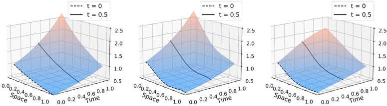
Three identical 3D surface plots visualize a dynamic system's evolution between two time points (t=0 and t=0.5). Each plot shows a spatial-temporal relationship with a color gradient transitioning from blue (t=0) to red (t=0.5). The z-axis represents an unlabeled dependent variable (likely intensity or magnitude), with contour lines indicating gradient transitions.
### Components/Axes
- **X-axis (Space)**: Labeled "Space" with values from 0.0 to 1.0 in 0.2 increments.
- **Y-axis (Time)**: Labeled "Time" with values from 0.0 to 1.0 in 0.2 increments.
- **Z-axis**: Unlabeled, but values range approximately 0.0 to 2.5 based on peak heights.
- **Legend**: Located in the top-right corner of each plot, with:
- Dashed black line: t = 0
- Solid black line: t = 0.5
- **Color Gradient**: Blue (t=0) to red (t=0.5), with intermediate purple shading.
### Detailed Analysis
1. **Surface Structure**:
- All plots share identical spatial (x) and temporal (y) axes.
- The surface forms a triangular peak at (Space=0.0, Time=0.0) for t=0, with a height of ~2.5.
- At t=0.5, the peak shifts slightly rightward (Space≈0.1) and lowers to ~2.0.
2. **Contour Lines**:
- Black dashed lines represent t=0, solid lines represent t=0.5.
- Contour spacing indicates gradient steepness: closer lines = steeper gradients.
3. **Color Matching**:
- Blue regions (t=0) dominate the lower-left quadrant.
- Red regions (t=0.5) concentrate near the peak, with purple gradients in transitional zones.
### Key Observations
- **Peak Degradation**: The maximum z-value decreases from ~2.5 (t=0) to ~2.0 (t=0.5), suggesting decay or dissipation.
- **Temporal Shift**: The peak position shifts rightward (Space=0.0 → 0.1) as time progresses.
- **Gradient Dynamics**: The purple gradient narrows between t=0 and t=0.5, indicating faster transitions near the peak.
### Interpretation
The plots depict a system where a localized maximum (e.g., energy, concentration) decays over time while shifting spatially. The contour lines suggest the rate of change is most pronounced near the peak. Normalized axes imply the system is dimensionless or scaled for comparison. The consistent structure across all three plots suggests identical initial conditions with varying parameters (not shown). The absence of a z-axis label limits quantitative interpretation but highlights the relative magnitude trend.