TECHNICAL ASSET FINGERPRINT
440b6c22bebd5652da8f8f83
Click to view fullscreen
Press ESC or click to close
FOUND IN PAPERS
EXPERT: gemini-2.0-flash VERSION 1
RUNTIME: nugit/gemini/gemini-2.0-flash
INTEL_VERIFIED
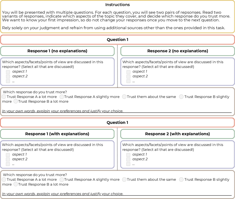
## Survey Form: Response Evaluation
### Overview
The image presents a survey form designed to evaluate two responses to a question, both with and without explanations. The form prompts users to identify which aspects are discussed in each response and to indicate which response they trust more, providing space for justification. The form is repeated twice, once for responses without explanations and once for responses with explanations.
### Components/Axes
* **Instructions (Top)**: A block of text providing instructions to the user.
* "You will be presented with multiple questions. For each question, you will see two pairs of responses. Read two variants of responses, indicate which aspects of the topic they cover, and decide which response do you trust more. We want to know your first impression, so do not change your responses once you move to the next question. Rely solely on your judgment and refrain from using additional sources other than the ones provided in this task."
* **Question 1 (Top Section)**:
* **Response 1 (no explanations)**: A section for evaluating the first response without explanations.
* "Which aspects/facets/points of view are discussed in this response? (Select all that are discussed!)"
* "aspect 1" (checkbox)
* "aspect 2" (checkbox)
* "..." (checkbox)
* "Which response do you trust more?"
* "Trust Response A a lot more" (radio button)
* "Trust Response A slightly more" (radio button)
* "Trust them about the same" (radio button)
* "Trust Response B slightly more" (radio button)
* "Trust Response B a lot more" (radio button)
* "In your own words, explain your preferences and justify your choice." (text input box)
* **Response 2 (no explanations)**: A section for evaluating the second response without explanations.
* "Which aspects/facets/points of view are discussed in this response? (Select all that are discussed!)"
* "aspect 1" (checkbox)
* "aspect 2" (checkbox)
* "..." (checkbox)
* "Which response do you trust more?"
* "Trust Response A a lot more" (radio button)
* "Trust Response A slightly more" (radio button)
* "Trust them about the same" (radio button)
* "Trust Response B slightly more" (radio button)
* "Trust Response B a lot more" (radio button)
* "In your own words, explain your preferences and justify your choice." (text input box)
* **Question 1 (Bottom Section)**:
* **Response 1 (with explanations)**: A section for evaluating the first response with explanations.
* "Which aspects/facets/points of view are discussed in this response? (Select all that are discussed!)"
* "aspect 1" (checkbox)
* "aspect 2" (checkbox)
* "..." (checkbox)
* "Which response do you trust more?"
* "Trust Response A a lot more" (radio button)
* "Trust Response A slightly more" (radio button)
* "Trust them about the same" (radio button)
* "Trust Response B slightly more" (radio button)
* "Trust Response B a lot more" (radio button)
* "In your own words, explain your preferences and justify your choice." (text input box)
* **Response 2 (with explanations)**: A section for evaluating the second response with explanations.
* "Which aspects/facets/points of view are discussed in this response? (Select all that are discussed!)"
* "aspect 1" (checkbox)
* "aspect 2" (checkbox)
* "..." (checkbox)
* "Which response do you trust more?"
* "Trust Response A a lot more" (radio button)
* "Trust Response A slightly more" (radio button)
* "Trust them about the same" (radio button)
* "Trust Response B slightly more" (radio button)
* "Trust Response B a lot more" (radio button)
* "In your own words, explain your preferences and justify your choice." (text input box)
### Detailed Analysis or Content Details
The form is structured to gather subjective evaluations of two responses to a question. The evaluation is performed twice: once for responses without explanations and once for responses with explanations. For each response, the user is asked to identify the aspects discussed and to indicate their level of trust in the response. A text box is provided for the user to justify their choice.
### Key Observations
* The form is designed to compare the perceived trustworthiness of responses with and without explanations.
* The form allows for the identification of specific aspects discussed in each response.
* The form includes a free-text field for users to provide qualitative feedback.
### Interpretation
The survey aims to understand how explanations affect the perceived trustworthiness of responses. By comparing evaluations of responses with and without explanations, the survey can reveal whether explanations increase, decrease, or have no impact on trust. The identification of discussed aspects allows for a more nuanced understanding of the content of each response, while the free-text field provides valuable qualitative data on the reasons behind user preferences. The form's structure facilitates a comparative analysis of the two responses, allowing for insights into the factors that influence trust in information.
DECODING INTELLIGENCE...
EXPERT: gemma-3-27b-it-free VERSION 2
RUNTIME: google-free/gemma-3-27b-it
INTEL_VERIFIED
\n
## Screenshot: Instructions for a Response Evaluation Task
### Overview
This is a screenshot of an instruction page for a task involving the evaluation of two response variants to a question. The page presents two sets of response pairs, one labeled "Response 1 (no explanations)" and "Response 2 (no explanations)", and another labeled "Response 1 (with explanations)" and "Response 2 (with explanations)". Each pair is followed by a question asking the user to select which response they trust more, and a text box for justification.
### Components/Axes
The screenshot contains the following components:
* **Header:** "Instructions" in large font.
* **Introductory Text:** A paragraph explaining the task's objective – to compare response variants and select the more trustworthy one based on initial judgment.
* **Question 1 (No Explanations):**
* Two response boxes labeled "Response 1 (no explanations)" and "Response 2 (no explanations)".
* A question: "Which aspects/facets/points of view are discussed in this response? (Select all that are discussed)".
* Two checkboxes labeled "aspect 1" and "aspect 2".
* A radio button question: "Which response do you trust more?". Options are: "Trust Response A a lot more", "Trust Response A slightly more", "Trust them about the same", "Trust Response B slightly more", "Trust Response B a lot more".
* A text box: "In your own words, explain your preferences and justify your choice."
* **Question 1 (With Explanations):** Identical structure to the "No Explanations" section, but labeled "Response 1 (with explanations)" and "Response 2 (with explanations)".
### Detailed Analysis or Content Details
The text content is as follows:
"You will be presented with multiple questions. For each question, you will see two pairs of responses. Read two variants of responses, indicate which aspects of the topic they cover, and decide which response do you trust more. We want to know your first impression, so do not change your responses once you move to the next question. Rely solely on your judgment and refrain from using additional sources other than the ones provided in this task."
Within each question section:
* "Which aspects/facets/points of view are discussed in this response? (Select all that are discussed)"
* "aspect 1"
* "aspect 2"
* "Which response do you trust more?"
* "Trust Response A a lot more"
* "Trust Response A slightly more"
* "Trust them about the same"
* "Trust Response B slightly more"
* "Trust Response B a lot more"
* "In your own words, explain your preferences and justify your choice."
### Key Observations
The screenshot is designed as a user interface for a survey or experiment. The repeated structure of the question pairs suggests a comparative evaluation process. The emphasis on "first impression" and avoiding external sources indicates a focus on intuitive judgment. The inclusion of checkboxes for "aspects" and a justification text box encourages detailed consideration of the responses.
### Interpretation
The screenshot represents a methodology for gathering subjective data on the perceived quality or trustworthiness of different responses. The task is designed to minimize bias by restricting information access and emphasizing initial reactions. The structure allows for both quantitative (trust level) and qualitative (justification) data collection. The presence of two question sets (with and without explanations) suggests an investigation into the impact of explanatory content on trust and evaluation. The use of generic labels like "aspect 1" and "aspect 2" indicates that the specific topic of the questions is intentionally left unspecified, allowing for broader applicability of the evaluation process.
DECODING INTELLIGENCE...
EXPERT: healer-alpha-free VERSION 1
RUNTIME: free/openrouter/healer-alpha
INTEL_VERIFIED
## [Diagram]: Survey Interface for Response Evaluation
### Overview
The image displays a structured, multi-part survey or questionnaire interface designed to evaluate and compare two responses to a given question. The interface is divided into clear sections with instructions, a question block, and two identical question blocks below it, each presenting a pair of responses for evaluation. The design uses color-coded headers and a clean, form-like layout.
### Components/Axes
The diagram is segmented into the following regions, from top to bottom:
1. **Header (Instructions Box):**
* **Background Color:** Light yellow.
* **Title:** "Instructions" (bold, centered).
* **Text Content:** A paragraph explaining the task: "You will be presented with multiple questions. For each question, you will see two pairs of responses. Read two variants of responses, indicate which aspects of the topic they cover, and decide which response do you trust more. We want to know your first impression, so do not change your responses once you move to the next question. Rely solely on your judgment and refrain from using additional sources other than the ones provided in this task."
2. **Question Block 1:**
* **Header:** A red-bordered box with the title "Question 1".
* **Response Panels:** Two side-by-side panels with green headers.
* **Left Panel Header:** "Response 1 (no explanations)"
* **Right Panel Header:** "Response 2 (no explanations)"
* **Content within each Response Panel:**
* A prompt: "Which aspects/facets/points of view are discussed in this response? (Select all that are discussed!)"
* A checklist with placeholder items: "aspect 1", "aspect 2", and "..." (indicating more items).
* **Evaluation Section (below the two panels):**
* **Prompt:** "Which response do you trust more?"
* **Radio Button Options:**
* "Trust Response A a lot more"
* "Trust Response A slightly more"
* "Trust them about the same"
* "Trust Response B slightly more"
* "Trust Response B a lot more"
* **Text Input Field:** Labeled "In your own words, explain your preferences and justify your choice." with a blank line for a written response.
3. **Question Block 2:**
* **Header:** A red-bordered box with the title "Question 1" (identical to the first block).
* **Response Panels:** Two side-by-side panels with green headers.
* **Left Panel Header:** "Response 1 (with explanations)"
* **Right Panel Header:** "Response 2 (with explanations)"
* **Content within each Response Panel:** Identical to the first block (checklist prompt and items).
* **Evaluation Section:** Identical to the first block (trust rating radio buttons and explanation text field).
### Detailed Analysis
* **Spatial Layout:** The interface is vertically stacked. The instructions are at the top. The two "Question 1" blocks are arranged one above the other, separated by a thin horizontal line. Within each question block, the two response panels are placed side-by-side (left and right), with the evaluation section centered below them.
* **Text Transcription:** All text is in English. The transcription is exact as provided in the Components section above.
* **Visual Elements:** The design uses color (yellow, red, green) and borders to create a clear visual hierarchy and separate different functional areas (instructions, question, response options, evaluation). Checkboxes (□) and radio buttons (○) are used as standard form elements.
### Key Observations
1. **Repetitive Structure:** The two main question blocks are structurally identical, differing only in the header label for the response panels ("no explanations" vs. "with explanations"). This suggests a controlled comparison within the same question context.
2. **Task Design:** The task requires a two-step evaluation for each response pair: first, a categorical selection (aspects covered), and second, a comparative judgment (trust rating) with qualitative justification.
3. **Placeholder Content:** The use of "aspect 1", "aspect 2", and "..." indicates this is a template or mock-up of the interface, not a live instance with specific content.
4. **Instructional Emphasis:** The instructions explicitly stress forming a "first impression," not changing responses, and relying solely on provided information, highlighting a focus on immediate, unbiased judgment.
### Interpretation
This diagram illustrates the design of a **human evaluation protocol**, likely for assessing the quality, trustworthiness, or coverage of AI-generated or human-written responses. The structure serves several investigative purposes:
* **Comparative Analysis:** By presenting two responses side-by-side, it forces a direct comparison, which is a common method in A/B testing or preference ranking.
* **Multi-Dimensional Assessment:** It separates the evaluation into **coverage** (which aspects are discussed) and **trust** (a holistic judgment). This allows researchers to analyze whether trust correlates with the number or type of aspects covered.
* **Control for Explanation:** The two identical blocks ("no explanations" vs. "with explanations") suggest an experiment to test the impact of providing justifications or reasoning within the responses themselves on the evaluator's trust. This is a key variable in studies of explainable AI (XAI) or persuasive communication.
* **Qualitative & Quantitative Data:** The interface collects both structured data (checkbox selections, radio button ratings) and unstructured data (free-text explanations), enabling mixed-methods analysis of evaluator reasoning.
The design prioritizes clarity and consistency to minimize confounding variables in the evaluation process. The explicit instructions aim to standardize the evaluator's mindset, making the collected data more reliable for analyzing patterns in human judgment when comparing information sources.
DECODING INTELLIGENCE...
EXPERT: nemotron-free VERSION 1
RUNTIME: free/nvidia/nemotron-nano-12b-v2-vl:free
INTEL_VERIFIED
## Screenshot: Survey Interface for Response Evaluation
### Overview
The image depicts a structured survey interface designed to evaluate trust in responses based on explanatory content. It includes instructions, two questions with paired responses, and interactive elements for user input.
### Components/Axes
1. **Instructions Section**:
- Text block explaining the task: Users must compare two response pairs, identify covered aspects, and select the more trustworthy response without external sources.
- Key phrases: "Rely solely on your judgment," "do not change your responses once you move to the next question."
2. **Question Structure**:
- **Question 1** and **Question 2** (repeated structure):
- **Response 1 (no explanations)** and **Response 2 (no explanations)**:
- Sub-question: "Which aspects/facets/points of view are discussed in this response? (Select all that are discussed!)" with checkboxes for "aspect 1," "aspect 2," and an ellipsis for additional aspects.
- **Response 1 (with explanations)** and **Response 2 (with explanations)**:
- Identical sub-question format as above.
- **Trust Evaluation**:
- Radio buttons for trust levels:
- "Trust Response A a lot more"
- "Trust Response A slightly more"
- "Trust them about the same"
- "Trust Response B slightly more"
- "Trust Response B a lot more"
- Text prompt: "In your own words, explain your preferences and justify your choice."
### Detailed Analysis
- **Textual Content**:
- Instructions emphasize impartial judgment and prohibition of external sources.
- Questions alternate between responses with/without explanations to assess their impact on trust.
- Aspects are generically labeled (e.g., "aspect 1") to abstract the evaluation criteria.
- Trust scale uses ordinal categories (e.g., "a lot more," "slightly more") to quantify preference.
- **Spatial Grounding**:
- Instructions occupy the top section, followed by Question 1 and Question 2 in a vertical layout.
- Each question’s responses are side-by-side, with trust evaluation below.
- Checkboxes and radio buttons are aligned horizontally under respective sub-questions.
### Key Observations
1. **Symmetry in Design**: Both questions mirror each other, ensuring consistency in user experience.
2. **Placeholder Aspects**: Generic labels ("aspect 1," "aspect 2") suggest the survey is a template or example.
3. **Trust Scale Granularity**: The five-tier scale allows nuanced differentiation between trust levels.
4. **Explanatory Focus**: The inclusion of "with explanations" and "no explanations" variants isolates the impact of explanatory content on trust.
### Interpretation
This survey interface is structured to investigate how explanatory depth in responses influences perceived trustworthiness. By comparing trust levels for identical content with/without explanations, it aims to quantify the value of transparency in communication. The generic aspect labels imply adaptability to various topics, while the trust scale’s granularity ensures precise measurement of user preference. The prohibition of external sources ensures responses reflect immediate judgment rather than researched opinions.
DECODING INTELLIGENCE...