## Chart/Diagram Type: Two Line Graphs Comparing Age Groups and Prevalence
### Overview
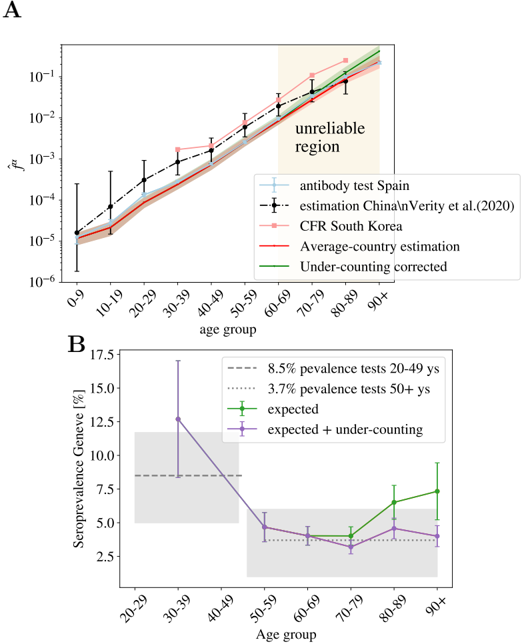
The image presents two line graphs, labeled A and B, comparing age groups with different prevalence metrics. Graph A shows the relationship between age group and a metric denoted as "f_hat_n" on a logarithmic scale, comparing antibody test results, CFR (Case Fatality Rate) data, and estimations. Graph B displays the seroprevalence in Geneva, Switzerland, across age groups, comparing expected values with and without under-counting correction.
### Components/Axes
**Graph A:**
* **Title:** Implicitly, a comparison of age-related prevalence or infection rates.
* **Y-axis:** "f_hat_n" on a logarithmic scale from 10^-6 to 10^-1.
* **X-axis:** "age group" with categories: 0-9, 10-19, 20-29, 30-39, 40-49, 50-59, 60-69, 70-79, 80-89, 90+.
* **Legend (Top-Right):**
* Light Blue: "antibody test Spain"
* Black Dashed: "estimation China\nVerity et al.(2020)"
* Light Red: "CFR South Korea"
* Dark Red: "Average-country estimation"
* Green: "Under-counting corrected"
* **Annotation:** "unreliable region" highlighted in light orange, spanning the age groups 70-79 to 90+.
**Graph B:**
* **Title:** Seroprevalence in Geneva by Age Group
* **Y-axis:** "Seroprevalence Geneve [%]" with a linear scale from 2.5 to 17.5.
* **X-axis:** "Age group" with categories: 20-29, 30-39, 40-49, 50-59, 60-69, 70-79, 80-89, 90+.
* **Legend (Top-Right):**
* Gray Dashed: "8.5% prevalence tests 20-49 ys"
* Gray Dotted: "3.7% prevalence tests 50+ ys"
* Green: "expected"
* Purple: "expected + under-counting"
* **Annotations:** Gray shaded regions around the 8.5% and 3.7% prevalence lines, visually indicating the range of the tests.
### Detailed Analysis
**Graph A:**
* **Antibody Test Spain (Light Blue):** The line starts at approximately 10^-4 for the 0-9 age group and generally increases with age, reaching approximately 10^-2 for the 80-89 and 90+ age groups.
* **Estimation China (Black Dashed):** Starts around 2 * 10^-5 for the 0-9 age group, increases steadily, and reaches approximately 5 * 10^-3 for the 80-89 and 90+ age groups. Error bars are present, indicating uncertainty.
* **CFR South Korea (Light Red):** Starts around 3 * 10^-5 for the 0-9 age group, increases with age, and reaches approximately 8 * 10^-2 for the 80-89 and 90+ age groups.
* **Average-Country Estimation (Dark Red):** Starts around 2 * 10^-5 for the 0-9 age group, increases with age, and reaches approximately 7 * 10^-2 for the 80-89 and 90+ age groups.
* **Under-Counting Corrected (Green):** Starts around 3 * 10^-5 for the 0-9 age group, increases with age, and reaches approximately 9 * 10^-2 for the 80-89 and 90+ age groups.
**Graph B:**
* **8.5% Prevalence Tests 20-49 ys (Gray Dashed):** A horizontal line at 8.5%, representing the prevalence for the 20-49 age group.
* **3.7% Prevalence Tests 50+ ys (Gray Dotted):** A horizontal line at 3.7%, representing the prevalence for the 50+ age group.
* **Expected (Green):** Starts around 4% for the 20-29 age group, decreases slightly for the 30-39 age group, remains relatively stable around 3.5% for the 40-49 to 70-79 age groups, and then increases to approximately 7% for the 80-89 and 90+ age groups.
* **Expected + Under-Counting (Purple):** Starts around 13% for the 20-29 age group, decreases to approximately 5% for the 50-59 age group, remains relatively stable around 4% for the 60-69 to 90+ age groups.
### Key Observations
* **Graph A:** All data series show an increase in the metric "f_hat_n" with increasing age. The "unreliable region" annotation suggests that data for older age groups (70+) may be less reliable.
* **Graph B:** The "expected + under-counting" seroprevalence is higher than the "expected" seroprevalence, particularly in the younger age groups (20-49). Both series tend to converge in older age groups.
### Interpretation
**Graph A:** The increasing trend of "f_hat_n" with age suggests a higher prevalence or infection rate in older age groups. The different data series (antibody test, CFR, estimations) provide varying perspectives on this trend, with some showing higher values than others. The "unreliable region" highlights potential data quality issues in older age groups, which should be considered when interpreting the results.
**Graph B:** The seroprevalence data from Geneva indicates that under-counting may be more significant in younger age groups (20-49). The convergence of the "expected" and "expected + under-counting" series in older age groups suggests that under-counting may be less of an issue in these populations. The horizontal lines at 8.5% and 3.7% provide reference points for the prevalence in specific age groups, allowing for comparison with the observed data.