TECHNICAL ASSET FINGERPRINT
44521fb2d123264a395159c6
Click to view fullscreen
Press ESC or click to close
FOUND IN PAPERS
EXPERT: healer-alpha-free VERSION 1
RUNTIME: free/openrouter/healer-alpha
INTEL_VERIFIED
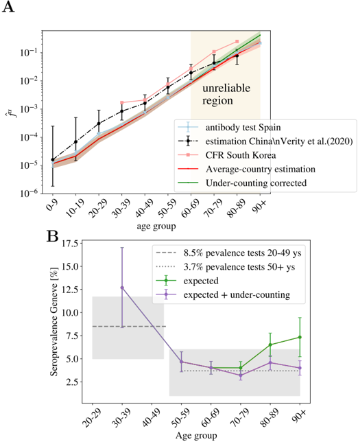
## Line Charts: Age-Dependent Infection Fatality Ratio and Seroprevalence
### Overview
The image contains two distinct line charts, labeled **A** and **B**, presenting epidemiological data related to COVID-19. Chart A plots the estimated infection fatality ratio (\( f^* \)) against age groups on a logarithmic scale. Chart B plots seroprevalence percentages in Geneva against age groups on a linear scale. Both charts include multiple data series with error bars and reference lines.
### Components/Axes
**Chart A (Top Panel):**
* **Title/Label:** "A" (top-left corner).
* **Y-axis:** Label is \( f^* \) (likely infection fatality ratio). Scale is logarithmic, with major tick marks at \(10^{-6}\), \(10^{-5}\), \(10^{-4}\), \(10^{-3}\), \(10^{-2}\), and \(10^{-1}\).
* **X-axis:** Label is "age group". Categories are: 0-9, 10-19, 20-29, 30-39, 40-49, 50-59, 60-69, 70-79, 80-89, 90+.
* **Legend (Bottom-Right):**
* Light blue line with circle markers: "antibody test Spain"
* Black dashed line with diamond markers: "estimation China\nVerity et al.(2020)"
* Pink line with square markers: "CFR South Korea"
* Red solid line: "Average-country estimation"
* Green solid line: "Under-counting corrected"
* **Annotation:** A shaded beige region in the top-right quadrant (covering age groups 60-69 to 90+) is labeled "unreliable region".
**Chart B (Bottom Panel):**
* **Title/Label:** "B" (top-left corner).
* **Y-axis:** Label is "Seroprevalence Geneva [%]". Scale is linear, with major tick marks at 2.5, 5.0, 7.5, 10.0, 12.5, 15.0, 17.5.
* **X-axis:** Label is "Age group". Categories are: 20-29, 30-39, 40-49, 50-59, 60-69, 70-79, 80-89, 90+.
* **Legend (Top-Right):**
* Grey dashed horizontal line: "8.5% prevalence tests 20-49 ys"
* Grey dotted horizontal line: "3.7% prevalence tests 50+ ys"
* Green line with square markers: "expected"
* Purple line with square markers: "expected + under-counting"
* **Background Elements:** Two shaded grey rectangular regions. One spans the y-axis from ~7.5% to ~12.5% across age groups 20-49. The other spans from ~2.5% to ~5.0% across age groups 50+.
### Detailed Analysis
**Chart A: Infection Fatality Ratio (\( f^* \)) by Age Group**
* **Trend Verification:** All five data series show a strong, consistent upward trend with increasing age. The lines slope steeply upward from left to right on the log-linear plot, indicating an exponential increase in \( f^* \) with age.
* **Data Series & Approximate Values (Reading from the graph):**
* **"antibody test Spain" (Light Blue):** Starts near \(10^{-5}\) for 0-9, rises to ~\(10^{-2}\) for 80-89. Error bars are present but not quantified.
* **"estimation China\nVerity et al.(2020)" (Black Dashed):** Follows a similar trajectory to the Spain data but is generally slightly higher. Starts near \(10^{-5}\) for 0-9, reaches ~\(2 \times 10^{-2}\) for 80-89.
* **"CFR South Korea" (Pink):** Starts lowest at ~\(10^{-5}\) for 0-9, rises to ~\(10^{-2}\) for 80-89. Appears to be the lowest estimate for most age groups.
* **"Average-country estimation" (Red):** A smooth curve. Starts at ~\(10^{-5}\) for 0-9, passes through ~\(10^{-3}\) at 50-59, and ends near ~\(10^{-1}\) for 90+.
* **"Under-counting corrected" (Green):** Closely follows the red "Average-country" line but is consistently slightly higher, especially in older age groups. Ends near ~\(1.5 \times 10^{-1}\) for 90+.
* **Uncertainty Region:** The "unreliable region" (beige shading) highlights that estimates for age groups 60 and above carry significant uncertainty, likely due to smaller sample sizes or data quality issues in the underlying studies.
**Chart B: Seroprevalence in Geneva by Age Group**
* **Trend Verification:** The "expected" (green) series shows a U-shaped trend: high for 30-39, dipping to a minimum around 60-69, then rising again for 80+. The "expected + under-counting" (purple) series follows a similar but attenuated pattern, with lower peaks and a less pronounced dip.
* **Data Series & Approximate Values:**
* **Reference Lines:**
* 8.5% prevalence (dashed grey): Horizontal line across 20-49 age groups.
* 3.7% prevalence (dotted grey): Horizontal line across 50+ age groups.
* **"expected" (Green):**
* 30-39: ~12.5% (with large error bar from ~7.5% to ~17.5%)
* 40-49: ~5.0%
* 50-59: ~4.0%
* 60-69: ~4.0%
* 70-79: ~6.5%
* 80-89: ~7.5%
* 90+: ~7.5%
* **"expected + under-counting" (Purple):**
* 30-39: ~12.5% (same point as green, shared error bar)
* 40-49: ~5.0%
* 50-59: ~4.0%
* 60-69: ~3.5%
* 70-79: ~3.0%
* 80-89: ~4.5%
* 90+: ~4.0%
* **Background Shading:** The grey shaded regions correspond to the prevalence test results referenced by the horizontal lines, providing a visual benchmark for the model-based estimates.
### Key Observations
1. **Exponential Age-Risk in Chart A:** The infection fatality ratio increases by approximately 4-5 orders of magnitude from the youngest to the oldest age groups, a stark and consistent finding across all data sources and models.
2. **Model Convergence and Divergence in Chart A:** All models agree on the direction and magnitude of the age trend. The "Under-counting corrected" (green) line being higher than the "Average-country" (red) line suggests that adjusting for under-counting of infections leads to a higher estimated IFR.
3. **Non-Monotonic Seroprevalence in Chart B:** Seroprevalence in Geneva does not increase linearly with age. It peaks in young adults (30-39), declines through middle age, and shows a secondary rise in the oldest groups.
4. **Impact of Under-Counting in Chart B:** The "expected + under-counting" (purple) series is generally lower than the "expected" (green) series for ages 60+, suggesting that under-counting adjustments have a more significant downward effect on seroprevalence estimates in older populations.
5. **High Uncertainty in Young Adults (Chart B):** The very large error bar for the 30-39 age group indicates substantial uncertainty in the seroprevalence estimate for that demographic.
### Interpretation
These charts together provide a nuanced view of COVID-19 epidemiology. **Chart A** delivers a clear, robust message: advanced age is the dominant risk factor for mortality following infection, with risk escalating exponentially. The inclusion of an "unreliable region" is a crucial piece of scientific transparency, cautioning against over-interpreting the highest age-group estimates.
**Chart B** shifts focus to infection prevalence (seroprevalence) in a specific location (Geneva). The U-shaped age distribution suggests complex transmission dynamics. The high seroprevalence in young adults (30-39) may reflect higher social mixing or exposure risk. The dip in middle age could be due to more cautious behavior or different social patterns. The rise in the oldest groups is concerning, as it indicates significant infection penetration into the most vulnerable population, despite potential shielding measures.
The comparison between the "expected" and "expected + under-counting" lines in Chart B highlights a key methodological challenge: serological tests may miss some infections, and correcting for this under-counting can significantly alter the estimated prevalence, particularly in older age groups where immune responses might differ. The grey benchmark regions from prevalence tests show that the model-based estimates ("expected" lines) are broadly consistent with direct test results, lending credibility to the models.
**In summary, the data underscores a critical public health paradox: while the risk of death from infection is overwhelmingly concentrated in the elderly (Chart A), the burden of infection itself (seroprevalence) is not, showing significant levels across the adult lifespan in this dataset (Chart B). This disconnect between infection risk and mortality risk is fundamental to understanding the pandemic's impact and shaping targeted interventions.**
DECODING INTELLIGENCE...