## Chart Type: Multi-Panel Data Analysis
### Overview
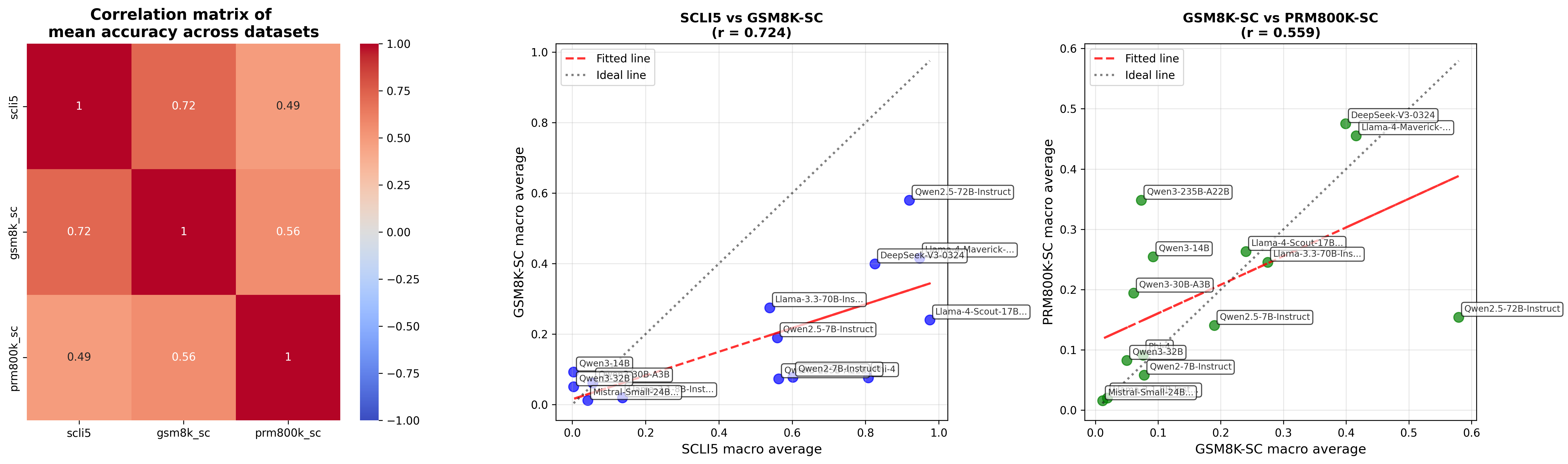
The image presents a multi-panel data analysis consisting of a correlation matrix and two scatter plots. The correlation matrix displays the mean accuracy correlations between three datasets: scli5, gsm8k_sc, and prm800k_sc. The scatter plots compare the macro averages of these datasets, with fitted lines and ideal lines overlaid to visualize the relationships.
### Components/Axes
**Panel 1: Correlation Matrix**
* **Title:** Correlation matrix of mean accuracy across datasets
* **X-axis Labels:** scli5, gsm8k_sc, prm800k_sc
* **Y-axis Labels:** scli5, gsm8k_sc, prm800k_sc
* **Color Scale:** Ranges from blue (-1.00) to red (1.00), with white representing 0.00.
* **Values:** Displayed within each cell of the matrix.
**Panel 2: Scatter Plot 1**
* **Title:** SCLI5 vs GSM8K-SC (r = 0.724)
* **X-axis Label:** SCLI5 macro average
* Scale: 0.0 to 1.0, incrementing by 0.2
* **Y-axis Label:** GSM8K-SC macro average
* Scale: 0.0 to 1.0, incrementing by 0.2
* **Data Points:** Blue circles, each labeled with a model name.
* **Fitted Line:** Red dashed line.
* **Ideal Line:** Gray dotted line.
* **Legend (Top-Left):**
* Fitted line: Red dashed line
* Ideal line: Gray dotted line
**Panel 3: Scatter Plot 2**
* **Title:** GSM8K-SC vs PRM800K-SC (r = 0.559)
* **X-axis Label:** GSM8K-SC macro average
* Scale: 0.0 to 0.6, incrementing by 0.1
* **Y-axis Label:** PRM800K-SC macro average
* Scale: 0.0 to 0.6, incrementing by 0.1
* **Data Points:** Green circles, each labeled with a model name.
* **Fitted Line:** Red dashed line.
* **Ideal Line:** Gray dotted line.
* **Legend (Top-Left):**
* Fitted line: Red dashed line
* Ideal line: Gray dotted line
### Detailed Analysis
**Panel 1: Correlation Matrix**
| | scli5 | gsm8k_sc | prm800k_sc |
| :-------- | :---- | :------- | :---------- |
| **scli5** | 1 | 0.72 | 0.49 |
| **gsm8k_sc** | 0.72 | 1 | 0.56 |
| **prm800k_sc**| 0.49 | 0.56 | 1 |
* All diagonal values are 1, indicating perfect correlation of a dataset with itself.
* scli5 and gsm8k_sc have a strong positive correlation of 0.72.
* scli5 and prm800k_sc have a moderate positive correlation of 0.49.
* gsm8k_sc and prm800k_sc have a moderate positive correlation of 0.56.
**Panel 2: Scatter Plot 1 (SCLI5 vs GSM8K-SC)**
* The fitted line (red dashed) shows a positive correlation between SCLI5 and GSM8K-SC macro averages.
* The ideal line (gray dotted) represents a 1:1 correlation.
* Data points (blue) are scattered around the fitted line, indicating some variance.
* **Llama-3.3-70B-Ins...**: Approximately (0.1, 0.1)
* **Qwen3-32B**: Approximately (0.1, 0.1)
* **Qwen3-30B-A3B**: Approximately (0.2, 0.1)
* **Mistral-Small-24B...**: Approximately (0.2, 0.0)
* **Qwen2-7B-Instruct i-4**: Approximately (0.5, 0.1)
* **Llama-4-Scout-17B...**: Approximately (0.6, 0.2)
* **DeepSeek-V3-0324**: Approximately (0.9, 0.4)
* **Llama-4-Maverick-...**: Approximately (0.9, 0.4)
* **Qwen2.5-72B-Instruct**: Approximately (1.0, 0.6)
* **Qwen2.5-7B-Instruct**: Approximately (0.6, 0.2)
**Panel 3: Scatter Plot 2 (GSM8K-SC vs PRM800K-SC)**
* The fitted line (red dashed) shows a positive correlation between GSM8K-SC and PRM800K-SC macro averages.
* The ideal line (gray dotted) represents a 1:1 correlation.
* Data points (green) are scattered around the fitted line, indicating some variance.
* **Mistral-Small-24B...**: Approximately (0.0, 0.0)
* **Qwen2-7B-Instruct**: Approximately (0.1, 0.0)
* **Qwen3-32B**: Approximately (0.1, 0.1)
* **Qwen3-30B-A3B**: Approximately (0.1, 0.2)
* **Qwen3-14B**: Approximately (0.2, 0.25)
* **Qwen3-235B-A22B**: Approximately (0.2, 0.35)
* **Llama-4-Scout-17B...**: Approximately (0.3, 0.25)
* **Llama-3.3-70B-Ins...**: Approximately (0.3, 0.25)
* **DeepSeek-V3-0324**: Approximately (0.1, 0.5)
* **Llama-4-Maverick-...**: Approximately (0.1, 0.5)
* **Qwen2.5-7B-Instruct**: Approximately (0.6, 0.2)
### Key Observations
* The correlation matrix indicates a strong relationship between scli5 and gsm8k_sc datasets.
* The scatter plots show positive correlations between the datasets, but with noticeable variance around the fitted lines.
* The 'r' values (0.724 and 0.559) indicate the strength of the linear correlation, with SCLI5 vs GSM8K-SC having a stronger correlation than GSM8K-SC vs PRM800K-SC.
* The data points in the scatter plots represent different models, and their positions indicate their relative performance on the respective datasets.
### Interpretation
The data suggests that while there is a positive correlation in mean accuracy across the datasets, the relationships are not perfectly linear. The correlation matrix confirms the inter-relatedness of the datasets, while the scatter plots provide a more granular view of model performance across different dataset pairings. The variance around the fitted lines in the scatter plots indicates that model performance is not consistent across all datasets, and some models may perform better on certain datasets than others. The 'r' values quantify the strength of these relationships, with a higher 'r' value indicating a stronger linear association.