\n
## 3D Heatmap: Conceptual Data Visualization
### Overview
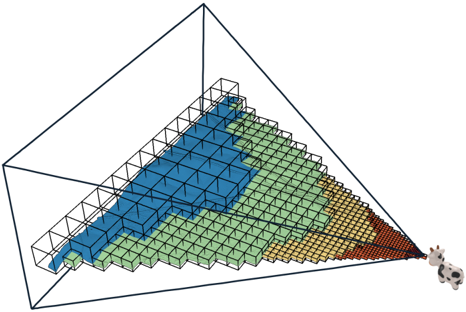
The image depicts a three-dimensional heatmap represented as a grid of colored cubes within a transparent cubic frame. The color gradient transitions from blue (lower values) to green, then to yellow, and finally to red/brown (higher values). Two cow figurines are present in the bottom-right corner of the visualization. There are no explicit axis labels or numerical values provided.
### Components/Axes
The visualization lacks explicit axis labels. However, it can be inferred that the three dimensions represent variables influencing the heatmap's values. The color of each cube represents the value of the function at that point in the three-dimensional space. The grid appears to be approximately 15x15x15 cubes, though precise counts are difficult due to perspective.
### Detailed Analysis or Content Details
The heatmap shows a clear gradient.
* **Blue Region:** Located in the top-left portion of the grid, representing the lowest values. The blue region occupies approximately the upper-left quarter of the grid.
* **Green Region:** Transitions from blue, occupying roughly the center-left portion of the grid.
* **Yellow Region:** Occupies the right-center portion of the grid, transitioning from green.
* **Red/Brown Region:** Located in the bottom-right corner, representing the highest values. This region is relatively small, occupying approximately the bottom-right corner of the grid.
The color transition appears relatively smooth, suggesting a continuous function. The cubes are arranged in a regular grid pattern, indicating a discrete sampling of a continuous function. The presence of the cow figurines does not appear to be related to the data itself, and may be a stylistic choice.
### Key Observations
The data suggests a function that increases in value as one moves from the top-left towards the bottom-right of the grid. The rate of increase appears to be non-linear, potentially accelerating towards the bottom-right corner. The limited extent of the red/brown region suggests that the highest values are concentrated in a small area.
### Interpretation
This visualization likely represents a three-variable function where the color intensity corresponds to the function's output. The gradient indicates a positive correlation between the variables and the output. The lack of axis labels makes it impossible to determine the specific meaning of the variables. The inclusion of the cow figurines is likely a playful element and does not contribute to the data's interpretation.
The visualization is a conceptual representation of data, and its primary purpose is to convey the overall trend and distribution of values. It is not intended to provide precise numerical data. The visualization could represent any number of phenomena, such as temperature distribution, chemical concentrations, or economic indicators. Without additional context, it is impossible to determine the specific meaning of the data. The visualization is a good example of how color can be used to effectively communicate complex data in a visually appealing manner.