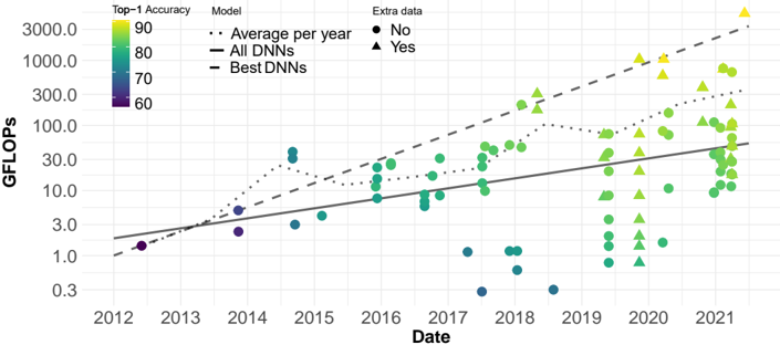
## Scatter Plot with Trend Lines: Deep Neural Network Computational Cost vs. Time (2012-2021)
### Overview
This image is a scatter plot with overlaid trend lines, illustrating the relationship between the computational cost (measured in GFLOPs) of deep neural network (DNN) models and their publication date from 2012 to 2021. The plot uses a logarithmic scale for the y-axis. Data points are color-coded by model accuracy and differentiated by marker shape based on whether the model used extra training data.
### Components/Axes
* **X-Axis (Horizontal):** Labeled "Date". It represents time in years, with major tick marks from 2012 to 2021.
* **Y-Axis (Vertical):** Labeled "GFLOPs". It represents computational cost in Giga Floating-Point Operations per second. The axis uses a **logarithmic scale**, with labeled tick marks at 0.3, 1.0, 3.0, 10.0, 30.0, 100.0, 300.0, 1000.0, and 3000.0.
* **Legend (Top-Left Corner):**
* **Top-1 Accuracy:** A vertical color bar legend. It maps color to model accuracy percentage, ranging from dark purple (60) to bright yellow (90). The scale appears continuous.
* **Model:** A legend for the three trend lines.
* `...` (Dotted line): "Average per year"
* `—` (Solid line): "All DNNs"
* `--` (Dashed line): "Best DNNs"
* **Extra data:** A legend for marker shapes.
* `●` (Circle): "No"
* `▲` (Triangle): "Yes"
### Detailed Analysis
* **Data Distribution:** The scatter plot contains approximately 100-150 data points (individual models). There is a clear upward trend in GFLOPs over time.
* **Trend Lines:**
1. **"Average per year" (Dotted Line):** This line shows the average GFLOPs for models published each year. It starts near 1.0 GFLOP in 2012 and rises to approximately 300.0 GFLOPs by 2021, following a roughly linear path on the log scale (indicating exponential growth).
2. **"All DNNs" (Solid Line):** This appears to be a linear regression fit to all data points on the log-log plot. It starts around 2.0 GFLOPs in 2012 and ends near 50.0 GFLOPs in 2021. Its slope is less steep than the "Average per year" line.
3. **"Best DNNs" (Dashed Line):** This line tracks the upper envelope of the data, representing the most computationally expensive models each year. It starts near 1.0 GFLOP in 2012 and rises sharply to over 3000.0 GFLOPs by 2021, showing the steepest growth.
* **Accuracy & Extra Data Trends:**
* **Color (Accuracy):** Earlier models (2012-2015) are predominantly dark purple and blue, indicating lower Top-1 Accuracy (~60-70). From 2016 onward, green and yellow points become common, with the brightest yellow points (highest accuracy, ~90) appearing mostly from 2019-2021.
* **Marker Shape (Extra Data):** Models using extra data (triangles) are sparse before 2018. From 2019 onward, triangles become very frequent, especially among the high-GFLOP, high-accuracy (yellow) models. Circles (no extra data) are present throughout the entire timeline.
* **Spatial Grounding & Notable Points:**
* The highest GFLOPs value (≈3000.0) is a yellow triangle (high accuracy, uses extra data) in mid-2021.
* A cluster of very low GFLOPs points (≈0.3-1.0) appears in 2017-2018, colored blue/green (medium accuracy).
* The "Best DNNs" dashed line passes through or near the highest-GFLOP point for each year from 2016 onward.
### Key Observations
1. **Exponential Growth:** The computational cost (GFLOPs) of state-of-the-art neural networks has grown exponentially over the decade, as evidenced by the linear trend on the logarithmic y-axis.
2. **Accuracy-Cost Correlation:** There is a strong visual correlation between higher model accuracy (yellow color) and higher computational cost (higher position on y-axis), particularly in recent years.
3. **Rise of Extra Data:** The use of "extra data" (triangles) becomes dominant among high-performance models in the latter half of the timeline (post-2018), coinciding with the highest accuracy and GFLOPs values.
4. **Diverging Trends:** The gap between the "Average per year" (dotted) and "Best DNNs" (dashed) lines widens over time, indicating that the most advanced models are scaling their compute much faster than the average model.
### Interpretation
This chart demonstrates the well-known "scaling laws" phenomenon in deep learning. The data suggests that over the past decade, achieving higher model accuracy has been strongly linked to increasing model size and computational requirements (GFLOPs). The trend is not merely linear but exponential.
The emergence of "extra data" as a common feature among top models from 2019 onward likely reflects the industry's shift towards massive datasets (e.g., JFT-300M, LAION) for pre-training, which enables higher accuracy but demands greater computational resources for both data processing and model training.
The outliers—such as the cluster of low-GFLOP, medium-accuracy models in 2017-2018—may represent research into efficient architectures (e.g., MobileNets, EfficientNets) that aim to break the cost-accuracy trade-off. The "Best DNNs" line represents the performance frontier, showing the maximum accuracy achievable at a given time, which has required a relentless increase in computational investment. This trajectory raises important questions about the sustainability, accessibility, and environmental impact of advancing AI capabilities.